TODO finalize Readme
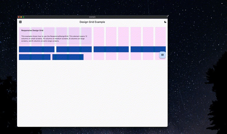
The classic use-case of implementing a colum-based design. Use the classic ResponsiveDesignGrid to implement a bootstrap-like design system where every element has a different column-span based on breakpoints.
Need to implement a design based on the strict rules of Material Layout? Use the MaterialDesignGrid to get an exact implementation of the Material Design Layout guide
✨ Features
Responsive Design Grid
Implement a column-based design with different column-spans for every breakpoint. Responsive design grid widgets can be indefinitely nested. Create small and clean widgets that use ResponsiveDesignGrid for layout. They will fit, no matter how deeply nested you use them.
You can customize:
- Breakpoints
- Column-spacing
- Row-spacing
- Grid-padding
- Amount of columns

Material Design Grid
Implement a design based on the Material Design guidelines. Material Design Grid is not meant to be used nested.
You can customize:
- Breakpoints
- Column-spacing
- Row-spacing
- Grid-padding
- Amount of columns per breakpoint

? Getting started
Decide whether you need to use the ResponsiveDesignGrid or the MaterialDesignGrid.
Talk with your designer to build a common understanding.
?️ Usage
Responsive Design Grid
@override
Widget build(BuildContext context){
    return ResponsiveDesignGridConfig(
        child: ResponsiveDesignGrid(
            children: [
                ResponsiveDesignGridRow(
                    children: [
                        ResponsiveDesignGridItem(
                            columns: ResponsiveDesignGridColumns(
                                small: 12,
                                medium: 10,
                                large: 8,
                                extraLarge: 6,
                            ),
                            child: Placeholder(),
                        ),
                    ],
                )
            ],
        ),
    );
}
Material Design Grid
@override
Widget build(BuildContext context) {
    return MaterialDesignGridTheme(
        child: MaterialDesignGrid(
            children: [
                MaterialDesignGridRow(
                    children: [
                        MaterialDesignGridItem(
                            columns: 4,
                            child: Placeholder(),
                        ),
                    ],
                )
            ],
        ),
    );
}
? Additional information
Implementing a custom design grid approach
The base widgets used for both the ResponsiveDesignGrid as well as the MaterialDesignGrid can be found in lib/src/widgets.
You can extend those to create your super-fancy very own custom design grid implementation ?.