Info Toast
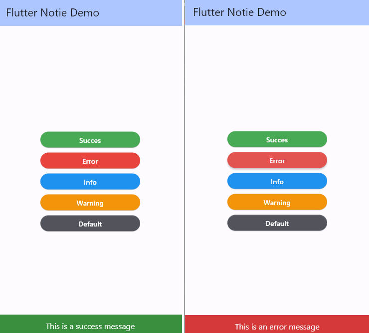
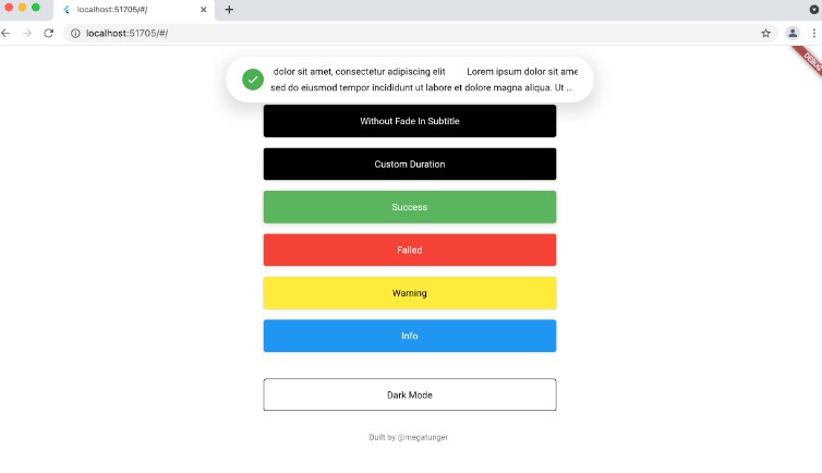
A package to help you seamlessly create beautiful and customizable animated toasts and alerts in your app.
|  |
| ————————————————————————————————————————– | ————————————————————————————————————————– | ———————————————————————————————————————————— |
|
|
| ————————————————————————————————————————– | ————————————————————————————————————————– | ———————————————————————————————————————————— |
|  |
|
Info Toast
-
Null safety support
-
Customizable positioning
-
Customizable colors
-
Built-in animations
-
Dismissable notifications
Installation
To add info_toast to your project add this line to your pubspec.yaml file
dependencies:
    info_toast: ^1.0.0
Parameters
///Text widget displayed as a title in the toast
///required parameter for all toast types
final  Text  title;

///Text widget displayed as a description in the toast
final  Text?  description;

///The action button displayed below description
///by default there's no action added
final  Text?  action;

///indicates whether display or not the title
final  bool  displayTitle;

///the toast icon, it's required when using the default constructor
late  IconData  icon;

///the Icon color
///this parameter is only available on the default constructor
///for the built-in themes the color will be set automatically
late  Color  iconColor;

///background color of container
final  Color  backgroundColor;
///box shadow color of container
final Color shadowColor;
//Custom widget displayed at the place of the predefined icons
final  Widget?  iconWidget;

///the icon size
///by default is 20
///this parameter is available in default constructor
late  double  iconSize;

///the toast display postion, possible values
///{
///top,
///bottom
///}
final  Position  toastPosition;

///The color that will be applied on the circle behind the icon
///for better rendering the action button must have the same color
late  Color  themeColor;

///the function invoked when clicking on the action button
final  Function?  actionHandler;

///The duration of the animation by default it's 1.5 seconds
final  Duration  animationDuration;

///the animation curve by default it's set to `Curves.ease`
final  Cubic  animationCurve;

///The animation type applied on the toast
///{
///fromTop,
///fromLeft,
///fromRight,
///fromBottom,
///}
final  AnimationType  animationType;

///indicates whether the toast will be hidden automatically or not
final  bool  autoDismiss;

///the duration of the toast if [autoDismiss] is true
///by default it's 3 seconds
final  Duration  toastDuration;


///the layout of the toast
///{
///ltr,
///rtl
///}
final  ToastLayout  layout;

///Display / Hide the close button icon
///by default it's true
final  bool  displayCloseButton;

///define the border radius applied on the toast
///by default it's 20
final  double  borderRadius;

///Define whether the icon will be rendered or not
final  bool  displayIcon;

///Define wether the animation on the icon will be rendered or not
final  bool  enableIconAnimation;
Usage
- Simple info_toast with only title
InfoToast.success(

title:  "Hello World!"

).show(context);
- Simple info_toast with action button
InfoToast.info(

title:  "User added",

action:  "Display information",

actionHandler: (){

print("Action button pressed");

},

).show(context);
A package to help you seamlessly create beautiful and customizable animated toasts and alerts in your app.
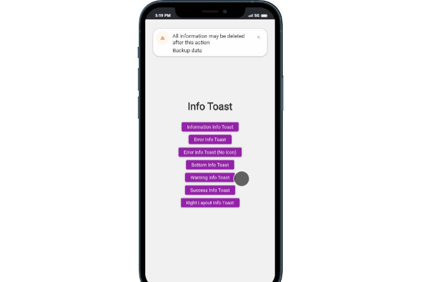
- Toast with description without title
InfoToast.warning(

title:  "",

displayTitle:  false,

description:  "All information may be deleted after this action",

animationType:  ANIMATION_TYPE.FROM_TOP,

action:  "Backup data",

actionHandler: (){

print("Hello World!!");

},

).show(context);
- Toast with nothing but description with different animation type and auto dismiss
InfoToast.error(

title:  "",

displayTitle:  false,

description:  "Invalid account information",

animationType:  ANIMATION_TYPE.FROM_RIGHT,

animationDuration:  Duration(milliseconds:  1000),

autoDismiss:  true

).show(context);
- Bottom displayed info_toast
InfoToast(

icon:  Icons.alarm_add,

themeColor:  Colors.pink,

title:  "",

displayTitle:  false,

description:  "A bottom info_toast example",

toastPosition:  POSITION.BOTTOM,

animationDuration:  Duration(milliseconds:  1000),

autoDismiss:  true

).show(context);
- Right layout rendered info_toast
InfoToast(

icon:  Icon(Icons.car_repair),

themeColor:  Colors.green,

title:  "",

displayTitle:  false,

description:  "هذا مثال تصميم من اليمين",

toastPosition:  POSITION.BOTTOM,

layout:  TOAST_LAYOUT.RTL,

animationType:  ANIMATION_TYPE.FROM_RIGHT,

action:  "انقر هنا",

actionStyle:  TextStyle(color:  Colors.green),

animationDuration:  Duration(milliseconds:  1000),

autoDismiss:  true)

.show(context);
Contribution
You can send your pull requests to the project repository
-
If you found a bug, open an issue.
-
If you have a feature request, open an issue.
-
If you want to contribute, submit a pull request.
Contributors