Boxy
This library provides several widgets and utilities that enable you to create advanced layouts without in-depth knowledge of the framework and minimal boilerplate.
Flex layouts
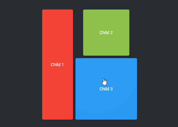
A common pattern is when you need one or more widgets in a Row or Column to have the same cross axis size
as another child in the list, you can achieve this layout using BoxyRow and Dominant, for example:
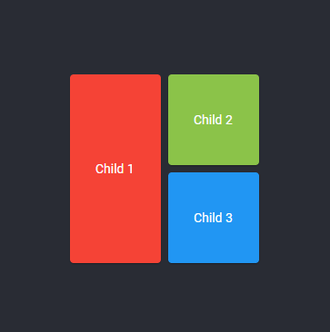
BoxyRow(
  mainAxisSize: MainAxisSize.min,
  children: [
    Child1(),
    Dominant(child: Column(
      mainAxisSize: MainAxisSize.min,
      children: [
        Child2(),
        Child3(),
      ],
    )),
  ],
]);
Complex custom layouts
For more complex layouts this library provides CustomBoxy, a multi-child layout widget that allows you to inflate,
constrain, lay out, and paint each child manually similar to a CustomMultiChildLayout.
This is useful if you need layouts that no other widget can provide, for example one where one child is positioned above
the border of two others:
class MyLayout extends StatelessWidget {
  final Widget top;
  final Widget middle;
  final Widget bottom;

  // The margin between the middle widget and right edge
  final double inset;

  MyLayout({
    @required this.top,
    @required this.middle,
    @required this.bottom,
    @required this.inset,
  });

  @override
  Widget build(context) => CustomBoxy(
    delegate: MyDelegate(inset: inset),
    children: [
      // Use LayoutId to give each child an id
      LayoutId(id: #top, child: top),
      LayoutId(id: #bottom, child: bottom),
      // The middle widget should be rendered above the others
      // so we put it at the bottom of the list
      LayoutId(id: #middle, child: middle),
    ],
  );
}

class MyDelegate extends BoxyDelegate {
  final double inset;

  MyDelegate({@required this.inset});

  @override
  Size layout() {
    // Get each child handle by a Symbol id
    var top = getChild(#top);
    var middle = getChild(#middle);
    var bottom = getChild(#bottom);

    // Children should have unbounded height
    var topConstraints = constraints.widthConstraints();

    // Lay out and position top widget
    var topSize = title.layout(topConstraints);
    top.position(Offset.zero);

    // Lay out and position middle widget using size of top widget
    var middleSize = middle.layout(BoxConstraints());
    middle.position(Offset(
      topSize.width - (middle.width + inset),
      topSize.height - middle.height / 2,
    ));

    // Lay out bottom widget
    var bottomSize = info.layout(topConstraints.tighten(
      // Bottom widget should be same width as top widget
      width: topSize.width,
    ));

    // Position bottom widget directly below top widget
    bottom.position(Offset(0, topSize.height));

    // Calculate total size
    return Size(
      topSize.width,
      topSize.height + bottomSize.height,
    );
  }

  // Check if any properties have changed
  @override
  bool shouldRelayout(MyDelegate old) => old.inset != inset;
}
See the Product Tile example for an implementation of this
layout, and the documentation of CustomBoxy for
more information.
Sliver containers
Ever want to give SliverList a box decoration? The sliver library
provides SliverContainer which allows you to use a box widget as the foreground or background of a sliver:
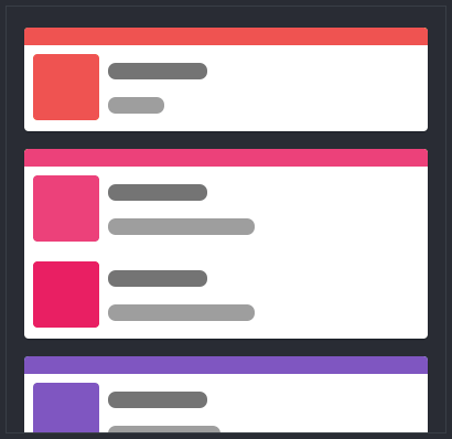
This card effect can be achieved with SliverCard:
SliverCard(
  color: Colors.white,
  clipBehavior: Clip.antiAlias,
  sliver: SliverList(...),
)
The following example uses SliverContainer to give SliverList a rounded blue border:
SliverContainer(
  // How far the background will extend off-screen, prevents the border
  // from shrinking as the sliver is scrolled out of view
  bufferExtent: 12.0,

  // The background and foreground are layed out to cover the visible
  // space of the sliver
  background: DecoratedBox(
    border: Border.all(
      color: Colors.blue,
      width: 2,
    ),
    borderRadius: BorderRadius.circular(12),
  ),

  margin: EdgeInsets.all(8.0),
  padding: EdgeInsets.all(8.0),
  sliver: SliverList(...),
)
Utilities
The utils library provides extensions with axis dependant
methods and constructors for several data types. These extensions make writing direction agnostic math significantly
easier.
Full list of methods:
BoxConstraintsAxisUtil.create
BoxConstraintsAxisUtil.expand
BoxConstraintsAxisUtil.tightFor
BoxConstraintsAxisUtil.tightForFinite
BoxConstraints.hasTightAxis
BoxConstraints.hasTightCrossAxis
BoxConstraints.hasBoundedAxis
BoxConstraints.hasBoundedCrossAxis
BoxConstraints.hasInfiniteAxis
BoxConstraints.hasInfiniteCrossAxis
BoxConstraints.maxAxis
BoxConstraints.minAxis
BoxConstraints.maxCrossAxis
BoxConstraints.minCrossAxis
BoxConstraints.tightenAxis
BoxConstraints.constrainAxisDimensions
BoxConstraints.constrainAxis
BoxConstraints.constrainCrossAxis
BoxConstraints.copyWithAxis
BoxConstraints.axisConstraints
BoxConstraints.crossAxisConstraints
Axis.cross
Axis.direction
Axis.crossDirection
VerticalDirection.reversed
VerticalDirection.direction
AxisDirection.axis
AxisDirection.crossAxis
AxisDirection.isReverse
AxisDirection.isForward
AxisDirection.reversed
AxisDirection.ccw
AxisDirection.cw
AxisDirection.operator+
AxisDirection.operator-
RenderBox.getMinIntrinsicAxis
RenderBox.getMinIntrinsicCrossAxis
RenderBox.getMaxIntrinsicAxis
RenderBox.getMaxIntrinsicCrossAxis
OffsetAxisUtil.create
OffsetAxisUtil.direction
Offset.axisOffset
Offset.crossAxisOffset
Offset.directionExtent
SizeAxisUtil.create
SizeAxisUtil.from
SizeAxisUtil.crossFrom
Size.axisSize
Size.crossAxisSize
EdgeInsetsAxisUtil.create
EdgeInsetsAxisUtil.symmetric
EdgeInsetsAxisUtil.direction
EdgeInsets.directionExtent
AxisSizedBox