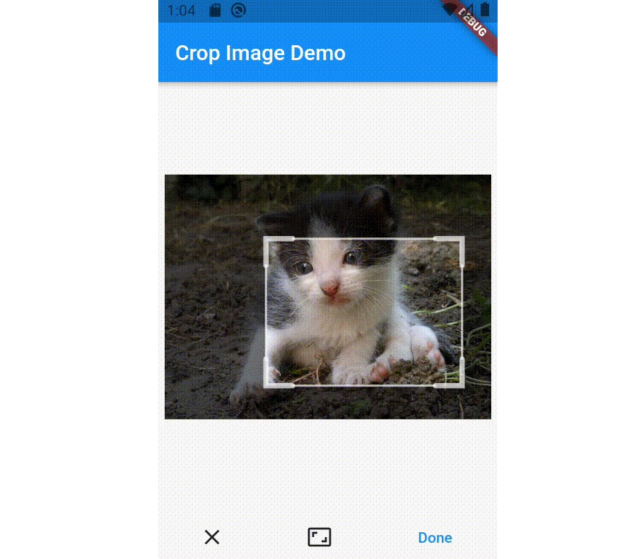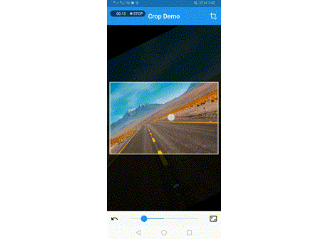
crop_your_image
A flutter plugin which provides Crop Widget for cropping images.
crop_your_image provides only minimum UI for deciding cropping area inside images. Other UI parts, such as "Crop" button or "Change Aspect Ratio" button, need to be prepared by each app developers.
This policy helps app developers to build "Cropping page" with the design of their own brand.In order to control the actions for cropping images, you can use CropController from whatever your Widgets.
Features
- Minimum UI restrictions.
- Flexible
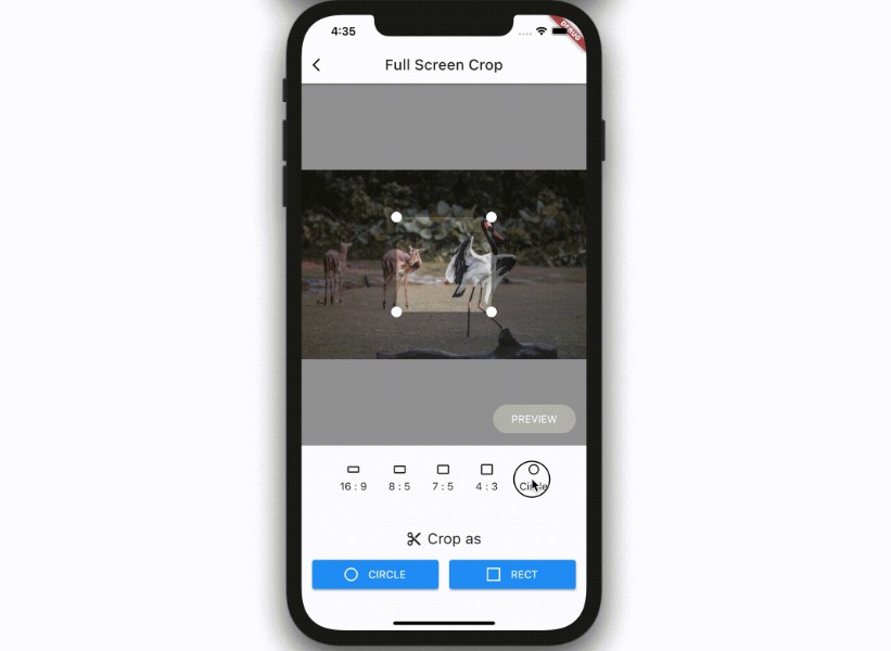
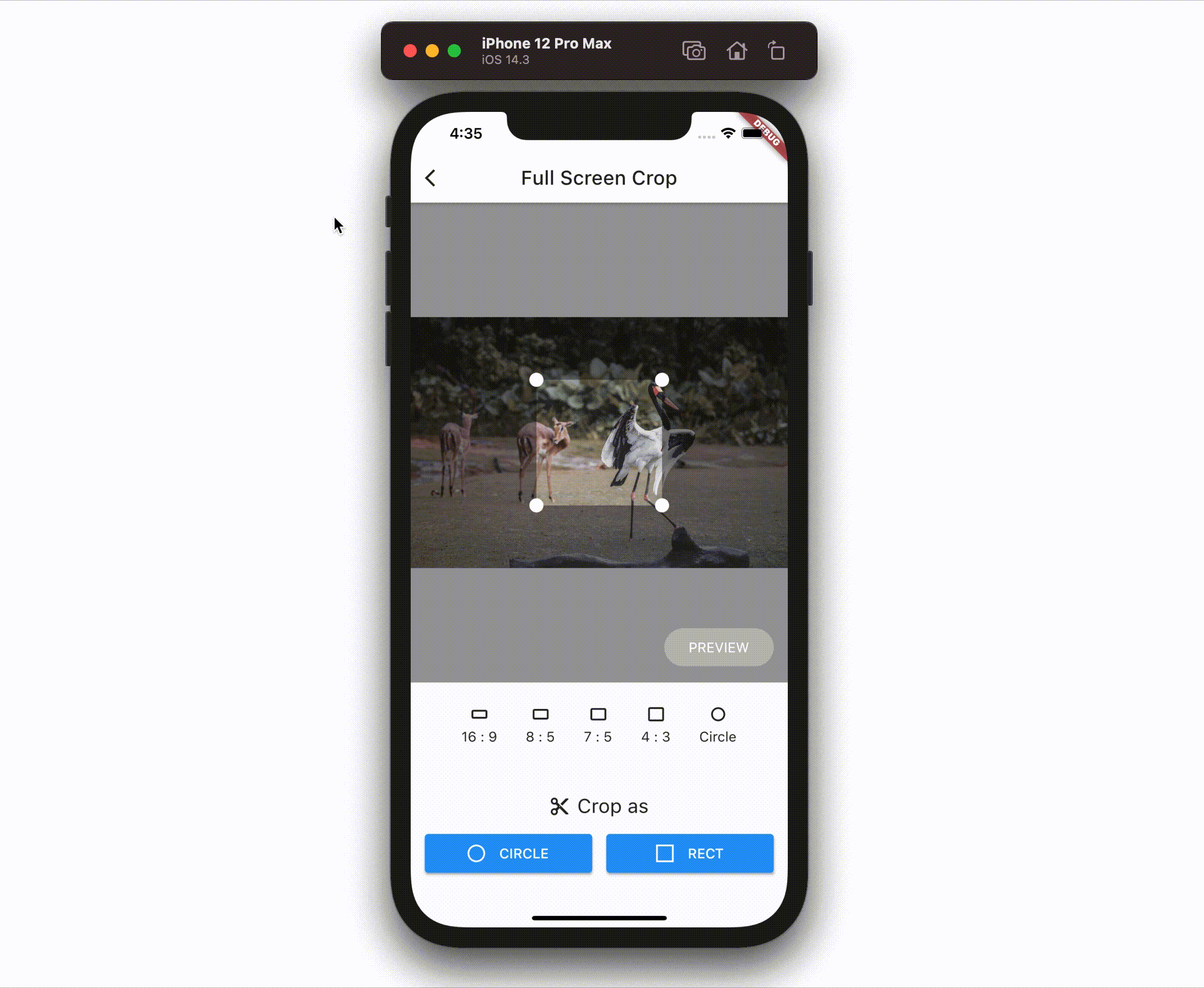
Cropwidget which can be placed anywhere on your widget tree. CropControllerto control crop actions.- Crop with both rect and circle
- Fix aspect ratio.
- Set the rect of cropping area programmatically.
Note that this package DON'T
- read / download image data from any storages, such as gallery, internet, etc.
- resize, tilt, or other conversions which can be done with image package directly.
- provide UI parts other than cropping editor, such as "Crop" button, "Preview" button or "Change Aspect Ratio" menu. Building UI is completely UP TO YOU!
Note
Please note that this package is at the very starting point of developping. I'm always waiting for your feedbacks and Pull Requests for making crop_your_image more handy and useful with less bugs.
Usage
Basics
Place Crop Widget wherever you want to place image cropping UI.
final _controller = CropController();

Widget build(BuildContext context) {
  return Crop(
    image: _imageData,
    controller: _controller,
    onCropped: (image) {
      // do something with image data
    }
  );
}
Then, Crop widget will automatically display cropping editor UI on users screen with given image.
By creating a CropController instance and pass it to controller property of Crop, you can controll the Crop widget from your own designed Widgets.
For example, when you want to crop the image with current selected cropping area, you can just call _controller.crop() wherever you want, such like the code below.
ElevatedButton(
  child: Text('Crop it!')
  onPressed: _cropController.crop,
),
Because _controller.crop() only kicks the cropping process, this method returns immediately without any cropped image data. You can always obtain the result of cropping images via onCropped callback of Crop Widget.
Advanced
All the properties of Crop and their usages are below.
final _controller = CropController();

Widget build(BuildContext context) {
  return Crop(
    image: _imageData,
    controller: _controller,
    onCropped: (image) {
      // do something with image data
    },
    aspectRatio: 4 / 3,
    initialSize: 0.5,
    // initialArea: Rect.fromLTWH(240, 212, 800, 600),
    // withCircleUi: true,
    baseColor: Colors.blue.shade900,
    maskColor: Colors.white.withAlpha(100),
    onMoved: (newRect) {
      // do something with current cropping area.
    }
    cornerDotBuilder: (size, cornerIndex) => const DotControl(color: Colors.blue),
  );
}
imageis Image data whose type isUInt8List, and the result of cropping can be obtained viaonCroppedcallback.aspectRatiois the aspect ratio of cropping area. Setnullor just omit if you want to crop images with any aspect ratio.aspectRatiocan be changed dynamically via setter ofCropController.aspectRatio. (see below)initialSizeis the initial size of cropping area.1.0(ornull, by default) fits the size of image, which means cropping area extends as much as possible.0.5would be the half. This value is also referred whenaspectRatiochanges viaCropController.aspectRatio.initialAreais the initialRectof cropping area based on actual image data.withCircleUiflag is to decide the shape of cropping UI. Iftrue,aspectRatiois automatically set1.0and the shape of cropping UI would be circle. Note that this flag does NOT affect to the result of cropping image. If you want cropped images with circle shape, callCropController.cropCircleinstead ofCropController.crop.baseColoris the color of the mask widget which is placed over the cropping editor.maskColoris the color of the base color of the cropping editor.onMovedcallback is called when cropping area is moved regardless of its reasons.newRectof argument is currentRectof cropping area.cornerDotBuilderis the builder to build Widget placed at corners. The builder passessizewhich widget must follow andcornerIndexwhich indicates the position: 0: left-top, 1: right-top, 2: left-bottom, 3: right-bottom.
In addition, image, aspectRatio, withCircleUi, rect and area can also be changed via CropController, and other properties, such as baseColor, maskColor and cornerDotBuilder, can be changed by setState.