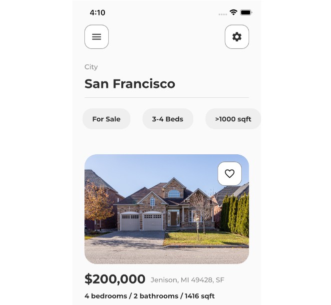
Flutter UI Practice
Two Sample Screens for a real estate app UI
These UI Screens are from RetroPortal Studio
The Images are from unsplash
How To Test
Prerequisite
- Flutter/Dart knowledge
- Physical or virtual mobile device
- Flutter development environment
- Text Editor or IDE
Steps
- Clone this repository
- Open the project folder on a text editor or IDE
- Install dependencies run
flutter pub geton the terminal console - Connect device to the text editor or IDE
- Debug the project.
Updates to the code
- The naming of constant variables adjusted to match dart convention.
lib/utils/constants.dart.- The body Texts have a height property to regulate the line-height of the paragraphs
- The accentColor was deprecated use secondary color from colorSwatch instead. lib/main.dart
return MaterialApp(
    theme: ThemeData(
        colorScheme: ColorScheme.fromSwatch().copyWith(
            secondary: colorGrey,
        ),
    ),
);
- Add the nullable operator to the padding variable declaration of the border box widget to allow building the widget with a null padding value.
lib/custom/border_box.dartfinal EdgeInsets? padding
-
Replace all Container widgets with a width and height property to SizedBox widget.
-
Refactor code so that reusable widgets are contained within their respective files.
-
Remove the unecessary container in the RealEstateItem Widget and add padding from the bottom to the Column replacing the aforementioned container.
lib/custom/real_estate_ite,.dart
- Remove unecessary Strin Interpolation on the currency value text widget.
lib/custom/real_estate_ite,.dart
- FlatButton was deprecated so the FlatButton widget is replaced with the TextButton with matchin styling as the deprecated FlatButton.
- A convinient way of restricting the size of a TextButton widget is to use a SizedBox of fixed width and height then have the TextButton as a child of the SizedBox widget. like so:
return SizedBox(
      width: width,
      child: TextButton(
        onPressed: () {},
        style: TextButton.styleFrom(
          backgroundColor: colorDarkBlue,
          foregroundColor: colorWhite,
          shape: RoundedRectangleBorder(
            borderRadius: BorderRadius.circular(50.0),
          ),
          padding: const EdgeInsets.symmetric(
            horizontal: 20.0,
            vertical: 15.0,
          ),
        ),
        child: Row(
          children: <Widget>[
            Icon(
              icon,
              color: colorWhite,
            ),
            addHorizontalSpace(10.0),
            Text(
              text,
              style: const TextStyle(color: colorWhite),
            ),
          ],
        ),
      ),
    );
Images: