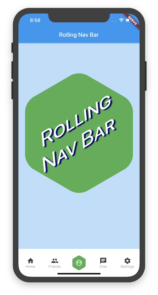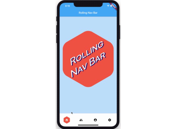
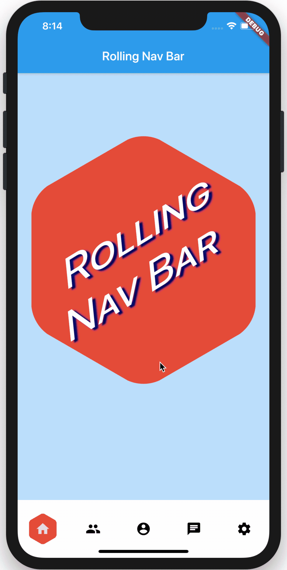
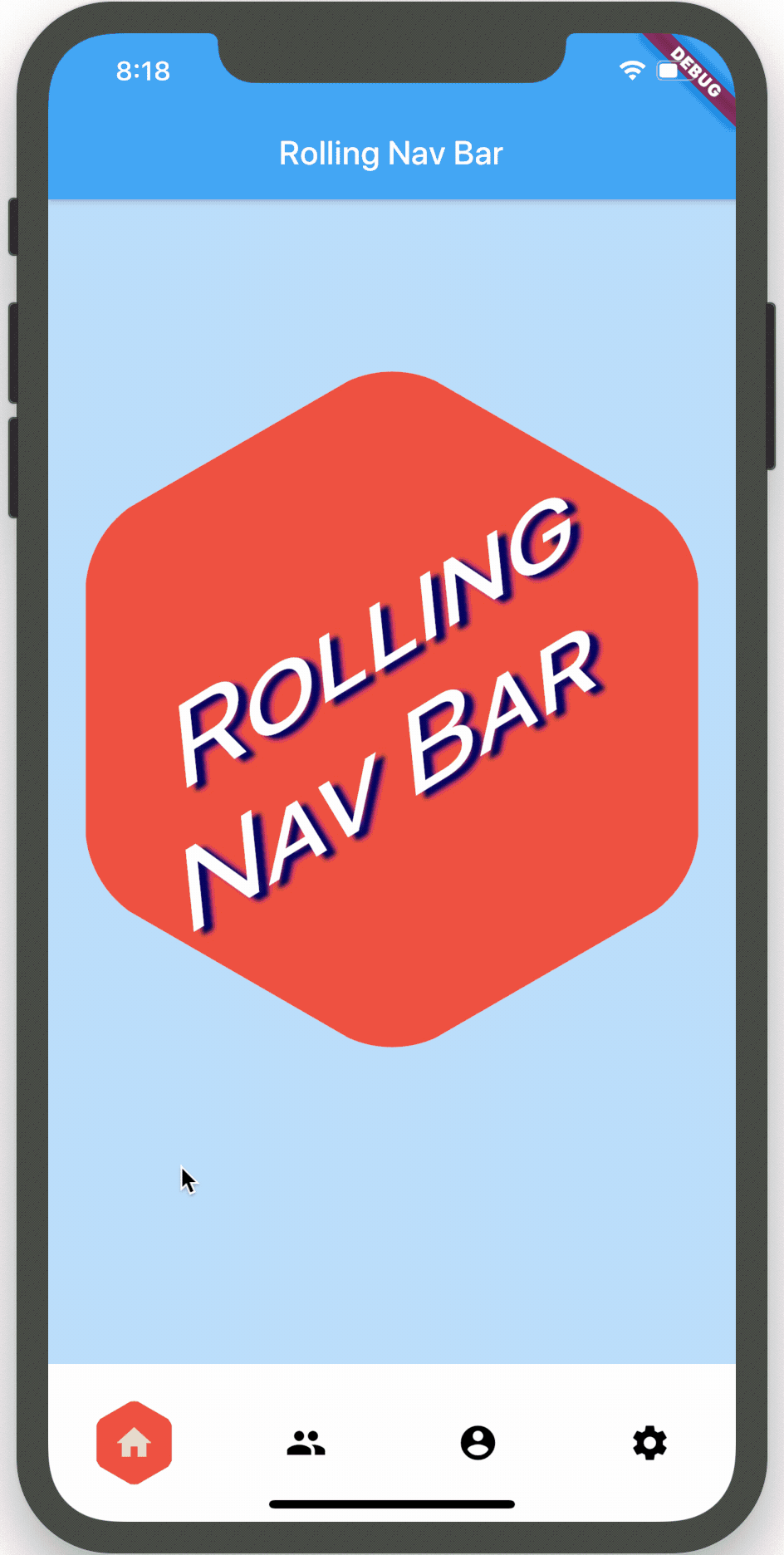
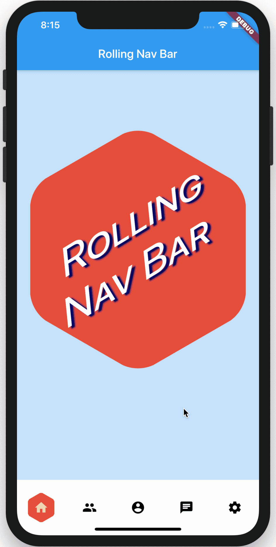
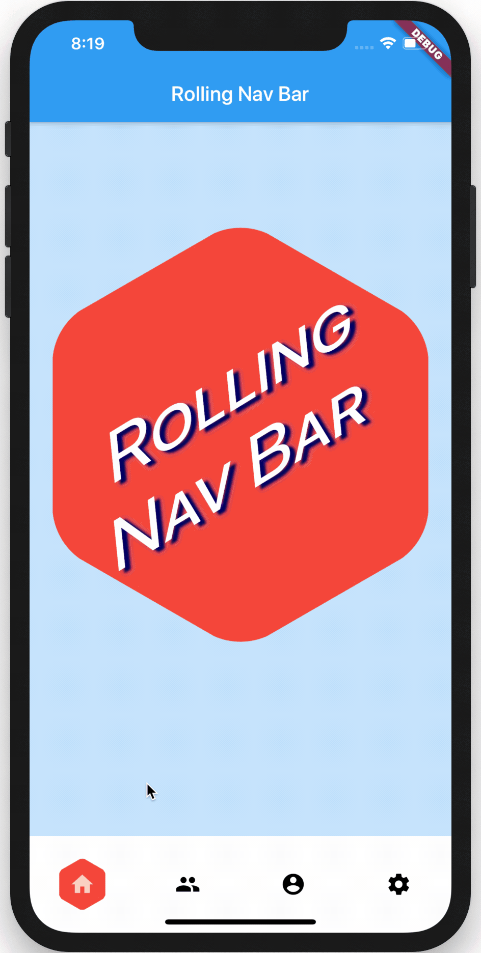
rolling_nav_bar
A bottom nav bar with layout inspired by this design and with heavily customizable animations, colors, and shapes.
Getting Started
To get started, place your RollingNavBar in the bottomNavigationCar slot of a
Scaffold, wrapped in a widget that provides max height. For example:
Scaffold(
  bottomNavigationBar: Container(
    height: 95,
    child: RollingNavBar(
      // nav items
    ),
  )
);
Alternatively, you can place it directly using a Stack:
Scaffold(
  body: Stack(
    children: <Widget>[
      Positioned(
        bottom: 0,
        height: 95,
        width: MediaQuery.of(context).size.width,
        child: RollingNavBar(
          // nav items
        ),
      )
    ]
  )
);
Customization
RollingNavBar is heavily customizable and works with 3, 4, or 5 navigation elements.
Each element is also fully customizable through the two primary ways to specify child
navigation elements.
The first option is to pass a list of IconData objects, along with optional lists
of Color objects.
RollingNavBar.iconData(
  iconData: <IconData>[
    Icons.home,
    Icons.people,
    Icons.settings,
  ],
  indicatorColors: <Color>[
    Colors.red,
    Colors.yellow,
    Colors.blue,
  ],
)
The second option is to pass a list of widgets, though less automatic active-state handling
is available in this method.
RollingNavBar.children(
  children: <Widget>[
    Text('1', style: TextStyle(color: Colors.grey)),
    Text('2', style: TextStyle(color: Colors.grey)),
    Text('3', style: TextStyle(color: Colors.grey)),
  ],
  indicatorColors: <Color>[
    Colors.red,
    Colors.yellow,
    Colors.blue,
  ],
)
Animation Types
RollingNavBar comes with four animation flavors for the active indicator's transition from
tab to tab.
The first animation type is the namesake: AnimationType.roll:
RollingNavBar.iconData(
  animationCurve: Curves.easeOut,  // `easeOut` (the default) is recommended here
  animationType: AnimationType.roll,
  baseAnimationSpeed: 200, // milliseconds
  iconData: <IconData>[
    ...
  ],
)
Note: For the
rollanimation type, your supplied animation speed is a multiplier considered against the distance the indicator must travel. This ensures a constant speed of travel no matter where the user clicks.
The second animation type is is a fade-and-reappear effect:
RollingNavBar.iconData(
  animationCurve: Curves.linear, // `linear` is recommended for `shrinkOutIn`
  animationType: AnimationType.shrinkOutIn,
  baseAnimationSpeed: 500, // slower animations look nicer for `shrinkOutIn`
  iconData: <IconData>[
    ...
  ],
)
Note: For the
shinkOutInanimation type, theyour supplied animation speed is constant, since the active indicator never travels the intermediate distance.
The third animation type is a spinning version of fade-and-reappear:
RollingNavBar.iconData(
  animationCurve: Curves.linear, // `linear` is recommended for `spinOutIn`
  animationType: AnimationType.spinOutIn,
  baseAnimationSpeed: 500, // slower animations look nicer for `spinOutIn`
  iconData: <IconData>[
    ...
  ],
)
Note: Like with
shinkOutIn, for thespinOutInanimation type, your supplied animation speed is constant, since the active indicator never travels the intermediate distance.
The final animation flavor is a non-animation:
RollingNavBar.iconData(
  // `animationCurve` and `baseAnimationSpeed` are ignored
  animationType: AnimationType.snap,
  iconData: <IconData>[
    ...
  ],
)
In addition to the above options, animationCurve and baseAnimationSpeed parameters
are also exposed.
Hooking into the animation
In the demo, the background of the larger hexagon matches the background of
the nav bar hexagon. To achieve this and similar effects, two callbacks, onTap and onAnimate are available. onAnimate can be particularly helpful for syncing visual effects elsewhere in your app with nav bar progress.
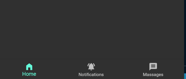
Tab Item Text
If using the iconData constructor, you are also able to pass a list of widgets
to render as text below inactive icons.
RollingNavBar.iconData(
  // A list of length one implies the same color for all icons
  iconColors: <Color>[
    Colors.grey[800],
  ],
  iconData: <IconData>[
    Icons.home,
    Icons.friends,
    Icons.settings,
  ],
  iconText: <Widget>[
    Text('Home', style: TextStyle(color: Colors.grey, fontSize: 12)),
    Text('Friends', style: TextStyle(color: Colors.grey, fontSize: 12)),
    Text('Settings', style: TextStyle(color: Colors.grey, fontSize: 12)),
  ]
)