Responsive Widgets
This plugin helps to create responsive widgets, that makes a auto-size with the proportion between reference screen size (width, height and shortest side(dpi)) with the screen that the app is running. The package only changed the original widgets, like "Container" to apply a function that make this calculation.
Getting Started
First of all you need to use the code ResponsiveWidgets().init(context) to make the plugin works. The code need to be placed on the first screen of the app, inside of the build method, like this: See also in code
class  _HomeScreenState  extends  State<HomeScreen> {
    @override
    Widget  build(BuildContext context) {

	    ResponsiveWidgets().init(context,
		    referenceHeight: 1920, // Optional
		    referenceWidth: 1080, // Optional
		    referenceShortestSide: 411 // Optional, default = 360
	    );

	    return  Scaffold(
		    body: Container()
	    );
	}
}
ShortestSide is basically the dpi of the device, can be got by this code: MediaQuery.of(context).size.shortestSide;
Or be changed in the device in Config>Developer Options>Drawing Section>ShortestSide.
Widgets
ContainerResponsive
ContainerResponsive(
    child: Widget,
    height: double, // Responsive wight
    heightResponsive: bool, // Enable/Disable Responsive height
    width: double, // Responsive width
    widthResponsive: , bool// Enable/Disable Responsive width
)
EdgeInsetsResponsive (Can be used in any widget with parameter padding)
Padding(
    child: Widget,
    padding: EdgeInsetsResponsive.all(50), // EdgeInsets Responsive padding
)
IconResponsive
IconResponsive(
    icon,
    size: double, // Responsive size
)
IconButtonResponsive
IconButtonResponsive(
    icon: IconData,
	size: double, // Responsive size,
	onTap: (){}
)
TextResponsive
TextResponsive(
    text // Responsive fontSize
)
RaisedButtonResponsive
RaisedButtonResponsive(
    child: Widget,
    onPressed: (){}
)
Function to recalculate size responsibly
Have special cases that doesn't have Responsive Widgets created, one of this cases is the Positioned, to solve this problem is simple use this function: ResponsiveWidgets().getSize(double size) that will return the correct value to the screen.
Examples
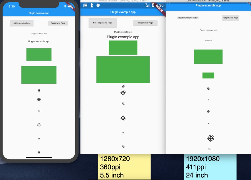
Mixed, responsive and normal, respectively

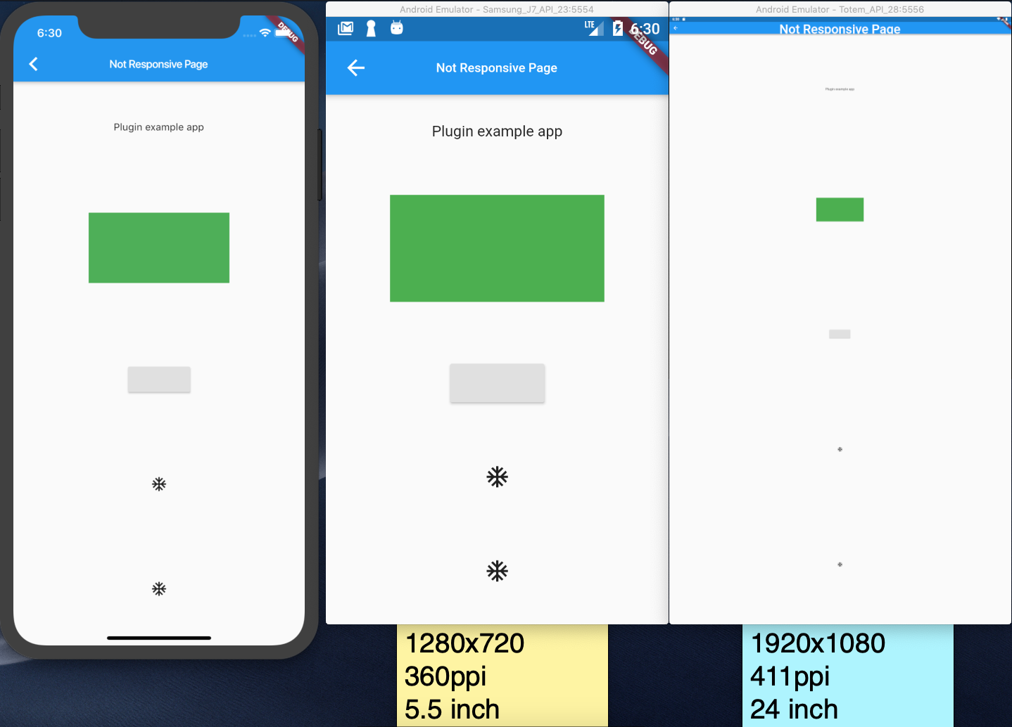
Not responsive page
Responsive page