theme_provider
Easy to use, customizable and pluggable Theme Provider. This is still a work in progress.
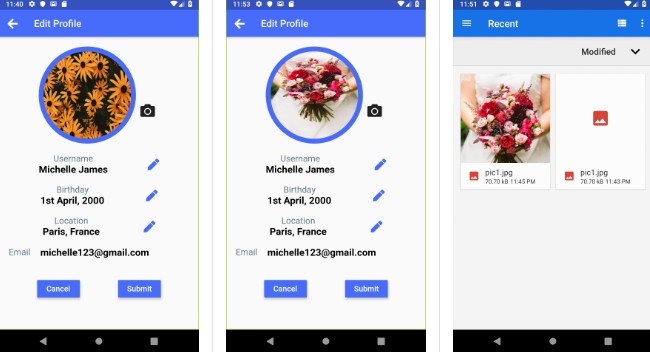
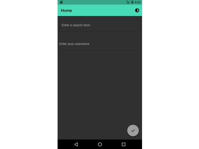
| Basic Usage | Basic Usage |
|---|---|
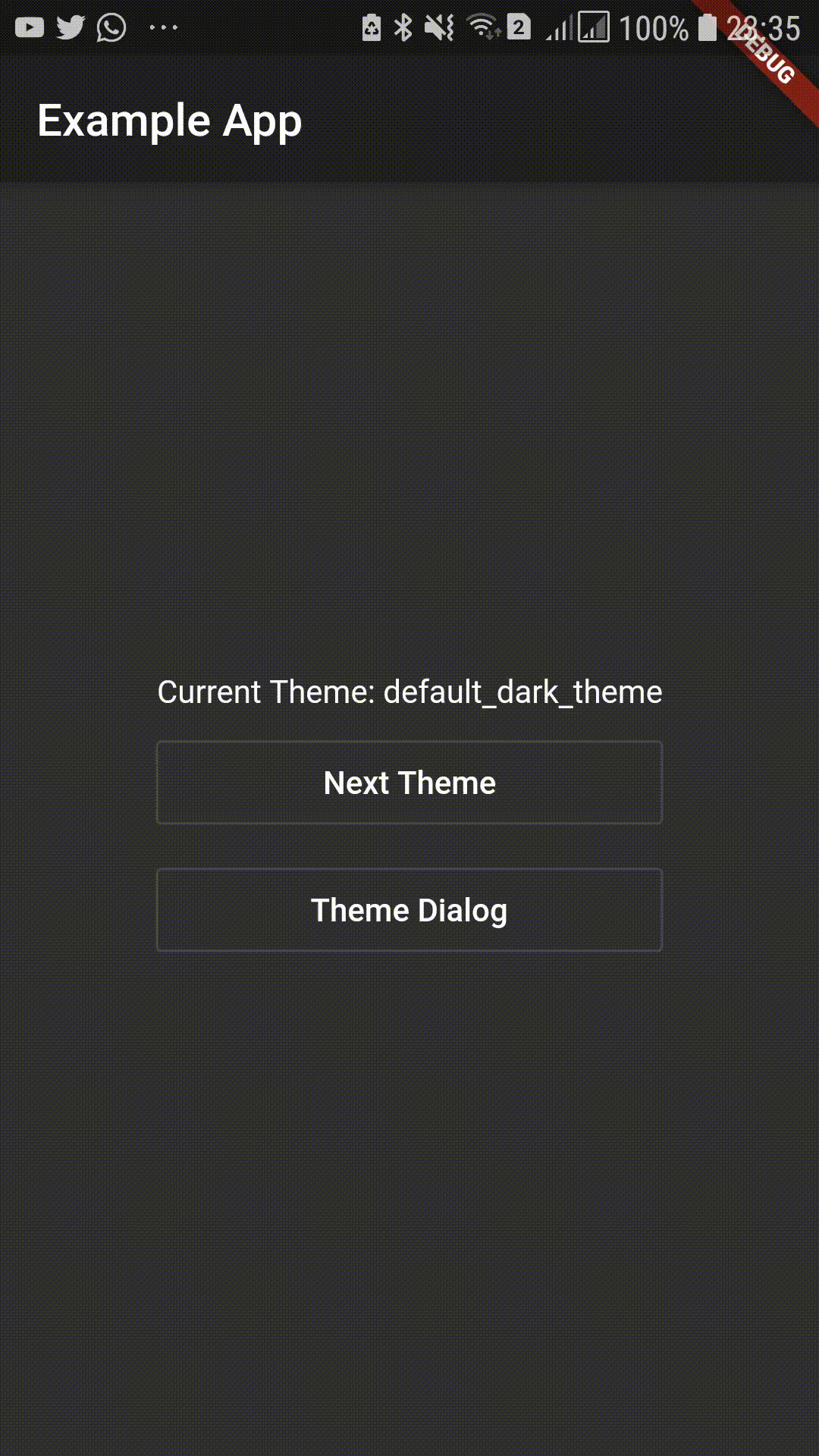 |
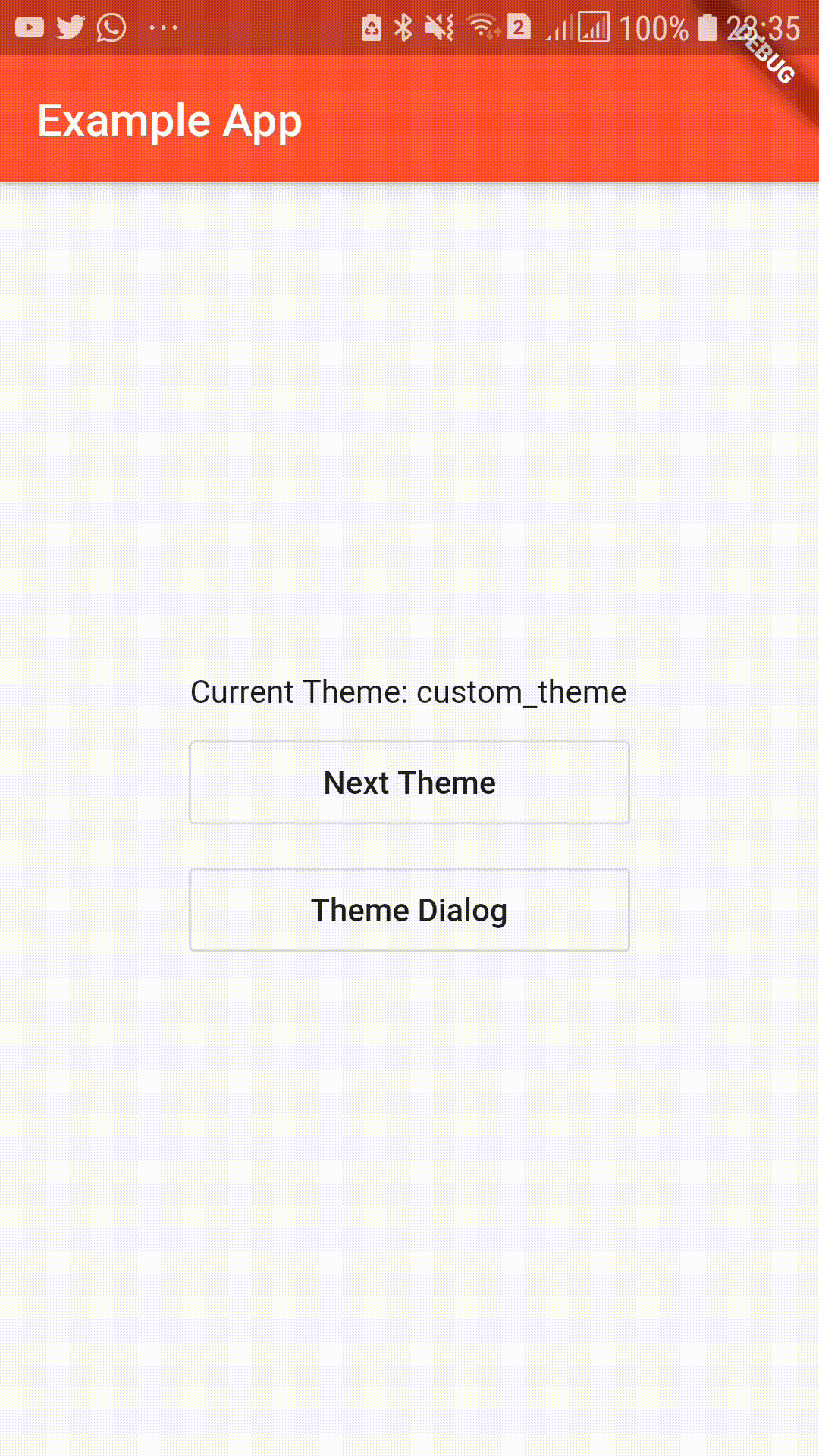 |
Include in your project
dependencies:
  theme_provider: ^0.0.1
run packages get and import it
import 'package:theme_provider/theme_provider.dart';
Usage
Wrap your material app like this:
class MyApp extends StatelessWidget {
  @override
  Widget build(BuildContext context) {
    return ThemeProvider(
      builder: (context, theme) => MaterialApp(
        home: HomePage(),
        theme: theme,
      ),
    );
  }
}
To change the theme:
ThemeProvider.controllerOf(context).nextTheme();
Access current AppTheme
ThemeProvider.themeOf(context)
Access theme data:
 ThemeProvider.themeOf(context).data
 // or
 Theme.of(context)
Passing Additional Options
This can also be used to pass additional data associated with the theme. Use options to pass additional data that should be associated with the theme.
eg: If font color on a specific button changes create a class to encapsulate the value.
  class ThemeOptions{
    final Color specificButtonColor;
    ThemeOptions(this.specificButtonColor);
  }
Then provide the options with the theme.
class MyApp extends StatelessWidget {
@override
Widget build(BuildContext context) {
  return ThemeProvider(
    themes: themes: [
        AppTheme<ThemeOptions>(
            data: ThemeData.light(),
            options: ThemeOptions(Colors.blue),
        ),
        AppTheme<ThemeOptions>(
            data: ThemeData.dark(),
            options: ThemeOptions(Colors.red),
        ),
      ],
      builder: (context, theme) => MaterialApp(
        home: HomePage(),
        theme: theme,
      ),
  );
}
}
Then the option can be retrieved as,
ThemeProvider.optionsOf<ThemeOptions>(context).specificButtonColor
Additonal Widgets
Theme Cycle Widget
IconButton to be added to AppBar to cycle to next theme.
Scaffold(
  appBar: AppBar(
    title: Text("Example App"),
    actions: [CycleThemeIconButton()]
  ),
),
Theme Selecting Dialog
SimpleDialog to let the user select the theme.
showDialog(context: context, builder: (_) => ThemeDialog())
TODO
- [x] Add next theme command
- [x] Add theme cycling widget
- [x] Add theme selection by theme id
- [x] Add theme select and preview widget
- [ ] Persist current selected theme
- [x] Add unit tests and example
- [x] Remove provider dependency