Flutter Custom Themes Vol. 1
Welcome to the first volume of custom themes for Flutter.
There is one file per theme, feel free to download the files or fork the complete repo if you want to try them all.
Leave a star, don’t be shy!

How to use the themes?
Need more customization? Skip to #mods.
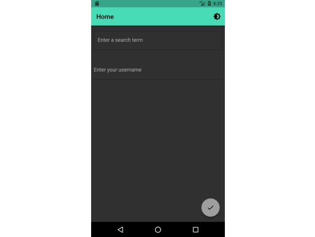
Each theme is created to be used automatically in any Flutter app and it has been tested with the default widgets for regular aplication.
Here are some instructions on how to install each of the files in the repo:
- Download the file that you want to use and import it to your project.
- In your main file just pass it as the parameter of the light and dark theme.
import 'package:flutter/material.dart';
import 'package:YOUR_APP/YOUR_ROUTE/flutter_monokai_theme.dart'; // This is an exaple using the Monokai theme.
import 'package:YOUR_APP/YOUR_ROUTE/welcome_screen.dart';

void main() {
  runApp(const MyApp());
}

class MyApp extends StatelessWidget {
  const MyApp({super.key});

  @override
  Widget build(BuildContext context) {
    return MaterialApp(
      title: 'A new flutter project',
      theme: FlutterMonokaiTheme.lightTheme,
      darkTheme: FlutterMonokaiTheme.darkTheme,
      home: WelcomeScreen(),
    );
  }
}
- Run your app. Enjoy!
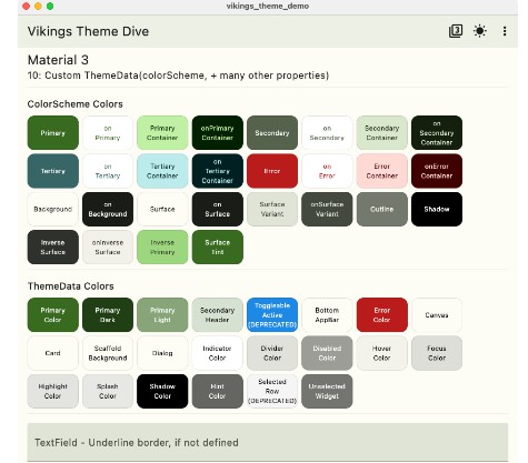
List of themes
- Monokai [+]

- More themes are on progress. Keep passing by.
- Contributions are welcome. Send your pull request.
- Check out my apps on the Google Play store so you can see the themes in action. Leave a cool comment. Drink water. Peace!
Mods
It is possible that you need to pass an specific color to a widget that you want to customize.
Here is an example of coloring the AppBar with an specific color of the theme that you are using.
class YourWidget extends StatelessWidget {
const YourWidget({super.key});

@override
Widget build(BuildContext context) {
  return Scaffold(
    appBar: AppBar(
      backgroundColor: Theme.of(context).colorScheme.inversePrimary, // Modify it like this. You can select the specific color by checking the theme file.
      leading: IconButton(
        color: Theme.of(context).colorScheme.primary,
        icon: const Icon(Icons.arrow_back_outlined),
        onPressed: () {
          Navigator.pop(context);
        },
      ),
      title: Text("Settings",
          style: TextStyle(
              color: Theme.of(context).colorScheme.onSurfaceVariant)), // Modify it like this. You can select the specific color by checking the theme file.
    ),
    body: ListView(
      children: [
        ListTile(
          leading: IconButton(
            icon: const Icon(Icons.help),
            onPressed: () {
              Navigator.push(
                context,
                MaterialPageRoute(
                  builder: (context) => const ConejozManual(),
                ),
              );
            },
          ),
          title: Text(
            'Manual',
            style: TextStyle(color: Theme.of(context).colorScheme.onPrimary), // Modify it like this. You can select the specific color by checking the theme file.
          ),
          subtitle: const Text('Some cool stuff here'),
          trailing: Icon(Icons.arrow_forward_ios,
              color: Theme.of(context).colorScheme.primary),
        ),
      ],
    ),
  );
}
}