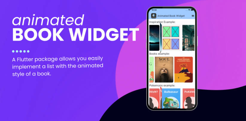
Features
Flutter has an extremely versatile SDK, however sometimes we just need 10% of the features to do 90% of the work. I created this widget to regroup features I thought added the most to designing while still keeping it as simple as possible.
- The Box makes it easier to read and write widgets by simplifying parameters used often.
- Shadow, Border, Radius, Inkwell and Gradient are flattened on the same level.
- Added shortcut functions for Shadow, Border, Radius and Gradient initialization.
- This is intended to be used by design systems as a low-level building block in order to create more complex elements.
Getting started
Add this to your package’s pubspec.yaml file:
dependencies:
  design_box: ^1.0.0
Usage
const box = Box(
  width: 40,
  height: 40,
  padding: const EdgeInsets.all(8),
  margin: const EdgeInsets.all(8),
  radius: boxRadius(10),
  border: boxBorder(Colors.white, width: 2),
  shadow: boxShadow(4),
  gradient: boxGradient(
    begin: Alignment.topRight,
    end: Alignment.bottomLeft,
    beginColor: Colors.deepOrange,
    endColor: Colors.deepPurple,
  ),
  onPressed: () {},
);
Additional information
See the included project for example implementations.