date_time_picker
A Flutter widget to show a text form field to display a date or clock dialog. This widget extend TextField and has a similar behavior as TextFormField.
Usage
In the pubspec.yaml of your flutter project, add the following dependency:
dependencies:
  ...
  date_time_picker: "^1.0.2"
In your library add the following import:
import 'package:date_time_picker/date_time_picker.dart';
For help getting started with Flutter, view the online documentation.
Example
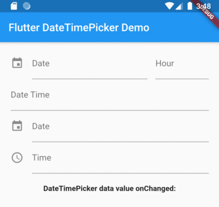
There are four presentations for DateTimePicker and can be defined in the type parameter:
DateTimePickerType.datewill present a text field with the action tap showing a datePicker dialog box;DateTimePickerType.timewill present a text field with the action tap showing a timePicker dialog box;DateTimePickerType.dateTimewill present a text field with the action tap showing a datePicker dialog box then a timePicker dialog box;DateTimePickerType.dateTimeSeparatedwill display two text fields side by side, the first for date and the second for time. Each displaying their respective dialog box, datePicker and timePicker in the tap action;
DateTimePicker(
  type: date, // options: [date | time | dateTime | dateTimeSeparated], default is date
  ...
)
initialValue or controller.text can be null, empty or a DateTime string otherwise it will throw an error.
DateTimePicker(
  initialValue: '',
  firstDate: DateTime(2000),
  lastDate: DateTime(2100),
  dateLabelText: 'Date',
  onChanged: (val) => print(val),
  validator: (val) {
    print(val);
    return null;
  },
  onSaved: (val) => print(val),
);
More complete example:
DateTimePicker(
  type: DateTimePickerType.dateTimeSeparate,
  dateMask: 'd MMM, yyyy',
  initialValue: DateTime.now().toString(),
  firstDate: DateTime(2000),
  lastDate: DateTime(2100),
  icon: Icon(Icons.event),
  dateLabelText: 'Date',
  timeLabelText: "Hour",
  selectableDayPredicate: (date) {
    // Disable weekend days to select from the calendar
    if (date.weekday == 6 || date.weekday == 7) {
      return false;
    }

    return true;
  },
  onChanged: (val) => print(val),
  validator: (val) {
    print(val);
    return null;
  },
  onSaved: (val) => print(val),
);
The result of val in onChanged, validator and onSaved will be a DateTime String or just a Time String:
- ex.: [2020-07-20 14:30] or [15:30] DateTimePickerType.time;
- month, day, hour and minute will be 2 digits and time always be in 24 hours mode;
- but the presentation in text field can be formated by the dateMask parameter.