Material Text Field

Material Text Field is a customizable widget for text input values in Dart. You can define the styling of the text field in your app’s theme file or create multiple text fields with different styling. You can easily create text input fields with customizable styling and behaviors.
Installation
To use Material Text Field in your Dart project, add the following dependency to your “pubspec.yaml” file
dependencies:
material_text_fields: ^<latest-version>
Then run flutter pub get to install the package.
In your library add the following import
import 'package:material_text_fields/material_text_fields.dart';
Usage
To use Material Text Field in your Flutter app, import the package and create a new instance of the MaterialTextField widget
           MaterialTextField(
              keyboardType: TextInputType.emailAddress,
              hint: 'Email',
              textInputAction: TextInputAction.next,
              prefixIcon: Image.asset('assets/images/ic_email.png'),
              controller: _emailTextController,   // TextEditingController _emailTextController = TextEditingController()
              validator: FormValidation.emailTextField,
            )
You can create multiple text fields with different styling with providing “theme” attribute.
            MaterialTextField(
              keyboardType: TextInputType.text,
              labelText: 'Name',
              theme: FilledOrOutlinedTextTheme(
                enabledColor: Colors.grey,
                focusedColor: Colors.green,
                fillColor: Colors.transparent,
                // You can use all properties of FilledOrOutlinedTextTheme
                // to decor text field
              ),
              prefixIcon: Image.asset('assets/images/ic_email.png'),
            )
Advance Usage
With all possible params
             MaterialTextField(
                keyboardType: TextInputType.emailAddress,
                hint: 'Email',
                textInputAction: TextInputAction.next,
                prefixIcon: Image.asset('assets/images/ic_lock.png'),
                controller: _emailTextController,
                validator: FormValidation.emailTextField,
                onChanged: (text) {
                  print('First text field: $text');
                },
                suffixIcon: Image.asset('assets/images/ic_lock.png'),
                enabled: false,
                obscureText: true,
                style: const TextStyle(fontSize: 16, color: Colors.black),
                labelText: 'Password',
                theme: FilledOrOutlinedTextTheme(
                  enabledColor: Colors.grey,
                  focusedColor: Colors.green,
                  fillColor: Colors.transparent,
                ) // you can use theme param to differ this text field from app level theming
              )
Theming
To define the styling of the text field, you can either use the app-level theme file or specify the styling directly on the widget.
App-level theme
You can use MaterialTextFieldTheme class for text field theming. This Theme class which define theming for Filled/Outlined and underline text field theming. You can use this class for text field theming
Example 1 (Filled Text Field)
Here is an example of filled field
    MaterialTextField(
        keyboardType: TextInputType.emailAddress,
        hint: 'Email',
        textInputAction: TextInputAction.next,
        prefixIcon: const Icon(Icons.email_outlined),
        suffixIcon: const Icon(Icons.check),
        controller: _emailTextController,
        validator: FormValidation.emailTextField,
      )
To define the text field style in your app-level theme file, add the following code to your ThemeData:
ThemeData(
inputDecorationTheme: FilledOrOutlinedTextTheme(
radius: 16,
contentPadding: const EdgeInsets.symmetric(horizontal: 8, vertical: 8),
errorStyle: const TextStyle(fontSize: 16, fontWeight: FontWeight.w700),
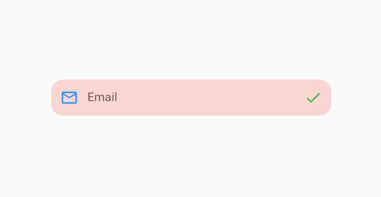
fillColor: Colors.red.withAlpha(50),
suffixIconColor: Colors.green,
prefixIconColor: Colors.blue,
),
);
Output

Example 2 (Filled Outlined Text Field)
Here is an example of filled text field with outlined border (enable and focus border)
    MaterialTextField(
        keyboardType: TextInputType.emailAddress,
        hint: 'Email',
        textInputAction: TextInputAction.next,
        prefixIcon: const Icon(Icons.email_outlined),
        suffixIcon: const Icon(Icons.check),
        controller: _emailTextController,
        validator: FormValidation.emailTextField,
       )
To define the text field style in your app-level theme file, add the following code to your ThemeData:
    ThemeData(
      inputDecorationTheme: FilledOrOutlinedTextTheme(
      radius: 30,
      contentPadding: const EdgeInsets.symmetric(horizontal: 4, vertical: 4),
      errorStyle: const TextStyle(fontSize: 16, fontWeight: FontWeight.w700),
      fillColor: Colors.grey.withAlpha(30),
      suffixIconColor: Colors.red,
      prefixIconColor: Colors.blue,
      enabledColor: Colors.grey,
      focusedColor: Colors.green
     ),
  );
Output

Example 3 (Outlined Text Field)
Here is an example of Outlined text field
  MaterialTextField(
     keyboardType: TextInputType.emailAddress,
     hint: 'Email',
     labelText: 'Email',
     textInputAction: TextInputAction.next,
     prefixIcon: const Icon(Icons.email_outlined),
     controller: _emailTextController,
     validator: FormValidation.emailTextField,
    )
To define the text field style in your app-level theme file, add the following code to your ThemeData:
     ThemeData(
       inputDecorationTheme: FilledOrOutlinedTextTheme(
        radius: 8,
        contentPadding: const EdgeInsets.symmetric(horizontal: 4, vertical: 4),
        errorStyle: const TextStyle(fontSize: 16, fontWeight: FontWeight.w700),
        fillColor: Colors.transparent,
        prefixIconColor: Colors.green,
        enabledColor: Colors.grey,
        focusedColor: Colors.green,
        floatingLabelStyle: const TextStyle(color: Colors.green),
        width: 1.5,
        labelStyle: const TextStyle(fontSize: 16, color: Colors.black),
     );
Output

Example 4 (Underline/Default Text Field)
Here is an example of Underline/default text field
MaterialTextField(
     keyboardType: TextInputType.emailAddress,
     hint: 'Email',
     textInputAction: TextInputAction.next,
     suffixIcon: const Icon(Icons.email_outlined),
     controller: _emailTextController,
     validator: FormValidation.emailTextField,
  )
If you want to apply theming on underline/default field, Use this MaterialTextFieldTheme.borderlessTextTheme function.
ThemeData(
   inputDecorationTheme: BorderlessTextTheme(
   errorStyle: const TextStyle(fontSize: 16, fontWeight: FontWeight.w700),
   prefixIconColor: Colors.green,
   enabledColor: Colors.grey,
   focusedColor: Colors.green,
   floatingLabelStyle: const TextStyle(color: Colors.green),
   width: 1,
 );
Output

Example 5 (Labeled Text Field)
Example of labeled text field
    LabeledTextField(
       title: 'Password',
       labelSpacing: 8,
       titleStyling: const TextStyle(
        fontSize: 16,
        color: Colors.black,
        fontWeight: FontWeight.w700,
           ),
           child: MaterialTextField(
                keyboardType: TextInputType.emailAddress,
                hint: 'Password',
                textInputAction: TextInputAction.done,
                obscureText: true,
                theme: FilledOrOutlinedTextTheme(
                   fillColor: Colors.green.withAlpha(50),
                   radius: 12,
                 ),
                 prefixIcon: Image.asset('assets/images/ic_lock.png'),
                 suffixIcon: const Icon(Icons.visibility),
                 controller: _passwordTextController,
                 validator: FormValidation.requiredTextField,
               ),
             );
Output

Widget level theme
You can specify the styling directly on the widget
    MaterialTextField(
        keyboardType: TextInputType.text,
        hint: 'Full Name',
        labelText: 'Name',
        theme: FilledOrOutlinedTextTheme(
            enabledColor: Colors.grey,
            focusedColor: Colors.green,
            fillColor: Colors.transparent,
                ),
        textInputAction: TextInputAction.next,
        prefixIcon: Image.asset('assets/images/ic_email.png'),
        validator: FormValidation.requiredTextField,
        );
Author
Connect with Us:
Contributing
Contributions, issues, and feature requests are welcome!
Show your Support
Give a star if this project helped you.
Bugs and feature requests
Have a bug or a feature request? Please first search for existing and closed issues. If your problem or idea is not addressed yet, please open a new issue.
Copyright & License
Code copyright 2023–2024 DevCrew I/O. Code released under the MIT license.