sizer
Sizer is helps you to create responsive UI easily.

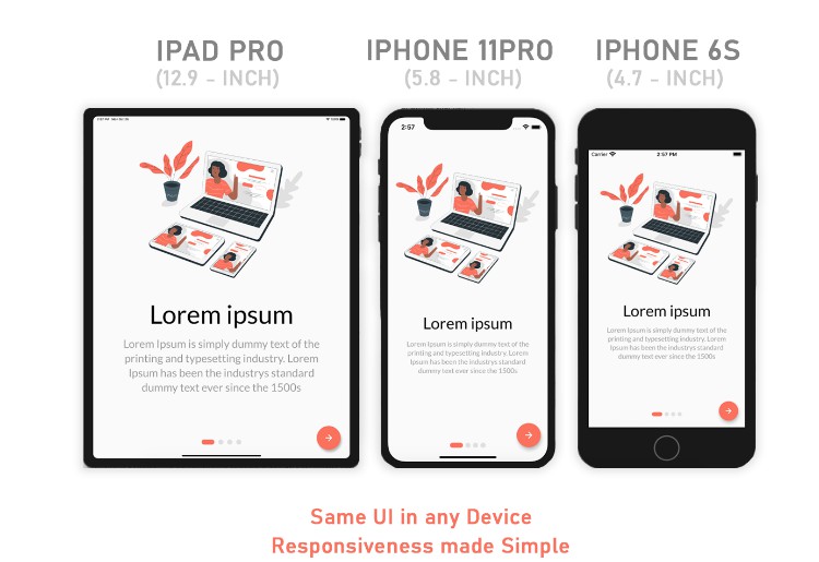
A flutter plugin for Easily make Flutter apps responsive. Automatically adapt UI to different screen sizes. Responsiveness made simple.


Content
Existing User
Hello Existing users, I have updated the package for supporting Flutter 2.0 and solving many bugs then Whenever you update 1.x.x to 2.x.x will be got many errors so please update the package with the new below code.
Installation ⬇️
Add to pubspec.yaml.
dependencies:
  ...
  sizer: ^2.0.14
Parameters ⚙️
.h– Returns a calculated height based on the device.w– Returns a calculated width based on the device.sp– Returns a calculated sp based on the deviceSizerUtil.orientation– for screen orientation portrait or landscapeSizerUtil.deviceType– for device type mobile or tablet
Usage ?
Add the following imports to your Dart code:
import 'package:sizer/sizer.dart';
Wrap MaterialApp with ResponsiveSizer widget
ResponsiveSizer(
      builder: (context, orientation, deviceType) {
        return MaterialApp();
      }
 )
Whenever you use height and width first import sizer package.
import 'package:sizer/sizer.dart';
Widget Size ?
    Container(
      width: 20.w,    //It will take a 20% of screen width
      height:30.h     //It will take a 30% of screen height
    )
Padding ⏹
    Padding(
      padding: EdgeInsets.symmetric(vertical: 5.h, horizontal: 3.h),
      child: Container(),
    );
Font size ?
    Text(
      'Sizer',style: TextStyle(fontSize: 15.sp),
    );
Square Widget ?
If you want to make square size widget then give height or width in both height and width.
    Container(
            width: 30.h,      //It will take a 30% of screen height
            height: 30.h,     //It will take a 30% of screen height
    );
Orientation ?
If you want to support both portrait and landscape orientations
Device.orientation == Orientation.portrait
  ? Container(   // Widget for Portrait
      width: 100.w,
      height: 20.5.h,
   )
  : Container(   // Widget for Landscape
      width: 100.w,
      height: 12.5.h,
   )
DeviceType ?
If you want the same layout to look different in tablet and mobile, use the SizerUtil.deviceType method:
SizerUtil.deviceType == DeviceType.mobile
  ? Container(   // Widget for Mobile
      width: 100.w,
      height: 20.5.h,
   )
  : Container(   // Widget for Tablet
      width: 100.w,
      height: 12.5.h,
   )
Suggestion
Orientation
If you want to give support for both portrait and landscape then make separate widget for both like orientation example.
DeviceType
If you want to give support for both mobile and tablet then make separate widget for both like deviceType example.
Note
You need to import sizer package in order to access number.h, number.w, and number.sp
Auto import in VSCode and Android Studio doesn’t work for dart extension methods. Typing 10.h would not bring up auto import suggestion for this package
One workaround is to type Device so that the auto import suggestion would show up:
import 'package:sizer/sizer.dart';
Issue and feedback ?
If you have any suggestion for including a feature or if something doesn’t work, feel free to open a Github issue for us to have a discussion on it.