FlexColorScheme
FlexColorScheme helps you make beautiful color scheme based Flutter themes, with optional level of primary color branded surfaces. The created themes are based on the same concept as Flutter's ColorScheme based themes, but with a few interesting twists and features.
When you design Flutter applications you should base the colors of your application on a light theme mode
ColorScheme and a dark theme mode ColorScheme. Then make your light and dark ThemeData from these color schemes, and in
your MaterialApp use these themes for the light and dark themes. This gives you an application that uses the defined
color scheme on the built-in Material UI Widgets, well on most of them anyway. Flutter's ThemeData.from a
ColorScheme has a few gaps, the used color scheme is not consistently applied to all standard Material UI Widgets.
FlexColorScheme corrects these minor inconsistencies and gaps that exist in the current version of Flutter's
ThemeData.from factory. It also makes a few opinionated, but subtle theme modifications compared to the
ThemeData.from themes created from a ColorScheme. These topics are covered in detail in the last chapter and in the article you can find a
visual presentation of the differences.
This is just the basic part, FlexColorScheme can do some other nice theme design tricks.
If you have seen the Flutter FlexFold web demo application, then you
have already seen FlexColorScheme in action. The FlexFold demo app uses this package for its fancy theming and to
enable effortless switching between all the themes it uses. The package included examples in the
tutorial chapter, show you how the Flexfold demo app theming is done with this package.
Color Branded Backgrounds and Surfaces
The Material Guide briefly mentions
color branded surfaces. With FlexColorScheme you
can easily create such primary color branded themes. This is done by using the four built-in strengths for blending in
primary color into surface and background colors, while avoiding blending it in with the scaffold background color,
for all but the highest strength. It is quite interesting what a bit of extra flair and purposefully designed feeling it
can result in when used appropriately.
Nuanced Scheme Set from One Color
A FlexColorScheme can like Flutter's standard ColorScheme be created by specifying all the required
scheme colors, but you can also specify just the primary color and get all other colors needed for a complete color
scheme computed based on just the provided primary color.
There is a helper class with a factory FlexSchemeColor.from that can do this for you. Another helper can
also create a computed matching dark scheme, from a defined light scheme this is done with FlexSchemeColor.toDark.
This works regardless of if you created a fully specified custom light scheme or just one from a single color.
These features are presented and explained in the tutorial with
example 4 and
example 5.
What About My Theme Additions?
FlexColorScheme does not get in the way of adding your own additional custom theming to your application.
When you have defined your FlexColorScheme, you make a theme based on its scheme with FlexColorScheme.toTheme,
that returns a ThemeData object that you can use like any other ThemeData object. You can then of course
override this returned theme data and add additional custom sub-theming to it with the normal
ThemeData copyWith method before passing it on to your app.
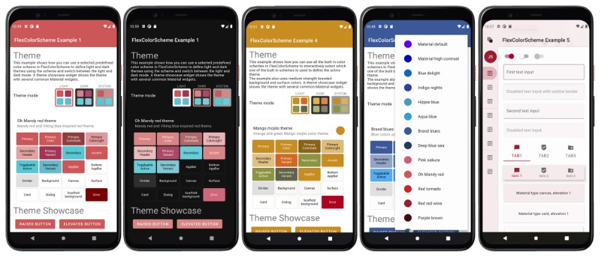
Built-in Color Schemes
Color schemes are no fun without some built-in example schemes to use and play with.
FlexColorScheme comes with 20 ready to go color schemes that you can use in your apps if you like.
Here you can see phone sized screen-shots of
them all, in both light and dark theme-mode.
The bundled examples are all tuned matching light and dark theme pairs. The first two color schemes are actually
the Flutter and Material Design guide examples of light and dark mode themes, and the Flutter high contrast light and
dark color versions as well. So OK, there are actually "only" 18 new ready-made color schemes.
There is of course no need to use any of the built-in color schemes, the package examples show how you can easily
make your own custom schemes, maybe the built-in examples will inspire you.
Installing and Using
In the pubspec.yaml of your Flutter project, add the following dependency:
dependencies:
  flex_color_scheme: any
In your library file add the following import:
import 'package:flex_color_scheme/flex_color_scheme.dart';
You can now start using FlexColorScheme based themes in your application. The easiest way to do so is to use one
of the 20 built-in color schemes. The schemes have enums that you can use to refer to them. Their corresponding
data object holds name, description and separate scheme data for each schemes' light and dark mode.
As a simple use case, take the default Flutter counter app, do the above installation and select one of the
built-in FlexColorScheme's schemes to use with it.
In this example we use "Oh Mandy red" scheme that is represented by enum value FlexScheme.mandyRed.
There is a FlexColor.schemes map with the FlexScheme enums as keys, with corresponding predefined
FlexSchemeData objects as values. We use this FlexSchemeData object's light colors for the light color scheme that
we make with the FlexColorScheme.light factory by assigning the light FlexSchemeColor set, from the
predefined FlexSchemeData we got with the enum key from the map, to the colors property of the
FlexColorScheme.light factory.
Then we use toTheme to let the resulting FlexColorScheme.light object return the theme this factory defines,
that we finally assign to the MaterialApp theme property.
The above may sound a bit complicated, but it is just one line of code:
theme: FlexColorScheme.light(colors: FlexColor.schemes[FlexScheme.mandyRed].light).toTheme,
For the dark theme we do the equivalent using the FlexColorScheme.dark factory and the dark version of the
FlexSchemeColor that we have in our FlexSchemeData object from the FlexColor.schemes map via
the same FlexScheme.mandyRed key.
darkTheme: FlexColorScheme.dark(colors: FlexColor.schemes[FlexScheme.mandyRed].dark).toTheme,
We also set the app's themeMode property to ThemeMode.system so that the used device can control if the app
uses its light or dark theme, based on the device system setting for light and dark theme.
Totally just one property modified, and two properties added to the default counter app, plus the package
import of course. The modified MaterialApp from the Flutter default counter app is shown below.
  class MyApp extends StatelessWidget {
    @override
    Widget build(BuildContext context) {
    return MaterialApp(
      title: 'Flutter Demo',
      // The Mandy red light theme.
      theme: FlexColorScheme.light(
        colors: FlexColor.schemes[FlexScheme.mandyRed].light,
      ).toTheme,
      // The Mandy red dark theme.
      darkTheme: FlexColorScheme.dark(
        colors: FlexColor.schemes[FlexScheme.mandyRed].dark,
      ).toTheme,
      // Use dark or light theme based on system setting.
      themeMode: ThemeMode.system,
      home: MyHomePage(title: 'Flutter Demo Home Page'),
    );
This gives us the following counter app look:

Perhaps not so exciting, that is because the basic counter app uses very few features and widgets, so it cannot really
illustrate the result very well. This is why the included samples contain demo UI, that is not really at all relevant
to using FlexColorScheme and is really only there to better demonstrate the result.
The default example 1, is just a repeat of the above example, but with a themeMode 3-way toggle
switch, an effective theme colors widget, plus a bunch of dummy commonly used Material UI widgets.
Can I use different built-in schemes for my light and dark themes?
Yes this is possible, just use different enums values as keys for the light and dark FlexColorScheme factories
when you get the predefined FlexSchemeData from the map. If the colors in used schemes are a bit related this
can be used to create nice and unique light and dark combinations of the predefined schemes.You can even apply a FlexSchemeColor that has data that was designed for a light theme to the FlexColorScheme.dark
factory and wise versa. The result will just not be as useful or pretty.
The rationale for the slightly involved structure, is to keep it flexible, but at the same time provide self
documenting API guidance on how the data was designed to be used and consumed.
Default Sample Application
The package contains five different example applications with increasing complexity.
To try the simplest of them, example 1 in on a device or simulator,
clone the repository and run the example:
cd example/
flutter run --release
The result is a sample app that uses one of the built-in "Oh Mandy red" color schemes as its theme. Has a
light/dark/system theme mode switch, includes a theme colors and Material UI widget samples, so you can
see the theme colors and theme's impact on common Material UI widgets.


Building the examples
If you cloned the repository to build the examples, you can open the package/examplefolder with your IDE to build
the above default example. This example is the same as the example in the/example/lib/example1folder.If you want to build the other examples, without setting up different configurations in your IDE for the different
main files, you can copy and paste the wanted example'smain.dartcode into the/example/lib/main.dartfile to
build it from your IDE.After copying the other example content, change the relative import for the "all shared imports" file to:
import 'all_shared_imports.dart';
and for examples 4 and 5, also the "sub page" import to:
import 'shared/sub_page.dart';
Live WEB Demos of the Examples
If you want to take a quick look at all the example applications, you can try live web versions of them.
Example 1 represents the simplest use case, to just use one of the
built-in color schemes as your application theme and toggle between its light
and dark variant, or allow device mode setting to control if the dark or light theme is used.

Example 2 is like example 1, but here we use custom colors
to make a custom scheme and turn it into a theme.


In example 3 we can toggle the active theme between 3 different
predefined color schemes, plus the custom one we made in example 2.


In example 4 we can select any of the different built-in themes
and three custom ones we made.


Example 5 is the last, and most complex one of the examples and presents
more configuration options that you can modify interactively.
This example is best seen and tested on a tablet, desktop or desktop web browser, rather than on a phone, but it
certainly works on a phone sized canvas too. This example is explained in more detail further below.


A really fancy example of FlexColorScheme usage is the Flexfold demo app.

It might look and feel complicated, but it is actually only slightly more involved than the above example nr 5, that
has almost all the same theming features and exactly the same themes as the Flexfold demo app.
Go through the examples, and you will be ready to make cool interactively custom themed apps in no time.
Tutorial
In this tutorial we go through all the bundled examples and explain the FlexColorScheme relevant topics.
For simplicity the example applications do not use any advanced state management solution. The key part for each
example is always in the used stateful MaterialApp, where all the scheme setup for the themes are made. The rest of
the content in the examples is just there to make a visual presentation of the resulting theme from the used
color scheme.
HomePage for the Examples
The content of the HomePage in all these examples is not really so relevant for using FlexColorScheme based
application theming. The critical parts are in the example MaterialApp theme definitions. The HomePage mostly
contains UI to visually show what the defined themes look like when used in an application with commonly
used Widgets. In example 5 we can also make interactive changes to used FlexColorScheme API values to
see and learn more about how they work.
In all the examples we pass in the FlexSchemeData object we used for the active theme to the application's HomePage.
This is not really needed in order to use FlexColorScheme based themes, but we use it to be able to show
the active theme name and its description in the examples. We also use its color data for the 3-way theme mode switch
FlexThemeModeSwitch, that uses the light and dark scheme colors in its theme toggle widget for the theme mode
option buttons, that also show the 4 main colors in the active light and dark scheme.
Optional FlexThemeModeSwitch
One special feature on the HomePage of all the examples is the FlexThemeModeSwitch. It is the UI Widget used
for the 3-way theme mode switch used in all the examples to change the active theme mode.

Using the switch is very simple, give it the active theme mode, the active FlexSchemeData scheme and use the
onThemeModeChanged callback for changes, and act on it in the MaterialApp themeMode to actually toggle used
mode and theme.
FlexThemeModeSwitch(
  themeMode: themeMode,
  onThemeModeChanged: onThemeModeChanged,
  flexSchemeData: flexSchemeData,
),
Using the FlexThemeModeSwitch 3-way theme mode switch is optional and not required to
use FlexColorScheme based themes. It is a simple, but different theme mode switch design and was included
as a bonus feature in the FlexColorScheme package. It was added based on a request after it
had been observed in the wild in the Flexfold demo app.
In the Flexfold demo app the switch was originally a fairly fixed design, now FlexThemeModeSwitch has many
properties that allow you to customize it extensively. You can find its API
reference here
and its companion, the FlexThemeModeOptionButton
API reference here.
With the API you can customize the look of the FlexThemeModeSwitch, here are some examples:

The FlexThemeModeOptionButton is typically used by the FlexThemeModeSwitch, but it can also be used as a part
of other theme related indicator widgets. Like for example the scrolling horizontal list used in the Flexfold demo.
Where it is used as theme indicator in a list, used as a way to show all available themes and select the active theme,
just as an alternative to the rather plain popup menu.

Example 1 Use a predefined color scheme
The first and simplest example shows how you can use a predefined color scheme in FlexColorScheme to
define light and dark themes using the scheme, and then switch between the light and dark mode. A theme showcase
widget shows the theme with several common Material widgets.
This is example basically a repeat of the Flutter default counter app modification example above, but with a different
HomePage and a way to change the MaterialApp active themeMode property value via the FlexThemeModeSwitch
switch on the HomePage and an ordinary callback.
void main() => runApp(const DemoApp());

class DemoApp extends StatefulWidget {
 const DemoApp({Key key}) : super(key: key);
 @override
 _DemoAppState createState() => _DemoAppState();
}

class _DemoAppState extends State<DemoApp> {
 // Used to select if we use the dark or light theme.
 ThemeMode themeMode;

 @override
 void initState() {
   themeMode = ThemeMode.light;
   super.initState();
 }

 @override
 Widget build(BuildContext context) {
   // Define which predefined FlexScheme to use.
   // Go ahead and try some other ones too.
   const FlexScheme usedFlexScheme = FlexScheme.mandyRed;
   return MaterialApp(
     debugShowCheckedModeBanner: false,
     title: 'FlexColorScheme',
     // A light scheme, passed to FlexColorScheme.light factory, then use
     // toTheme to return the resulting theme to the MaterialApp theme.
     theme: FlexColorScheme.light(
       colors: FlexColor.schemes[usedFlexScheme].light,
       // Use comfortable on desktops instead of compact, devices use default.
       visualDensity: FlexColorScheme.comfortablePlatformDensity,
     ).toTheme,
     // We do the same thing for the dark theme, but using FlexColorScheme.dark
     // factory and the dark FlexSchemeColor in FlexColor.schemes.
     darkTheme: FlexColorScheme.dark(
       colors: FlexColor.schemes[usedFlexScheme].dark,
       visualDensity: FlexColorScheme.comfortablePlatformDensity,
     ).toTheme,
     // Use the above dark or light theme, based on active themeMode
     // value light/dark/system.
     themeMode: themeMode,
     // The HomePage, with its properties. In this example we pass the
     // current themeMode, change it via its call-back. We also pass
     // the currently used FlexSchemeData to the HomePage so we can use
     // it to display some info about it.
     home: HomePage(
       themeMode: themeMode,
       onThemeModeChanged: (ThemeMode mode) {
         setState(() { themeMode = mode; });
       },
       // Pass in the used active FlexSchemeData so we can
       // use its properties on the HomePage.
       flexSchemeData: FlexColor.schemes[usedFlexScheme],
     ),
   );
 }
}
There is one more small addition
Example 1 and the other examples, use comfortable adaptive platform visual density via
FlexColorScheme.comfortablePlatformDensity, instead of the counter app's normal
VisualDensity.adaptivePlatformDensity.This is an alternative that on desktop app's results in the Flutter
comfortablevisual density being used, instead ofcompact. On devices, they both result in default large
small device friendly visual density. This helper function was added to provide an easy option for using a bit larger
UI elements also on desktop and web apps while keeping the correct size for devices. This is useful if the desktop
and web versions are occasionally used on computers with touch screens. Thecomfortabledensity is a nice
balance that still look compact enough to be desktop like, while providing a bit
more touch friendly space without looking like an overblown device UI on a desktop.
Building and running example 1
When you build and run example 1 you get a sample application that looks like this in light and dark mode:
Try example 1 live on the web here.
In the app, scroll down to see the theme showcase further below, it presents the theme with common Material widgets.
This simple first example is not using primary color surface branding, it is just a normal theme with a few
convenient fixes for some theme design gaps in Flutter's own themes created with ThemeData.from a ColorScheme.
Example 2 Create a custom color scheme
This example shows how you can define your own FlexSchemeData and create FlexColorScheme based themes from it.
A theme showcase widget shows the theme with several common Material widgets.
The full code is not shown in the tutorial, please see the code in the package folder
flex_color_scheme/example/lib/example2
for the entire example.
To make a custom color scheme, we will for simplicity just define it as a constant in this example.
We make a FlexSchemeData object with a name, description and scheme colors defined with
FlexSchemeColor for the light and matching dark scheme. In this example we use dark purple and deep green
and matching desaturated versions for the dark scheme.
const FlexSchemeData customFlexScheme = FlexSchemeData(
  name: 'Toledo purple',
  description: 'Purple theme created from custom defined colors.',
  light: FlexSchemeColor(
    primary: Color(0xFF4E0028),
    primaryVariant: Color(0xFF320019),
    secondary: Color(0xFF003419),
    secondaryVariant: Color(0xFF002411),
  ),
  dark: FlexSchemeColor(
    primary: Color(0xFF9E7389),
    primaryVariant: Color(0xFF775C69),
    secondary: Color(0xFF738F81),
    secondaryVariant: Color(0xFF5C7267),
  ),
);
Then we use this FlexSchemeData customFlexScheme instance light and dark properties as scheme colors
for the FlexColorScheme.light and dark factory for each theme mode and toTheme to get the themes they define.
This setup is totally equivalent to how we used one of the built-in predefined FlexSchemeData objects in example 1,
in this case we just defined our own custom FlexSchemeData in customFlexScheme.
  :
  @override
  Widget build(BuildContext context) {
    return MaterialApp(
      debugShowCheckedModeBanner: false,
      title: 'FlexColorScheme',

      theme: FlexColorScheme.light(
        colors: customFlexScheme.light,
        visualDensity: FlexColorScheme.comfortablePlatformDensity,
      ).toTheme,

      darkTheme: FlexColorScheme.dark(
        colors: customFlexScheme.dark,
        visualDensity: FlexColorScheme.comfortablePlatformDensity,
      ).toTheme,

      home: HomePage(
        themeMode: themeMode,
        onThemeModeChanged: (ThemeMode mode) {
          setState(() { themeMode = mode; });
        },
        // We use our custom FlexSchemeData on the HomePage too.
        flexSchemeData: customFlexScheme,
      ),
    );
  }
}
When you build and run example 2 you get a sample application that looks like this in light and dark mode:
Try example 2 live on the web here.
Scroll down to see the theme showcase widgets further below, presenting the theme with some widgets. This example is
not using primary color surface branding, it is just a normal theme with a few convenient fixes for certain
theme properties.


Example 3 Switch between different color schemes
This example shows how you can use three built-in color schemes, add a custom scheme and then use all four as
selectable FlexColorScheme based theme options in an application. The example also uses strong branded surface
colors. A theme showcase widget shows the theme with several common Material widgets.
The full example code is not shown here, please see the code in the package folder
flex_color_scheme/example/lib/example3
for the entire example.
The customFlexScheme FlexSchemeData definition is the same as in example 2, it is not repeated below.
In the example below, if we select the FlexScheme.custom option, we use our customFlexScheme object, otherwise
the selected built-in scheme we selected on the HomePage is used. We also set the surface style to
FlexSurface.strong, for a strong primary color branded blend in surfaces and backgrounds.
:
class _DemoAppState extends State<DemoApp> {
  ThemeMode themeMode;
  // Used to store which FlexSchemeData option we selected
  FlexScheme flexScheme;

  @override
  void initState() {
    themeMode = ThemeMode.light;
    flexScheme = FlexScheme.hippieBlue; // Default selected theme
    super.initState();
  }
  @override
  Widget build(BuildContext context) {
    return MaterialApp(
      debugShowCheckedModeBanner: false,
      title: 'FlexColorScheme',

      theme: FlexColorScheme.light(
        // When we select the custom FlexScheme on the home
        // page, we get the custom enum value back and use the custom
        // scheme we defined, otherwise we use the selected scheme
        // from the the built in map.
        colors: flexScheme == FlexScheme.custom
            ? customFlexScheme.light
            : FlexColor.schemesWithCustom[flexScheme].light,
        // This surface style gives a strong blend of primary
        // color on surfaces and background colors.
        surfaceStyle: FlexSurface.strong,
        visualDensity: FlexColorScheme.comfortablePlatformDensity,
      ).toTheme,
      // Just a repeat with equivalent setup for dark theme.
      darkTheme: FlexColorScheme.dark(
        colors: flexScheme == FlexScheme.custom
            ? customFlexScheme.dark
            : FlexColor.schemesWithCustom[flexScheme].dark,
        surfaceStyle: FlexSurface.strong,
        visualDensity: FlexColorScheme.comfortablePlatformDensity,
      ).toTheme,
      themeMode: themeMode,

      home: HomePage(
        themeMode: themeMode,
        onThemeModeChanged: (ThemeMode mode) {
          setState(() { themeMode = mode; });
        },
        // We pass the enum value of the active scheme to the HomePage.
        flexScheme: flexScheme,
        // Where we can select a new scheme and get its enum value back.
        onFlexSchemeChanged: (FlexScheme selectedScheme) {
          setState(() { flexScheme = selectedScheme; });
        },
        // We take care to pass in selected built-in scheme data
        // or the custom one we made if it is selected.
        flexSchemeData: flexScheme == FlexScheme.custom
            ? customFlexScheme
            : FlexColor.schemesWithCustom[flexScheme],
      ),
    );
  }
}
In this example on the HomePage we removed the option to allow the theme mode to depend on the system theme mode
setting, by setting showSystemMode to false, thus removing this option from switch.
  :
  FlexThemeModeSwitch(
    themeMode: themeMode,
    onThemeModeChanged: onThemeModeChanged,
    flexSchemeData: flexSchemeData,
    showSystemMode: false,
  ),
  :
These are the four resulting different themes with their light and dark modes, that we can select and
use with this example.
Hippie blue scheme in light and dark mode.
Green money scheme in light and dark mode.
Red red wine scheme in light and dark mode.


Our custom Toledo purple scheme in light and dark mode.


Try example 3 live on the web here.
Example 4 Switch between all built in color schemes and three custom ones
This example shows how you can use all the built-in color schemes, plus three custom schemes.
How to interactively select which one of these schemes is used to define the active theme. The example also uses
medium branded background and surface colors. A theme showcase widget shows the theme with several common Material
widgets. A sub-page is also available that shows the same theme applied when opening another page, that in Flutter
just inherits the same theme.
The full example code is not shown here, please see the code in the package folder
flex_color_scheme/example/lib/example4
for the entire example.
In this example we set the surface style to FlexSurface.medium, for medium primary color branded surfaces.
The example is otherwise fairly straight forward. We use the built in FlexColor.schemesList to access all the
pre-defined FlexSchemeData objects, with its schemes. Unpack it with the spread operator into a new
custom myFlexSchemes list, and add our three custom schemes in FlexSchemeData objects to the end of this new list.
We then access the list with index number, that we simply change with a popup menu on the HomePage.
That is the general principle, let's go through it step by step.
First, let's begin by defining the same colors that we used in example 2 and 3 for our first custom color. In this
case we also assign the same color that we used for secondaryVariantscheme color, to the optional appBarColor.
This is done because the built-in schemes use their secondary variant color as their custom app bar color, it could
of course be any color, but for consistency we will do the same for our custom FlexSchemeColors.
 void main() => runApp(const DemoApp());
 // Create a custom flex color scheme for a light theme.
 const FlexSchemeColor myScheme1Light = FlexSchemeColor(
   primary: Color(0xFF4E0028),
   primaryVariant: Color(0xFF320019),
   secondary: Color(0xFF003419),
   secondaryVariant: Color(0xFF002411),
   appBarColor: Color(0xFF002411),
 );
 // Create a corresponding custom flex color scheme for a dark theme.
 const FlexSchemeColor myScheme1Dark = FlexSchemeColor(
   primary: Color(0xFF9E7389),
   primaryVariant: Color(0xFF775C69),
   secondary: Color(0xFF738F81),
   secondaryVariant: Color(0xFF5C7267),
   appBarColor: Color(0xFF5C7267),
 );
We can build a scheme the long way, by specifying all the required hand-picked scheme colors, like above, or we can
also build schemes from a single primary color. With the FlexSchemeColor.from factory. With the factory the
only required color is the primary color, the other colors will be computed. You can optionally also provide the
primaryVariant, secondary and secondaryVariant colors with the factory, but any color that is not provided will
always be computed for the full set of required colors in a FlexSchemeColor.
In this example we create our 2nd scheme from just a primary color for the light and dark schemes. The custom app
bar color will in this case also receive the same color value as the one that is computed for secondaryVariant color,
this is the default with the FlexSchemeColor.from factory if the color is not specified.
 final FlexSchemeColor myScheme2Light =
   FlexSchemeColor.from(primary: const Color(0xFF4C4E06));

 final FlexSchemeColor myScheme2Dark =
   FlexSchemeColor.from(primary: const Color(0xFF9D9E76));
For our 3rd custom scheme we will define primary and secondary colors for a light color scheme, but no variant colors.
We will not make any dark scheme definitions either.
 final FlexSchemeColor myScheme3Light = FlexSchemeColor.from(
   primary: const Color(0xFF993200),
   secondary: const Color(0xFF1B5C62),
 );
Then we create a list with all the FlexSchemeData objects we will use as our schemes in this example,
starting with all the built-in ones and adding our three custom ones at the end.
A FlexSchemeData object stores name and description, plus the separately defined color schemes for light and
matching dark scheme colors. As a rule of thumb, the dark scheme colors must be much less saturated than light ones.
Using the same colors in light and dark color schemes does not produce nice looking or usable dark and light
theme mode pairs. You can read more in the Material Design guide about selecting suitable dark
theme colors.
We first unpack the predefined FlexSchemeData into the list myFlexSchemes, add our own light and
dark scheme definition pairs as FlexSchemeData to the end. For our last custom FlexSchemeColor myScheme3Light we
did not make a matching dark scheme pair, we instead use the .toDark() method on the light scheme to get one
automatically computed from the defined light scheme colors.
 final List<FlexSchemeData> myFlexSchemes = <FlexSchemeData>[
   // Add ALL the predefined FlexColor schemes
   ...FlexColor.schemesList,
   // Then add our first custom schemes to the FlexSchemeData list.
   const FlexSchemeData(
     name: 'Toledo purple',
     description: 'Purple theme, created from full custom defined color scheme.',
     light: myScheme1Light,
     dark: myScheme1Dark,
   ),
   // Do the same for our second custom scheme.
   FlexSchemeData(
     name: 'Olive green',
     description: 'Olive green theme, created from primary light and dark colors.',
     light: myScheme2Light,
     dark: myScheme2Dark,
   ),
   FlexSchemeData(
     name: 'Oregon orange',
     description: 'Custom orange and blue theme, from only light scheme colors.',
     light: myScheme3Light,
     // We create the dark desaturated colors from the light scheme.
     dark: myScheme3Light.toDark(),
   ),
 ];
The setup of the stateful MaterialApp is as simple as the previous examples.
 :
 class _DemoAppState extends State<DemoApp> {
   ThemeMode themeMode;
   // Used to select which FlexSchemeData we use from a popup menu.
   int themeIndex;

   @override
   void initState() {
     themeMode = ThemeMode.light;
     themeIndex = 6; // Start with index 6, the brand blue colors.
     super.initState();
   }

   @override
   Widget build(BuildContext context) {
     return MaterialApp(
       debugShowCheckedModeBanner: false,
       title: 'FlexColorScheme',

       theme: FlexColorScheme.light(
         colors: myFlexSchemes[themeIndex].light,
         surfaceStyle: FlexSurface.medium,
         visualDensity: FlexColorScheme.comfortablePlatformDensity,
       ).toTheme,

       darkTheme: FlexColorScheme.dark(
         colors: myFlexSchemes[themeIndex].dark,
         surfaceStyle: FlexSurface.medium,
        visualDensity: FlexColorScheme.comfortablePlatformDensity,
       ).toTheme,

       themeMode: themeMode,

       home: HomePage(
         themeMode: themeMode,
         onThemeModeChanged: (ThemeMode mode) {
           setState(() { themeMode = mode; });
         },
         // We can pass the index of the active theme to the HomePage.
         schemeIndex: themeIndex,
         // Where we can select a new theme in a popup menu
         // and get its index back.
         onSchemeChanged: (int index) {
           setState(() { themeIndex = index; });
         },
         flexSchemeData: myFlexSchemes[themeIndex],
       ),
     );
   }
 }
When you build Example 4, it starts with Brand blues theme. A theme that uses blue colors found in
well known web brands. The main primary blue color in the light scheme might look very familiar.
You can use the popup menu available via the ListTile showing the current theme, to change theme to any
of the supplied 20 + 3 custom color schemes we added. When you change scheme, you will notice that the active
theme's color changes are animated by interpolating from the active theme colors, to the new theme colors.
This is a very nice built-in feature when you modify the theme interactively in Flutter Material applications.
Try some more of the themes, here is the Mango mojito theme for fun.
Try example 4 live on the web here
Example 5 Full featured demo
This example shows how you can use all the built-in color schemes in FlexColorScheme to define themes from them
and how you can define your own custom scheme colors and use them together with the predefined ones. It can
give you an idea of how you can create your own complete custom list of themes if you do not want to use any
of the predefined ones.
The example also shows how you can use the surface branding feature and how to use the custom app bar theme
features of FlexColorScheme. The usage of the true black theme feature for dark themes is also demonstrated.
Using the optional Windows desktop like tooltip theme is also shown.
The example includes a dummy responsive side menu and rail to give a visual presentation of what applications
that have larger visible surfaces using the surface branding look like. A theme showcase widget again shows
the theme with several common Material widgets.
A sub-page is also available that show the same theme applied when opening another page that in Flutter
just inherits the same theme. If you tried these examples on a device, and not on the Web or a built them on
desktop, you might have noticed that the navigation bar on Android devices does not always change. It is not themed to
have matching background and theme mode to match the active application theme. This example shows how this can be
fixed and that the used method remains in effect when opening a sub-page.
The same custom color schemes as in example 4, are also used in this example. They are not explained here again, please
see example 4. The full example code is not shown here, please see the code in the package folder
flex_color_scheme/example/lib/example5
for the entire example.
In this example we will also toggle the app bar theme style, the surface primary color branding strength,
tooltip style and try the true black theme toggle for dark-mode.
We will also introduce a toggle that allows us to for all the schemes use the toDark computed dark schemes, instead
of the hand tuned built-in ones. You can then compare the results, the toDark method does a pretty good job and can
even be tuned with a parameter if so desired. If you use this toggle on the last custom scheme, you will not see
any difference, because we already created its dark scheme with this method, the toggle just again computes the same
dark scheme.
Additionally, we will include a toggle that allows us to instead of using the FlexColorScheme.toTheme method, use
the standard flutter ThemeData.from factory to create the theme from the same color scheme definitions.
This way we can use this toggle to see and study the differences.
 :

 class _DemoAppState extends State<DemoApp> {
   // Used to select if we use the dark or light theme.
   ThemeMode themeMode;
    // Used to select which FlexSchemeData we use in our list of schemes.
   int themeIndex;
   // Enum used to select what app bar style we use.
   FlexAppBarStyle flexAppBarStyle;
   // Enum used to control primary color branding on surface and background.
   FlexSurface flexSurface;
   // If true, tooltip background will be light in light theme, and dark
   // in dark themes. The Flutter Material default and standard is the other
   // way, tooltip background color is inverted compared to app background.
   bool tooltipsMatchBackground;
   // Allow toggling between normal dark mode and true black dark mode.
   bool darkIsTrueBlack;
   // Allow toggling between using the actual defined dark color scheme or
   // try how it would look if we had not defined the dark colors, but had
   // been lazy and just created the dark scheme from the light scheme
   // with the toDark() method.
   bool useToDarkMethod;
   // Use the toTheme to create Themes from `FlexColorScheme`. This is
   // the preferred method when using `FlexColorScheme`. In the demo
   // you can use a toggle to see what a FlexColorScheme looks like if
   // you the color scheme and `ThemeData.from` to instead create the theme.
   bool useToThemeMethod;

   @override
   void initState() {
     themeMode = ThemeMode.light;
     themeIndex = 7; // Start with deep blue see theme.
     flexAppBarStyle = FlexAppBarStyle.primary;
     flexSurface = FlexSurface.medium;
     tooltipsMatchBackground = false;
     darkIsTrueBlack = false;
     useToDarkMethod = false;
     useToThemeMethod = true;
     super.initState();
   }
We define the light theme for the app, using current theme index, selected surface style and app bar style. With
the built-in 20 themes, and the three custom ones we made, we can use 23 different app themes via the setup below,
times the five surface styles and app bar variants.
The factory FlexColorScheme.light is used to define a FlexColorScheme for a light theme, from the light
FlexSchemeColor in the myFlexSchemes list, plus some other properties, like the surface and app bar style used in
this example, as well as the tooltip and true black setting for the dark theme.
   :
   @override
   Widget build(BuildContext context) {
     return MaterialApp(
       debugShowCheckedModeBanner: false,
       title: 'FlexColorScheme',
       theme: useToThemeMethod
         ? FlexColorScheme.light(
             colors: myFlexSchemes[themeIndex].light,
             surfaceStyle: flexSurface,
             appBarStyle: flexAppBarStyle,
             tooltipsMatchBackground: tooltipsMatchBackground,
             visualDensity: FlexColorScheme.comfortablePlatformDensity,
           ).toTheme
We also demonstrate how to create the same theme with the standard from color scheme ThemeData factory
ThemeData.from. The surface style works, but will not be applied as elegantly, but it works fairly OK up
to medium branding. The app bar style has no effect, nor the tooltip style.
We also have to make sure we use the same typography as the one used in FlexColorScheme, otherwise the animated
theme will show an assertion error as it cannot animate between different typography or null default
typography in the theme data.
When toggling between the standard ThemeData.from and the FlexColorScheme.toTheme made themes from the
same ColorScheme data, we can observe the differences and see some theme colors that the standard method does
not adjust to match the used color scheme. The previously mentioned article includes
a visual presentation of the differences.
         : ThemeData.from(
             colorScheme: FlexColorScheme.light(
               colors: myFlexSchemes[themeIndex].light,
               surfaceStyle: flexSurface,
               appBarStyle: flexAppBarStyle,
               tooltipsMatchBackground: tooltipsMatchBackground,
               visualDensity: FlexColorScheme.comfortablePlatformDensity,
             ).toScheme,
           ).copyWith(
             visualDensity: FlexColorScheme.comfortablePlatformDensity,
             typography: Typography.material2018(
               platform: defaultTargetPlatform,
             ),
           ),
We do the equivalent definition for the dark theme, and we add
the true black option as well. We also use the switch for colors to pass it a FlexSchemeColor that is either
using the predefined ones or computes them from the light FlexSchemeColor,
     darkTheme: useToThemeMethod
       ? FlexColorScheme.dark(
          colors: useToDarkMethod
             ? myFlexSchemes[themeIndex].light.toDark()
             : myFlexSchemes[themeIndex].dark,
           surfaceStyle: flexSurface,
           appBarStyle: flexAppBarStyle,
           tooltipsMatchBackground: tooltipsMatchBackground,
           darkIsTrueBlack: darkIsTrueBlack,
           visualDensity: FlexColorScheme.comfortablePlatformDensity,
         ).toTheme
       : ThemeData.from(
           colorScheme: FlexColorScheme.dark(
             colors: useToDarkMethod
               ? myFlexSchemes[themeIndex].light.toDark()
               : myFlexSchemes[themeIndex].dark,
             surfaceStyle: flexSurface,
             appBarStyle: flexAppBarStyle,
             tooltipsMatchBackground: tooltipsMatchBackground,
             darkIsTrueBlack: darkIsTrueBlack,
             visualDensity: FlexColorScheme.comfortablePlatformDensity,
           ).toScheme,
         ).copyWith(
             visualDensity: FlexColorScheme.comfortablePlatformDensity,
             typography: Typography.material2018(
             platform: defaultTargetPlatform,
           ),
         ),
In dark-mode we will see some more gaps in the resulting ThemeData when using the standard ThemeData.from factory
to create the theme.
The rest of the additions in the stateful MaterialApp are just passing in current values and getting a new value for
it via callbacks for all our settings and their current values.
       // themeMode value and change callback
       themeMode: themeMode,
       home: HomePage(
         themeMode: themeMode,
         onThemeModeChanged: (ThemeMode mode) {
           setState(() { themeMode = mode; });
         },
         // Used theme index and change callback
         schemeIndex: themeIndex,
         onSchemeChanged: (int index) {
           setState(() { themeIndex = index;});
         },
         // Used app bar style and change callback
         appBarStyle: flexAppBarStyle,
         onAppBarStyleChanged: (FlexAppBarStyle style) {
           setState(() { flexAppBarStyle = style; });
         },
         // Used surface branding and change callback
         themeSurface: flexSurface,
         onThemeSurfaceChanged: (FlexSurface surface) {
           setState(() { flexSurface = surface; });
         },
         // Used tooltip style and change callback
         tooltipsMatchBackground: tooltipsMatchBackground,
         onTooltipsMatchBackgroundChanged: (bool value) {
           setState(() { tooltipsMatchBackground = value; });
         },
         // True black mode and change callback
         darkIsTrueBlack: darkIsTrueBlack,
         onDarkIsTrueBlackChanged: (bool value) {
           setState(() { darkIsTrueBlack = value; });
         },
         // Dark scheme method and toggle method callback
         useToDark: useToDarkMethod,
         onUseToDarkChanged: (bool value) {
           setState(() { useToDarkMethod = value; });
         },
         // Theme creation method and toggle method callback
         useToTheme: useToThemeMethod,
         onUseToThemeChanged: (bool value) {
           setState(() { useToThemeMethod = value; });
         },
         // And pass the current FlexSchemeData to the
         // homePage so we can use some info from it.
         // We use copyWith to modify the dark scheme to
         // the colors we get from toggling the switch
         // for computed dark colors or the actual defined
         // dark colors.
         flexSchemeData: myFlexSchemes[themeIndex].copyWith(
           dark: useToDarkMethod
             ? myFlexSchemes[themeIndex].light.toDark()
             : myFlexSchemes[themeIndex].dark),
       ),
     );
   }
 }
With this example we include a side rail, it expands to a menu on web and desktop, when using a larger
canvas, it even does it in phone landscape mode. This just for demo purposes. It is here to give a better
idea and presentation of what a surface branded theme
looks like. It is of course best viewed and experienced on a tablet, or the web demo where the surface branding
theming effect is more obvious.
The HomePage's build method for this example starts by wrapping the entire page content in an AnnotatedRegion
with a value that we get from the static helper FlexColorScheme.themedSystemNavigationBar(context). This way
we can get a system navigation bar on Android phones that still uses one, that also follows the active theme's
background color and theme mode.
   return AnnotatedRegion<SystemUiOverlayStyle>(
     value: FlexColorScheme.themedSystemNavigationBar(context),
     child: ...
   );
This example starts with the deep blue sea scheme. The example image below show the new feature included from
version 1.1.0, with correctly themed system navigation bar on Android devices. (Some older example screenshots
further below have not been updated to include this feature.)

Try example 5 live on the web here
Computed Dark Theme
Since the example allows us to toggle the dark mode from using its hand tuned predefined dark scheme colors, to the
dark scheme colors computed from the light scheme colors. Let's compare some examples.
With the above deep blue sea scheme, the computed ones are a bit more dull and muted in this example.
These screenshots are using medium surface branding, the computed dark scheme is on the right.

With some other schemes, like the Aqua blue one there is only a minor difference. These screenshots
are using strong surface branding, the computed dark scheme is on the right.


The result of the toDark method varies depending on how saturated the used light scheme colors are. It is possible
to tune the calculated dark scheme by modifying the whiteBlend parameter it uses to blend in white to make the
dark scheme. The default whiteBlend is 35%, this is normally a suitable value. For more saturated light scheme
colors try 40%, which is also used in the Material design guide to convert the default red error color for light mode,
to dark mode. For light scheme color with low saturation, a white blend of 30% often also produces nice results.
Branded Surfaces
Let us now explore the effect of branded surface colors. Branded surfaces are often
associated with dark mode, but it works well with light mode too when applied delicately. Below you see how
the primary color gets blended into Material surface and even stronger so, into Material background colors.
The screenshots below are using the medium branding strength.
You can use the toggle in the example to change from standard no branded surfaces colors, to light, medium,
strong and heavy.
The scaffold background does not receive any branding until the heavy mode. You might think that this and all
the other theming can be done by just passing the same scheme colors to the ThemeData.from factory. That is why
this demo allows you to flip a switch to do just that, so you can see and observe the difference between
color scheme based themes created by FlexColorScheme.toTheme and ThemeData.from. Feel free to experiment with
the live web demo where the differences are even easier to observe since you can have both versions open side by
side, in a large browser windows.

Now that when we tried basic branding, we can test the tricks FlexColorScheme can do
with the AppBarTheme. You can easily toggle both dark and light mode app bar theme to use differently
themed backgrounds. It can use scheme primary color, the default Material plain white/dark background color,
or the primary branded surface and background color versions, as well as an extra custom app bar scheme color,
which is a separate scheme color, that does not exist in Flutter's ColorScheme, it thus does
not have to be any of the colors in Flutter ColorScheme. The predefined schemes actually use the color defined
for normal scheme secondaryVariant as the custom color used for the app bar theme.
When you make your own schemes you can do the same or use a totally not
scheme related color as the app bar's theme color.
Below you can see some different branding strengths with a background primary color branded app bar color used as well.
This example compares medium versus heavy branding. The medium choice is usually well-balanced, but light can be
subtle and nice too. If you want to make a bold statement theme, go with heavy. Please note that the visual
impact of the branding also depends on how saturated the primary color is.


Here are few more images of the heavy primary color branded version, when looking at some widgets as well.
True Black
Dark-mode is nice, but with FlexColorScheme you can go even "deeper", go true black with the flick of a
switch. When using the true black option for dark-mode, surface, background and scaffold background are set to
fully black. This can save power on OLED screens as the pixels are turned off, but it can also cause scrolling artefact
issues when pixels turn fully on and off rapidly as you scroll. You can read about this and see an example of it in
the Material design guide
as well (scroll back up one heading to get to the mention of it).
If you use branded surfaces with true black mode enabled, you will notice that the branding has less of an impact,
only at strong and heavy levels will it have an impact. This is by design, to keep most surface totally or very close to
black when true black is combined with surface branding. If you really want total and true black for all surfaces
and backgrounds, then avoid combining true black mode with branded surfaces. On the other hand it still makes an even
darker theme, than normal dark theme, and it eliminates the scrolling issue since all background colored pixels are not
fully off in the strong and heavy branded true black modes.
Here is an example of a branded dark theme with true black OFF (default and standard) and true black ON,
when using heavy branding with the Red red wine color scheme.


Here is another difference example with the Deep blue sea scheme, when using medium strength surface branding.
These screenshots are also from the newer version 1.1.0 of example 5 that includes the proper theming and branding of
system navigation bar.

Behind the Scenes
FlexColorScheme does not actually use the ThemeData.from factory with a passed
in ColorScheme to make its theme. It uses the ThemeData factory directly with some
custom theming. It does of course define a
ColorScheme that it uses for the ThemeData. FlexColorScheme uses color calculations for the primary color
brand blended surfaces, and for the lazy schemes that do not specify all colors in a color scheme.
Used Theme Customizations
In addition to the primary color branded surfaces, full shaded schemes from just one primary color, true
black and app bar tricks. The returned ThemeData contains some opinionated modifications and theme
corrections compared to what you get if you would just use the standard ThemeData.from with a ColorScheme.
You can still of course override the returned theme with your own theme modifications and additions, by using
the copyWith method on the resulting theme.
If you want the details of what the differences compared to the standard ThemeData.from factory
are, here is a complete list:
-
ScaffoldBackgroundhas its own color property inFlexColorScheme
and can if so desired differ from theColorScheme.background
color. In the branding implementation, thescaffoldBackground
typically gets no primary branding applied, only in the heavy choice
is there a small amount. Whereasbackgroundin a FlexColorScheme
receives the most color branding of the surface colors. This fits
well for where thebackgroundcolor is used on Material in Widgets,
but it does not go so well together withscaffoldBackground, which
is the reason why it has its own color value in this implementation. -
The
dialogBackgroundColoruses theColorScheme.surfacecolor
instead of theColorScheme.background. Thebackgroundcolor needed
the strongest branding when branding is used, but this did not look
so good on dialogs, so its color choice was changed tosurface
instead, that gets lighter branding in FlexColorScheme when it is
used. With standard Material surface colors thebackgroundand
surfacecolors are the same, so there is no difference when using
the default background and surface colors. -
The
indicatorColoruses color schemeprimaryinstead of the
default, which isonSurfacein dark-mode, andonPrimaryin
light-mode. This is just an opinionated choice and to make the
indicator work by default on surface colored tabs. -
For
toggleableActiveColortheColorScheme.secondarycolor is used.
The Flutter default just uses the defaultThemeDatacolors and
not the actual colors you define in theColorSchemeyou create your
theme from. Perhaps an oversight in Flutter?
See issue: https:github.com/flutter/flutter/issues/65782. -
Flutter themes created with
ThemeData.fromdoes not define any color
scheme related color for theprimaryColorDarkcolor, this method
does. See issue: https:github.com/flutter/flutter/issues/65782.
TheThemeData.fromleaves this color atThemeDatafactory default,
this may not match your scheme. Widgets seldom use this color, so the
issue is rarely seen. -
Flutter themes created with
ThemeData.fromdoes not define any color
scheme based color for theprimaryColorLightcolor, this method does.
See issue: https:github.com/flutter/flutter/issues/65782.
TheThemeData.fromleaves this color atThemeDatafactory default
this may not match your scheme. Widgets seldom use this color, so the
issue is rarely seen. -
Flutter themes created with
ThemeData.fromdoes not define any color
scheme based color for thesecondaryHeaderColorcolor, this method
does. See issue: https:github.com/flutter/flutter/issues/65782.
ThemeData.fromleaves this color atThemeDatafactory default this
may not match your scheme. Widgets seldom use this color, so the issue
is rarely seen. -
Background color for
AppBarThemecan use a custom colored app bar
theme in both light and dark themes, that is not dependent on theme
primary or surface color. This functionality needs a custom text theme
to be possible to implement without a context. This implementation
does however not get correctly localized typography.A new feature implemented via:
https:github.com/flutter/flutter/pull/71184 also enables this kind
app bar theme and keep the correct typography localization. This new
feature is (as of 28.12.2020) not yet available on channel stable.
The first version on master could also not be enabled via Themes
only, one also had to opt in on AppBar level making it difficult to
adopt the feature. I wrote a proposal to introduce opt-in on theme
level too: https:github.com/flutter/flutter/issues/72206
The proposal has already been implemented. When these new features land
in stable channel, the implementation below will be changed to use
the new AppBarTheme feature, which is better than the work-around
since we no longer need a custom text theme. -
The
AppBarThemeelevation defaults to 0, an opinionated choice. -
Like standard
ThemeData.fromcolor scheme themes, the
bottomAppBarColoralso uses schemesurfacecolor. Additionally,
this color is also applied toBottomAppBarTheme, that like the
app bar also gets default elevation 0. -
A deviation from
ThemeData.fromcolor scheme based theme's is
thatThemeData.accentColoris set toColorScheme.primaryand not to
secondaryif not otherwise defined. This is done to get an easy way
for borders onTextField.decorationto use theme based primary
color in dark-mode, and notaccentColorcolor.There may be a bug in the way
InputDecorationThemegets used by theInputDecorator. We were
unable to define a theme that would work correctly for such a setup
without resorting to makingaccentColorequal to
ThemeData.primaryColor. This definition has less of an impact
visually to any built-in widgets than one might suspect. With the all
the other included theme definitions we saw no other widget that used
accentColor. FAB and toggles have their own theme and colors, so
they still use the default expectedcolorScheme.secondarycolor
despite this change. -
The
accentColoris made available as a separate scheme property.
Done to enable control of theOutlineInputBorder()active border
color property in color scheme based themes for dark theme-mode. -
In
TextSelectionThemeData, the standard forselectionColoris
colorScheme.primarywith opacity value0.4for dark-mode and0.12
for light mode. Here primary with0.5for dark-mode and0.3for
light mode is used. The standard forselectionHandleColoris
colorScheme.primary, here we use the slightly darker shade
primaryColorDarkinstead, which does not have a proper color
scheme color value in Flutter standardColorSchemebased themes. -
A predefined slightly opinionated
InputDecorationThemeis used. It
setsfilledtotrueand fill color to color scheme primary color
with opacity0.035in light mode and opacity0.06in dark-mode.
Another theme design change is done via modification of the
ThemeData.accentColordescribed earlier. Since the used theme, like
the default theme, does not define aborderproperty ofTextField,
an app can still easily use both the default underline style, or the
outline style by just specifying the defaultOutlineInputBorder()
for the border property when outlined TextField is desired.
If you don't want the filled style, or the primary colored
borders in dark-mode, you can override them back withcopyWith.
For totally different border color in dark-mode you can alternatively
specify it via theaccentColorproperty. Which should not affect
any other color than this border color when using FlexColorScheme
based themes. -
The property
fixTextFieldOutlineLabelis set totrueby default,
it looks better. The only reason why it is not the default in Flutter,
is for default backwards legacy design compatibility. -
Button theming is applied to
ThemeData.buttonColorusing color scheme
primary color. The entire color scheme is passed to old button's
ButtonThemeDataand it usestextThemeset to
ButtonTextTheme.primary, plus minor changes to padding and tap target
size. These modifications make the old buttons almost match the
default design and look of their corresponding newer buttons.
Thus, theRaisedButtonlooks
very similar toElevatedButton,OutlineButtontoOutlinedButton
andFlatButtontoTextButton. There are some differences in
margins and looks, especially in dark-mode, but they are very similar.This is a button style we used before the introduction of
the new buttons with their improved defaults. It just happened to be
very close, since the theme was based on how things looked in the Material
design guide already prior to Google releasing the new Flutter Material
buttons that fully implement the correct Material design.The newer buttons are nicer, especially when it
comes to their interactions and all the theming options they provide,
but they are a bit verbose to theme. If you want to make custom styled
buttons we still recommend using the newer buttons instead of the old
ones, as they offer more customization possibilities. Still, this
theming applied to the old buttons make them look close enough to
the new ones, to the extent that most might not even notice if
you still use the old buttons. -
The default theme for Chips contain a design bug that makes the
selectedChoiceChip()widget look disabled in dark-mode, regardless
if was created withThemeDataorThemeData.fromfactory.
See issue: https:github.com/flutter/flutter/issues/65663
TheChipThemeDatamodification used here fixes the issue. -
The
FloatingActionButtonThemeDatais set as follows:FloatingActionButtonThemeData( backgroundColor: colorScheme.secondary, foregroundColor: colorScheme.onSecondary),In order to ensure the same FAB style that was the default in ThemeData
factory viaaccentIconThemein the past. If it is not defined we
get the following deprecated warning:Warning: The support for configuring the foreground color of FloatingActionButtons using ThemeData.accentIconTheme has been deprecated. Please use ThemeData.floatingActionButtonTheme instead. See https:flutter.dev/go/remove-fab-accent-theme-dependency. This feature was deprecated after v1.13.2. -
For
TabBarThemea default design that fits with surface color is
used instead of one that fits with the app bar color. -
The
BottomNavigationBarThemeDatauses color scheme primary color for
the selected item. Flutter defaults to secondary color. Primary color
is a design used on iOS by default for the bottom navigation bar. We
agree and think it looks better as the default choice for apps. -
Default
tooltipThemein Flutter is currently a bit flawed on desktop
and web, because it defaults to using a very small font (10 dp).
See issue: https:github.com/flutter/flutter/issues/71429The default theming also does not handle multiline tooltips very well.
The here usedTooltipThemeDatatheme design corrects both these
issues. It uses 12 dp font on desktop and web instead of 10 dp,
and some padding instead of a height constraint to ensure that
multiline tooltips look nice too.FlexColorScheme also includes a new boolean property
tooltipsMatchBackground, that can be toggled to not used Flutter's
Material default that has a theme mode
inverted background. Tooltips using light background in light theme
and dark in dark, are commonly used on the Windows desktop platform.
You can tie the extra property to used platform to make an automatic
platform adaptation of the tooltip style if you like, or give users
a preference toggle the tooltip style to their liking. -
The property
transparentStatusBaris set to true by default and
used to make to the AppBar one-toned on Android device like on iOS.
Set it tofalseto restore default Android design.The modification is in current implementation made with an extra call
toSystemChrome.setSystemUIOverlayStyleto make the
statusBarColor transparent. The used implementation will be changed
when the new AppBarTheme
https://github.com/flutter/flutter/pull/71184 lands in channel stable
that allows us to modify its AnnotatedRegion with a passed in
SystemOverlayStyle.It would be nice if we could also make the system navigation button
area on Android transparent, but it does not work if we set
systemNavigationBarColor to a transparent color in the same call,
it does not change it all if called during the theme definition.
The style is doable, but requires modifying Android config files, not
possible from Flutter only (as per current information).
Related issue: https:github.com/flutter/flutter/issues/69999.FlexColorScheme offers a helper that allows us to easily create
and annotated region for the system navigation bar that uses
the active color scheme and theme mode to make it at least use
a correctly colored theme colored background for the active theme.
See example 5 for a demo on how to use this.