Toastification 

Toastification is a Flutter package that allows developers to easily display toast notifications in their apps. Toast notifications are a type of pop-up message that typically appear on the screen and disappear after a short amount of time. They are commonly used to display information, alerts, or confirmations to the user.
One of the advantages of the Toastification package is its ability to handle multiple toast messages. With Toastification, developers can display multiple toast notifications at once and display them in a queue. This means that if multiple notifications are triggered at the same time, they will be displayed one after the other, rather than overlapping on the screen.
Overall, Toastification is a useful package for Flutter developers who want to add toast notifications to their apps without having to write the code from scratch.
| Example Video with custom animations |
|---|
|
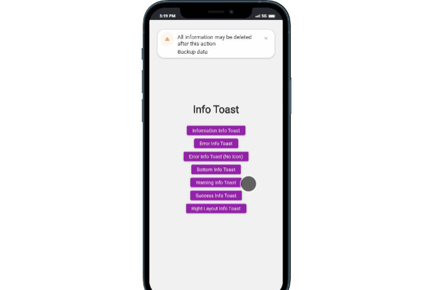
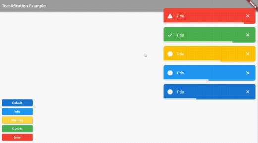
| Web Example | Mobile Example |
|---|---|
 |
 |
Installation
To use Toastification, you need to add it to your pubspec.yaml file:
dependencies:
  toastification: ^0.0.2
Then, run flutter pub get to install the package.
Usage
To use Toastification in your Flutter app, first import the package:
import 'package:toastification/toastification.dart';
Call the show method to display a toast notification:
toastification.show(
  context: context,
  title: 'Hello, world!',
  autoCloseDuration: const Duration(seconds: 5),
);
Alternatively, you can use Constructor of the Toastification class and call the show method:
Toastification().show(
  context: context,
  title: 'Hello, world!',
  autoCloseDuration: const Duration(seconds: 5),
);
Both methods have the same behavior:
This will display a toast message with the text “Hello, world!”.
You can customize the appearance of the toast message by passing in additional parameters to the show() method:
toastification.show(
  context: context,
  autoCloseDuration: const Duration(seconds: 5),
  title: 'Hello, World!',
  description: 'This is a sample toast message.',
  animationDuration: const Duration(milliseconds: 300),
  animationBuilder: (context, animation, child) {
    return RotationTransition(
      turns: animation,
      child: child,
    );
  },
  icon: Icon(Icons.check),
  backgroundColor: const Color(0xff1976d2),
  foregroundColor: Colors.white,
  brightness: Brightness.light,
  padding: const EdgeInsets.all(16),
  margin: const EdgeInsets.symmetric(horizontal: 12, vertical: 8),
  borderRadius: BorderRadius.circular(8),
  elevation: 4,
  onCloseTap: () {
    // Do something when the toast is closed
  },
  showProgressBar: true,
  showCloseButton: true,
  closeOnClick: false,
  pauseOnHover: true,
);
autoCloseDuration(optional): A Duration object that specifies how long the toast message should be displayed before automatically closing. If this parameter is not provided, the default duration of 2 seconds will be used.overlayState(optional): An OverlayState object that represents the state of the overlay where the toast message will be displayed. If this parameter is not provided, a new OverlayState object will be created.title(required): A string that represents the main message of the toast notification.description(optional): A string that represents a secondary message of the toast notification, displayed below the main message.icon(optional): A widget that represents an icon to be displayed in the toast notification.animationDuration(optional): A Duration for the custom animation. Default is null (no custom animation).animationBuilder(optional): A custom animation builder function that takes aBuildContext, anAnimationobject, and achild widgetas arguments. Default is null (no custom animation). you can create your custom transition by providing this field.backgroundColor(optional): A Color object that represents the background color of the toast notification. By default, the background color is set to Colors.grey[700].foregroundColor(optional): A Color object that represents the foreground (text) color of the toast notification. By default, the foreground color is set to white.brightness(optional): A Brightness object that represents the brightness of the toast notification. By default, the brightness is set to Brightness.dark.padding(optional): An EdgeInsetsGeometry object that specifies the padding of the toast notification.margin(optional): An EdgeInsetsGeometry object that specifies the margin of the toast notification.borderRadius(optional): A BorderRadiusGeometry object that specifies the border radius of the toast notification.elevation(optional): A double value that specifies the elevation of the toast notification.onCloseTap(optional): A VoidCallback function that will be called when the user taps on the close button of the toast notification.showProgressBar(optional): A boolean value that indicates whether to display a progress bar on the toast notification. By default, the progress bar is hidden.showCloseButton(optional): A boolean value that indicates whether to display a close button on the toast notification. By default, the close button is shown.closeOnClick(optional): A boolean value that indicates whether the toast notification should be closed when clicked. By default, the toast notification will not be closed when clicked.pauseOnHover(optional): A boolean value that indicates whether the toast notification should be paused when the mouse pointer hovers over it. By default, the toast notification will not be paused on hover.
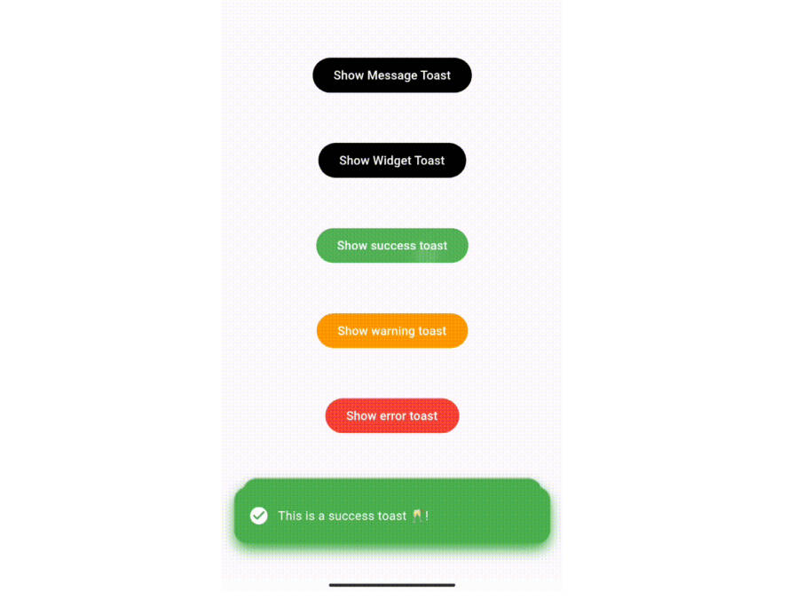
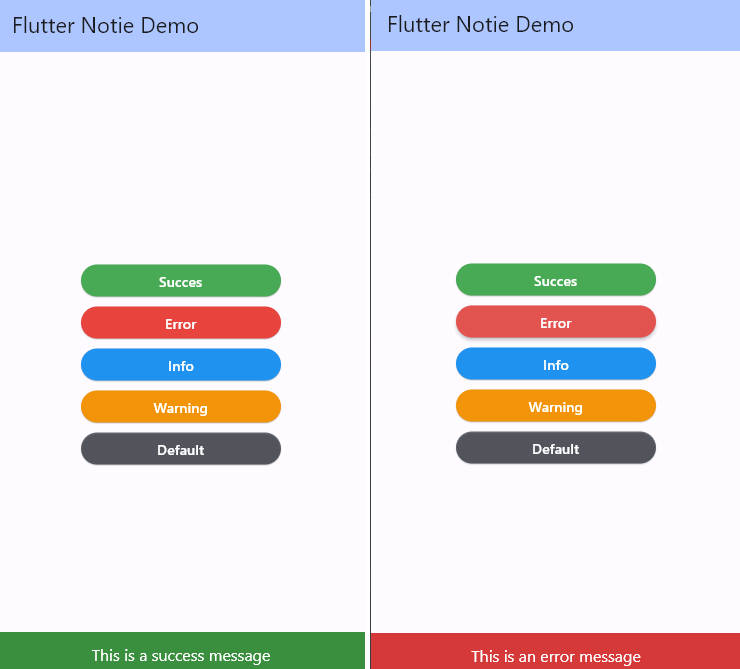
Other Predefined Styles methods
The Toastification package also provides four predefined methods to quickly create and display toast messages with different styles, depending on the type of message being displayed:
showSuccess: displays a success message with a green background and a checkmark icon.showError: displays an error message with a red background and an error icon.showInfo: displays an information message with a blue background and an information icon.showWarning: displays a warning message with a yellow background and a warning icon.
All four of these methods accept the same set of parameters as the show() method, allowing you to customize the appearance and behavior of the toast message as needed.
Here are examples of using each of the predefined methods:
showSuccess()
Displays a success message with a green background and a checkmark icon.
toastification.showSuccess(
  context: context,
  title: 'Success!',
  autoCloseDuration: const Duration(seconds: 5),
);
showError()
Displays an error message with a red background and an error icon.
toastification.showError(
  context: context,
  title: 'Error!',
  autoCloseDuration: const Duration(seconds: 5),
);
showInfo()
Displays an information message with a blue background and an information icon.
toastification.showInfo(
  context: context,
  title: 'Info',
  autoCloseDuration: const Duration(seconds: 5),
);
showWarning()
Displays a warning message with a yellow background and a warning icon.
toastification.showWarning(
  context: context,
  title: 'Warning!',
  autoCloseDuration: const Duration(seconds: 5),
);
Create Your Own Toast Style with showCustom()
If you are looking for even more control over the appearance and behavior of your toast messages, you can use the showCustom() method to create a completely custom toast message. This method lets you pass in a builder function that returns the widget you want to display, giving you complete control over the toast’s layout, styling, and interactivity.
With showCustom(), the possibilities are endless. You can create a custom toast message that matches your app’s unique visual style, or you can add interactive elements like buttons and sliders to make your toast messages more engaging and dynamic.
Here’s an example of how to use showCustom() to create a custom toast message with a button that lets users perform an action:
toastification.showCustom(
  context: context,
  builder: (BuildContext context, ToastificationItem holder) {
    return Container(
      decoration: BoxDecoration(
        borderRadius: BorderRadius.circular(8),
        color: Colors.blue,
      ),
      padding: const EdgeInsets.all(16),
      child: Column(
        crossAxisAlignment: CrossAxisAlignment.start,
        children: [
          Text('Custom Toast', style: TextStyle(color: Colors.white, fontWeight: FontWeight.bold)),
          SizedBox(height: 8),
          Text('This is a custom toast message!', style: TextStyle(color: Colors.white)),
          SizedBox(height: 16),
          ElevatedButton(
            onPressed: () {
              // Perform an action when the button is pressed
            },
            child: Text('Do Something'),
          ),
        ],
      ),
    );
  },
  autoCloseDuration: const Duration(seconds: 5),
);
With showCustom(), you’re only limited by your imagination. Create a toast message that stands out from the crowd and adds a touch of personality to your app!
Custom Animation
You can customize the animation of the toast notification by providing a Duration for the animation duration and implementing your own animation builder function using the animationBuilder parameter. Here’s an example of how to use custom animations:
toastification.show(
  context: context,
  title: 'Default',
  // .... Other parameters
  animationDuration: const Duration(milliseconds: 300),
  animationBuilder: (context, animation, child) {
    return RotationTransition(
      turns: animation,
      child: child,
    );
  },
);
Manage Your Notifications
In addition to displaying toast messages, the Toastification package also provides methods for managing and dismissing existing notifications. Here are the available methods:
Find a Notification item
Find a notification with the given ID
final notification = Toastification().findToastificationItem('my_notification');
Dismiss a Notification
Remove a specific notification from the screen.
final notification = Toastification().show(
  context: context,
  title: 'Hello',
  autoCloseDuration: const Duration(seconds: 5),
);

Toastification().dismiss(notification);
Dismiss a Notification by ID
Remove a notification with the given ID from the screen.
Toastification().dismissById('my_notification_id');
Dismiss the First Notification
Remove the first notification that was shown from the screen.
Toastification().dismissFirst();
Dismiss the Last Notification
Remove the last notification that was shown from the screen.
Toastification().dismissLast();
Contributions
Contributions are always welcome! If you have any suggestions, bug reports, or feature requests, please open an issue on the GitHub repository.
If you would like to contribute to the project, please read the CONTRIBUTING.md file for more information on how to contribute.
License
Toastification is released under the BSD-3-Clause License. You can find the full text of the license in the LICENSE file in the root of the repository.