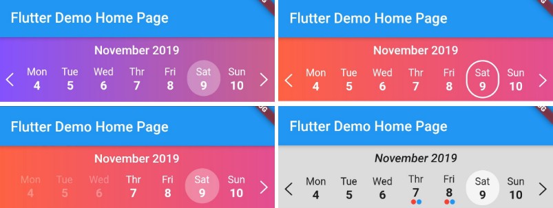
Flutter Calendar Strip
Easy to use and beautiful calendar strip component for Flutter.
Install
dependencies:
          ...
          calendar_strip: ^1.0.4
Usage Example
Container(
  child: CalendarStrip(
    startDate: startDate,
    endDate: endDate,
    onDateSelected: onSelect,
    dateTileBuilder: dateTileBuilder,
    iconColor: Colors.black87,
    monthNameWidget: _monthNameWidget,
    markedDates: markedDates,
    containerDecoration: BoxDecoration(color: Colors.black12),
  ))
DateBuilder Widget Method Usage
  dateTileBuilder(date, selectedDate, rowIndex, dayName, isDateMarked, isDateOutOfRange) {
    bool isSelectedDate = date.compareTo(selectedDate) == 0;
    Color fontColor = isDateOutOfRange ? Colors.black26 : Colors.black87;
    TextStyle normalStyle = TextStyle(fontSize: 17, fontWeight: FontWeight.w800, color: fontColor);
    TextStyle selectedStyle = TextStyle(fontSize: 17, fontWeight: FontWeight.w800, color: Colors.black87);
    TextStyle dayNameStyle = TextStyle(fontSize: 14.5, color: fontColor);
    List<Widget> _children = [
      Text(dayName, style: dayNameStyle),
      Text(date.day.toString(), style: !isSelectedDate ? normalStyle : selectedStyle),
    ];

    if (isDateMarked == true) {
      _children.add(getMarkedIndicatorWidget());
    }

    return AnimatedContainer(
      duration: Duration(milliseconds: 150),
      alignment: Alignment.center,
      padding: EdgeInsets.only(top: 8, left: 5, right: 5, bottom: 5),
      decoration: BoxDecoration(
        color: !isSelectedDate ? Colors.transparent : Colors.white70,
        borderRadius: BorderRadius.all(Radius.circular(60)),
      ),
      child: Column(
        children: _children,
      ),
    );
  }
MonthName Widget Method Usage
    monthNameWidget(monthName) {
    return Container(
      child: Text(
        monthName,
        style: TextStyle(
          fontSize: 17,
          fontWeight: FontWeight.w600,
          color: Colors.black87,
          fontStyle: FontStyle.italic,
        ),
      ),
      padding: EdgeInsets.only(top: 8, bottom: 4),
    );
  }
Full Example
import 'package:flutter/material.dart';
import 'package:calendar_strip/calendar_strip.dart';

void main() => runApp(MyApp());

class MyApp extends StatelessWidget {
  // This widget is the root of your application.
  @override
  Widget build(BuildContext context) {
    return MaterialApp(
      title: 'Flutter Demo',
      theme: ThemeData(primarySwatch: Colors.blue),
      home: MyHomePage(title: 'Flutter Demo Home Page'),
    );
  }
}

class MyHomePage extends StatefulWidget {
  MyHomePage({Key key, this.title}) : super(key: key);
  final String title;

  @override
  _MyHomePageState createState() => _MyHomePageState();
}

class _MyHomePageState extends State<MyHomePage> {
  DateTime startDate = DateTime.now().subtract(Duration(days: 2));
  DateTime endDate = DateTime.now().add(Duration(days: 2));
  DateTime selectedDate = DateTime.now().subtract(Duration(days: 2));
  List<DateTime> markedDates = [
    DateTime.now().subtract(Duration(days: 1)),
    DateTime.now().subtract(Duration(days: 2)),
    DateTime.now().add(Duration(days: 4))
  ];

  onSelect(data) {
    print("Selected Date -> $data");
  }

  _monthNameWidget(monthName) {
    return Container(
      child: Text(monthName,
          style:
              TextStyle(fontSize: 17, fontWeight: FontWeight.w600, color: Colors.black87, fontStyle: FontStyle.italic)),
      padding: EdgeInsets.only(top: 8, bottom: 4),
    );
  }

  getMarkedIndicatorWidget() {
    return Row(mainAxisAlignment: MainAxisAlignment.center, children: [
      Container(
        margin: EdgeInsets.only(left: 1, right: 1),
        width: 7,
        height: 7,
        decoration: BoxDecoration(shape: BoxShape.circle, color: Colors.red),
      ),
      Container(
        width: 7,
        height: 7,
        decoration: BoxDecoration(shape: BoxShape.circle, color: Colors.blue),
      )
    ]);
  }

  dateTileBuilder(date, selectedDate, rowIndex, dayName, isDateMarked, isDateOutOfRange) {
    bool isSelectedDate = date.compareTo(selectedDate) == 0;
    Color fontColor = isDateOutOfRange ? Colors.black26 : Colors.black87;
    TextStyle normalStyle = TextStyle(fontSize: 17, fontWeight: FontWeight.w800, color: fontColor);
    TextStyle selectedStyle = TextStyle(fontSize: 17, fontWeight: FontWeight.w800, color: Colors.black87);
    TextStyle dayNameStyle = TextStyle(fontSize: 14.5, color: fontColor);
    List<Widget> _children = [
      Text(dayName, style: dayNameStyle),
      Text(date.day.toString(), style: !isSelectedDate ? normalStyle : selectedStyle),
    ];

    if (isDateMarked == true) {
      _children.add(getMarkedIndicatorWidget());
    }

    return AnimatedContainer(
      duration: Duration(milliseconds: 150),
      alignment: Alignment.center,
      padding: EdgeInsets.only(top: 8, left: 5, right: 5, bottom: 5),
      decoration: BoxDecoration(
        color: !isSelectedDate ? Colors.transparent : Colors.white70,
        borderRadius: BorderRadius.all(Radius.circular(60)),
      ),
      child: Column(
        children: _children,
      ),
    );
  }

  @override
  Widget build(BuildContext context) {
    return Scaffold(
      appBar: AppBar(
        title: Text(widget.title),
      ),
      body: Container(
          child: CalendarStrip(
        startDate: startDate,
        endDate: endDate,
        onDateSelected: onSelect,
        dateTileBuilder: dateTileBuilder,
        iconColor: Colors.black87,
        monthNameWidget: _monthNameWidget,
        markedDates: markedDates,
        containerDecoration: BoxDecoration(color: Colors.black12),
      )),
    );
  }
}
Widget Properties
Initial data and onDateSelected handler
| Prop | Description | Type | Default |
|---|---|---|---|
startDate |
Date to be used for setting starting date in a date range. | DateTime |
- |
endDate |
Date to be used for setting ending date in a date range. | DateTime |
- |
selectedDate |
Date to be used for setting a date as pre-selected instead of current Date. | DateTime |
- |
markedDates |
List of DateTimes to be marked in UI. It is also passed as parementer in dateTileBuilder method, |
List<DateTime> |
- |
iconColor |
Icon colors of both Left and Right Chevron Icons. | Color |
Colors.black87 |
containerHeight |
The Height of the calendar strip. | int |
90 |
containerDecoration |
Box Decoration object styling the container for more custom styling. | BoxDecoration |
- |
monthNameWidget |
Function that returns a custom widget for rendering the name of the current month. | Function |
- |
dateTileBuilder |
Function that returns a custom widget for rendering the name of the current month | Function |
- |
onDateSelected |
Function that is called on selection of a date. (Required) | Function |
Required |