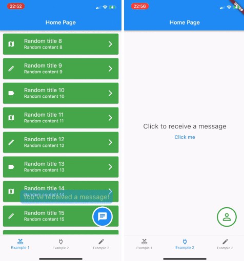
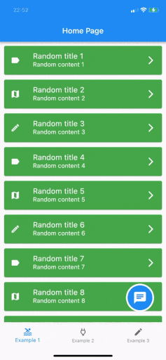
Show a draggable floating chat icon button and show messages on screens
Features
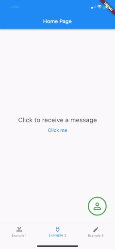
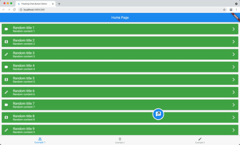
A widget for displaying a chat icon (or custom widget) on top of a background widget.
It can show and hide messages or display a message that is passed in its constructor.
Getting started
Add it as the body of a scaffold (or other full screen view) and then supply the widget that should be shown under the chat widget as the background parameter.
Alternately, use a stack view to position the chat widget and leave the background as null.
The FloatingChatIcon will default to a blue circle with white chat icon and the messageWidget will default to a blue rounded rectangle with white text. All of these colours can be configured or custom widgets can be passed to chatIconWidget, messageWidget or messageTextWidget.
The ShowMessageParameters allows you to show the message passed to the constructor after a given delayDuration, for the amount of time specified in durationToShowMessage and at a random frequency (eg “Only show this message 50% of the time that the widget is instantiated”) with showMessageFrequency.
Usage
@override
  Widget build(BuildContext context) {
    return Scaffold(
      appBar: AppBar(
        title: Text(widget.title),
      ),
      body: FloatingChatButton(
          background: BackgroundWidget(),
          onTap: (_) {
            _showBottomSheet(context);
          },
          messageText: "I like this package",
      )
    );
  }