flutter_charts
Charts Library for Flutter, written in Dart with Flutter.
New in the current release
Current release 0.1.8.
See <CHANGELOG.md> for the list of new features and bug fixes in this release.
As noted in the CHANGELOG, the two most important new features are:
- Making the codebase Dart 2 clean
- Adding the "iterative auto layout" of labels.
Labels auto layout is a sequence of steps, such as skipping some labels, tilting labels, or decreasing label font, that result in label 'fit' nicely, readably, without overflowing or running into each other.
Illustration of the new "iterative auto layout" feature
This section illustrates how the auto layout behaves when less and less horizontal space is available to display the chart.
Flutter chart library automatically checks for the X label overlap, and follows with rule-based iterative re-layout, to prevent labels running into each other.
To illustrate "stressed" horizontal space for the chart, we are gradually adding a text widget containing and increasing number of '<' signs on the right of the chart.
Autolayout step 1
Let's say there are six labels on a chart, and sufficient space to display labels horizontally. The result may look like this:

We can see all x axis labels displayed it full, horizontally oriented.
Autolayout step 2
Next, let us make less available space by taking away some space on the right with a wider text label like this '<<<<<<'

We can see the labels were automatically tilted by angle ChartOptions labelTiltRadians for the labels to fit.
Autolayout step 3
Next, let us make even less available space by taking away some space on the right with a wider text label like this '<<<<<<<<<<<'.

We can see that labels are not only tilted, but also automatically skipped (every 2nd) for labels not to overlap.
Autolayout step 4
Next, let us make even less available space some more compared to step 3, with even a wider text label like this '<<<<<<<<<<<<<<<<<<<<<<<<<<<<<<'.

We can see even more labels were skipped for labels to prevent overlap, the chart is showing evey 5th label
Autolayout step 5
Last, let us take away extreme amount of horizontal space by using '<<<<<<<<<<<<<<<<<<<<<<<<<<<<<<<<<<<<<<<<<<',

Here we can see the "default auto layout" finally gave up, and overlaps labels. Also, the legend is now hidded, as there is not enough horizontal space.
How to include the flutter_charts library in your application
Flutter Charts is a charting library for Flutter, written in Flutter. Currently, column chart and line chart are supported.
The package is published on pub for inclusion in your application's pubspec.yaml: The Installing tab on https://pub.dartlang.org/packages/flutter_charts contains instructions on how to include the flutter_charts package in your application.
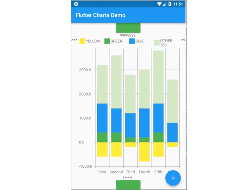
A chart created using flutter_charts - example application
There is an example application in flutter_charts: example/lib/main.dart. It shows how a Flutter Chart can be included in a Flutter application.
You can run the example application using one of the methods (6, 7) in the paragraph below.
This application is also used as a base to show several sample charts in the paragraphs below.
Here we show just two simple sample outputs, a column chart and a line chart.
A sample Vertical Bar Chart (Column Chart)

A sample point and Line Chart (Line Chart)

The output is generated from semi-random data. You can click the blue + button to rerun the chart with a different set of rows.
Known packages, libraries and apps that use this this flutter_charts package
- Michael R. Fairhurst's Language reader app - see https://github.com/MichaelRFairhurst/flutter-language-reader-app
Flutter Charts - an overview: data, options, classes
Before we show several examples of charts, a few notes.
- The
ChartDataclass: allows to define data - X labels, Y values, (optional) Y labels, each-dataRow (series) legends, each-dataRow (series) color. The list below provides a summary description of each item- X labels:
ChartData.xLabelsallow to define X labels. SettingxLabelsis required, but client can set them to empty strings. - Y values:
ChartData.dataRowsallow to define Y values in rows. Assumption: size of each data row inChartData.dataRowsis the same, and each data row size ==ChartData.xLabels.size - Y labels (optional): Normally, Y labels are generated from data. The option
ChartOptions.useUserProvidedYLabels(default true), asks flutter_charts to data-generate Y labels. If this option is set to false, thenChartData.yLabelsmust be set. Any number of such user-provided Y labels is allowed. - Each-dataRow (each series) legends:
ChartData.dataRowsLegendsallow to define a legend for each data row inChartData.dataRows. Assumption:ChartData.dataRows.size==ChartData.dataRowsLegends.size - Each-dataRow (each series) color:
ChartData.dataRowsColorsallow to define a color for each data row inChartData.dataRows. Assumption:ChartData.dataRows.size==ChartData.dataRowsColors.size
- X labels:
- The
ChartOptionsclass: allows to define options, by using it's defaults, or setting some options to non default values. There are alsoLineChartOptionsandVerticalBarChartOptionsclasses. - Support for randomly generated data, colors, labels: Flutter Charts also provides randomly generated data, in the class
RandomChartData. This class generates:- Y values data,
- X labels,
- Series colors,
- Series legends
- Currently the only purpose of
RandomChartDatais for use in the examples below. To be clear,RandomChartDataY values, series colors, and series legends are not completely random - they hardcode some demoable label, legends, color values, and data ranges (data random within the range).
Flutter Charts - examples: LineChart and VerticalBarChart. Code and resulting charts
Flutter Charts code allow to define the following data elements:
| *Data (Y values)* | User-Provided or Random |
| *X Labels* | User-Provided or Random |
| *Options including Colors* | User-Provided or Random |
| *Data Rows Legends* | User-Provided or Random |
| *Y Labels* | User-Provided or Data-Generated |
The examples below show a few alternative code snippets (User-Provided or Random data, labels, option) and the resulting charts.
The chart images were obtained by substituting the code snippet to the file:example/lib/main.dart code.
Random Data (Y values), Random X Labels, Random Colors, Random Data Rows Legends, Data-Generated Y Labels.
This example shows that Data-Generated Y labels is the default.
Flutter Charts support reasonably intelligently generated Y Labels from data, including dealing with negatives.
Code in defineOptionsAndData():
void defineOptionsAndData() {
  _lineChartOptions = new LineChartOptions();
  _verticalBarChartOptions = new VerticalBarChartOptions();
  _chartData = new RandomChartData(useUserProvidedYLabels: _lineChartOptions.useUserProvidedYLabels);
}
Result line chart:

Result vertical bar chart:

User-Provided Data (Y values), User-Provided X Labels, Random Colors, User-Provided Data Rows Legends, Data-Generated Y Labels,
Code in defineOptionsAndData():
void defineOptionsAndData() {
  _lineChartOptions = new LineChartOptions();
  _verticalBarChartOptions = new VerticalBarChartOptions();
  _chartData = new ChartData();
  _chartData.dataRowsLegends = [
    "Spring",
    "Summer",
    "Fall",
    "Winter"];
  _chartData.dataRows = [
    [10.0, 20.0,  5.0,  30.0,  5.0,  20.0, ],
    [30.0, 60.0, 16.0, 100.0, 12.0, 120.0, ],
    [25.0, 40.0, 20.0,  80.0, 12.0,  90.0, ],
    [12.0, 30.0, 18.0,  40.0, 10.0,  30.0, ],
  ];
  _chartData.xLabels =  ["Wolf", "Deer", "Owl", "Mouse", "Hawk", "Vole"];
  _chartData.assignDataRowsDefaultColors();
  // Note: ChartOptions.useUserProvidedYLabels default is still used (false);
}
Result line chart:

Result vertical bar chart:

User-Provided Data (Y values), User-Provided X Labels, Random Colors, User-Provided Data Rows Legends, User-Provided Y Labels
This example show how to use the option useUserProvidedYLabels, and scaling of data to the Y labels range.
Code in defineOptionsAndData():
void defineOptionsAndData() {
  // This example shows user defined Y Labels.
  //   When setting Y labels by user, the dataRows value scale
  //   is irrelevant. User can use for example interval <0, 1>,
  //   <0, 10>, or any other, even negative ranges. Here we use <0-10>.
  //   The only thing that matters is  the relative values in the data Rows.

  // Note that current implementation sets
  // the minimum of dataRows range (1.0 in this example)
  // on the level of the first Y Label ("Ok" in this example),
  // and the maximum  of dataRows range (10.0 in this example)
  // on the level of the last Y Label ("High" in this example).
  // This is not desirable, we need to add a userProvidedYLabelsBoundaryMin/Max.
  _lineChartOptions = new LineChartOptions();
  _verticalBarChartOptions = new VerticalBarChartOptions();
  _chartData = new ChartData();
  _chartData.dataRowsLegends = [
    "Java",
    "Dart",
    "Python",
    "Newspeak"];
  _chartData.dataRows = [
    [9.0, 4.0,  3.0,  9.0, ],
    [7.0, 6.0,  7.0,  6.0, ],
    [4.0, 9.0,  6.0,  8.0, ],
    [3.0, 9.0, 10.0,  1.0, ],
  ];
  _chartData.xLabels =  ["Fast", "Readable", "Novel", "Use"];
  _chartData.dataRowsColors = [
    Colors.blue,
    Colors.yellow,
    Colors.green,
    Colors.amber,
  ];
  _lineChartOptions.useUserProvidedYLabels = true; // use the labels below on Y axis
  _chartData.yLabels = [
    "Ok",
    "Higher",
    "High",
  ];
}
Result line chart:

(Disclaimer: Not actually measured)
Result vertical bar chart: Here the Y values should be numeric (if any) as manual labeling "Ok", "Higher", High" does not make sense for stacked type charts.

(Disclaimer: Not actually measured)
VerticalBar Chart - one more example, showing positive/negative stacks:
User-Provided Data (Y values), User-Provided X Labels, User-Provided Colors, User-Provided Data Rows Legends, User-Provided Y Labels
This example has again user defined Y Labels, with a bar chart, using the smart auto-layout of user defined Y Labels. The chart shows negative and positive values similar to %down/%up stock charts.
Code in defineOptionsAndData():
void defineOptionsAndData() {
  // This example shows user defined Y Labels with
  // a bar chart, showing negative and positive values
  // similar to %down/%up stock charts.
  _lineChartOptions = new LineChartOptions();
  _verticalBarChartOptions = new VerticalBarChartOptions();
  _chartData = new ChartData();
  _chartData.dataRowsLegends = [
    "-2%_0%",
    "<-2%",
    "0%_+2%",
    ">+2%"];
  // each column absolute values should add to same number todo- 100 would make more sense, to represent 100% of stocks in each category
  _chartData.dataRows = [
    [-9.0, -8.0,  -8.0,  -5.0, -8.0, ],
    [-1.0, -2.0,  -4.0,  -1.0, -1.0, ],
    [7.0, 8.0,  7.0, 11.0, 9.0, ],
    [3.0, 2.0, 1.0,  3.0,  3.0, ],
  ];
  _chartData.xLabels =  ["Energy", "Health", "Finance", "Chips", "Oil"];
  _chartData.dataRowsColors = [
    Colors.grey,
    Colors.red,
    Colors.greenAccent,
    Colors.black,
  ];
  _lineChartOptions.useUserProvidedYLabels = false; // use labels below
  //_chartData.yLabels = [
  //  "Ok",
  //  "Higher",
  //  "High",
  //];
}
Result vertical bar chart:

(there is a bug here,see Known Bugs)