
Flutter Progress HUD
Highly customizable modal progress indicator with fade animation.
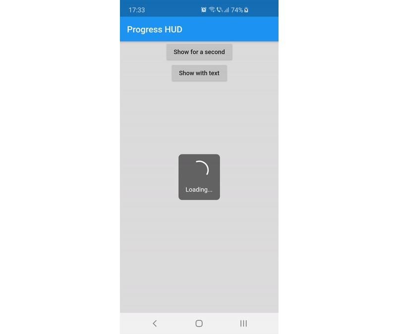
Preview

Usage
Wrap with ProgressHUD the widget on top of which you want to show the modal indicator.
ProgressHUD(
  child: HomePage(),
)
Get a reference of ProgressHUD
final progress = ProgressHUD.of(context);
Show indeterminate progress
progress.show();
Or a progress with text
progress.showWithText('Loading...');
Then dismiss
progress.dismiss();
Example (full)
ProgressHUD(
        child: Builder(
          builder: (context) => Center(
                child: Column(
                  children: <Widget>[
                    RaisedButton(
                      child: Text('Show for a second'),
                      onPressed: () {
                        final progress = ProgressHUD.of(context);
                        progress.show();
                        Future.delayed(Duration(seconds: 1), () {
                          progress.dismiss();
                        });
                      },
                    ),
                    RaisedButton(
                      child: Text('Show with text'),
                      onPressed: () {
                        final progress = ProgressHUD.of(context);
                        progress.showWithText('Loading...');
                        Future.delayed(Duration(seconds: 1), () {
                          progress.dismiss();
                        });
                      },
                    ),
                  ],
                ),
              ),
        ),
      ),
Customization
| Attribute Name | Default Value | Description |
|---|---|---|
| indicatorColor | Colors.white | When using the default indicator widget, this is how you set its color |
| indicatorWidget | A basic CircularProgressIndicator | Custom indicator widget |
| backgroundColor | Colors.black54 | Indicator background color |
| backgroundRadius | Radius.circular(8.0) | Indicator background radius |
| borderColor | Colors.white | Indicator background border color |
| borderWidth | 0.0 | Indicator background border width |
| barrierEnabled | true | You can disable the modal barrier if you want to allow touches while the progress is shown |
| barrierColor | Colors.black12 | Color of the Barrier displayed behind the indicator |
| textStyle | TextStyle(color: Colors.white, fontSize: 14.0) | TextStyle for the Text displayed below the indicator |
| padding | EdgeInsets.all(16.0)} | Indicator content padding |