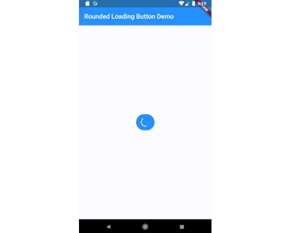
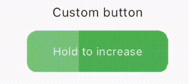
loading icon button
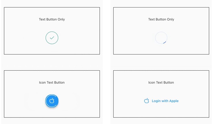
| with Card | without Card |
|---|---|
Installation
Add this to your pubspec.yaml:
dependencies:
    loading_icon_button: ^0.0.3
Usage
Import
import 'package:loading_icon_button/loading_icon_button.dart';
Simple Implementation
 final LoadingButtonController _btnController = LoadingButtonController();

  void buttonPressed() async {
    Future.delayed(const Duration(seconds: 1), () {
      _btnController.success();
      Future.delayed(const Duration(seconds: 1), () {
        _btnController.reset();
      });
    });
  }

  LoadingButton(
    child: const Text('Login with Apple'),
    iconData: PhosphorIcons.appleLogo,
    onPressed: () => buttonPressed(),
    controller: _btnController,
  );
Properties of IconLoadingButton:
duration– The duration of the button animationloaderSize– The size of the CircularProgressIndicatoranimateOnTap– Whether to trigger the loading animation on the tap eventresetAfterDuration– Reset the animation after specified duration, defaults to 15 secondserrorColor– The color of the button when it is in the error statesuccessColor– The color of the button when it is in the success statesuccessIcon– The icon for the success statefailedIcon– The icon for the failed stateiconColor– The icon color for the buttonshowBox– The visibility of the box(Card)
Contributions
All contributions are welcome!
Thanks to
RoundedLoadingButton rounded_loading_button
https://pub.dev/packages/rounded_loading_button
IconLoadingButton icon_loading_button
https://pub.dev/packages/icon_loading_button
