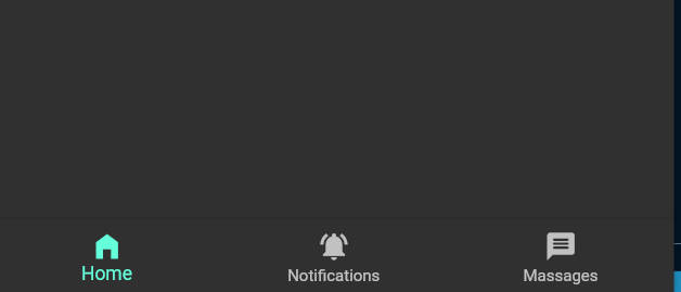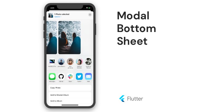
bottom_bar_with_sheet
Flutter custom Bottom Bar Widget.
?Non-standard way to use more space of screens in your application?
?Custom bottom Sheet under Bottom Navigation Bar?
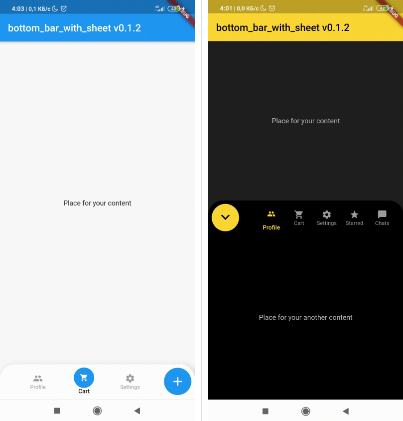
?Sounds sucks? ?First of all look at screens!
 |
 |
|---|
Getting Started
Add dependency
dependencies:
  bottom_bar_with_sheet: ^0.2.0 #latest version
Add import package
import 'package:bottom_bar_with_sheet/bottom_bar_with_sheet.dart';
Easy to use
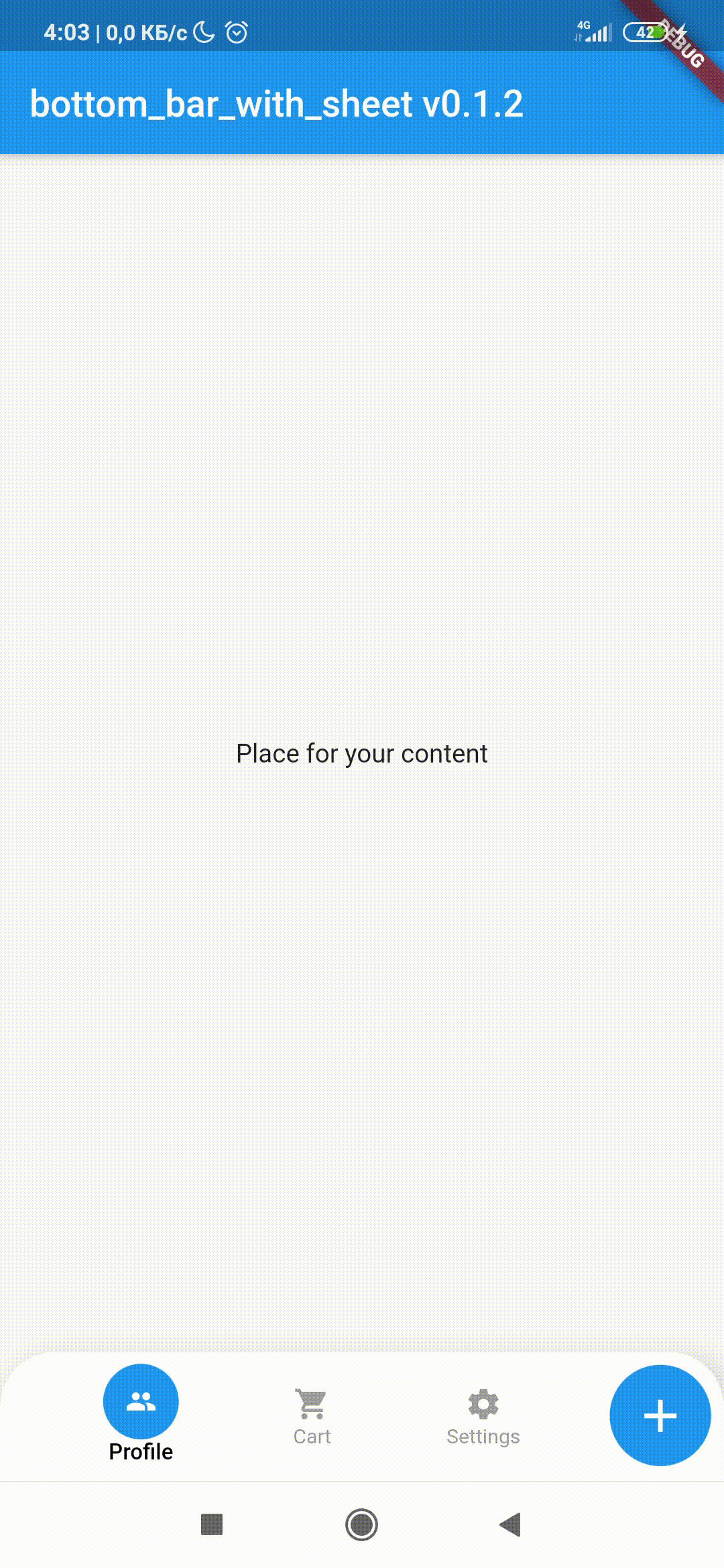
Create a Scaffold widget and set bottomNavigationBar with BottomBarWithSheet like in the code below
Scaffold(
      body: Center(child: Text("Place for your content")),
// -----------------------------------------------------------------------------
      bottomNavigationBar: BottomBarWithSheet(
        sheetChild: Center(child: Text("Place for your another content")),
        selectedIndex: 0,
        styleBottomBar: BottomBarTheme(
          mainButtonPosition: MainButtonPosition.right,
          mainActionButtonSize: 55,
          barHeightClosed: 75,
          barHeightOpened: 400,
          mainActionButtonIconClosed: Icon(
            Icons.add,
            color: Colors.white,
            size: 30,
          ),
          mainActionButtonIconOpened: Icon(
            Icons.close,
            color: Colors.white,
            size: 30,
          ),
        ),
        onSelectItem: (index) => print("$index bar item is selected"),
        items: [
          BottomBarWithSheetItem(
            iconData: Icons.people,
            label: 'Profile',
            selectedBackgroundColor: Colors.blue,
          ),
          BottomBarWithSheetItem(
            iconData: Icons.shopping_cart,
            label: 'Cart',
            selectedBackgroundColor: Colors.blue,
          ),
          BottomBarWithSheetItem(
            iconData: Icons.settings,
            label: 'Settings',
            selectedBackgroundColor: Colors.blue,
          ),
        ],
      ),
// ----------------------------------[end of widget]----------------------------------
    );
Attributes
sheetChild: an Widget to display on bottom sheet
selectedIndex: index of element in tab panel, can be used to change screens
duration: time to open the sheet
onSelectItem: function handling taps on items in tab panel
isOpened: bool value. Set true if you need to open bottom sheet when page was builded
items: List of BottomBarWithSheetItem(
- iconData: icon Widget that you use in tab button
- label: text under tab button
- selectedBackgroundColor: background color of circle when tab bar is selected
- itemWidth: custom width of element in tab panel
- animationDuration: speed of animation
- itemIconColor: custom color of element in tab panel
)
styleBottomBar: -> List of style settings to customize your bottom_bar_with_sheet ->(
Sizes
- barBackgroundColor: background color of main Widget
- rightMargin: size of space between right mobile border and Widget insides
- leftMargin: size of space between left mobile border and Widget insides
- marginBetweenPanelAndActtionButton: it seems so clear. No?. Request issue if so.
- barHeightClosed: main Widget height when sheet is closed
- barHeightOpened: main Widget height when sheet is opened
- mainActionButtonPadding: space beetwen circle border and icon of main action button
- mainActionButtonSize: size of main action button
- notchMargin: radius of space size between FloatingActionBar and BottomNavigationBar (if you need in FAB)
Colors
- mainActionButtonColorSplash: main action button splash color
- mainActionButtonColor: main action button color
- barBackgroundColor: backgroun color of tab panel
- selectedItemBackgroundColor: background circle color of selected item
- selectedItemIconColor: color of selected item icon
- selectedItemLabelColor: color of selected item text
- itemIconColor: color of unselected item icon
- itemLabelColor: color of unselected item text
Widgets & Full Styles
- mainActionButtonIconClosed: icon when sheet is closed
- mainActionButtonIconOpened: icon when sheet is opened
- selectedItemLabelColor: text style of selected item text
- itemTextStyle: text style unselected item text
- borderRadius: main Widget border radius
- boxShadow: main Widget shadow
)
For help getting started with Flutter, view our
online documentation, which offers tutorials,
samples, guidance on mobile development, and a full API reference.