Fluid Layout
Fluid layouts allows you to create responsive layout for mobile, web and desktop from a single codebase.
Let's get started
Install it
Follow the installation process here
Understand fluid layout
Fluid layout aims to help building a responsive experience through all the different screen sizes.
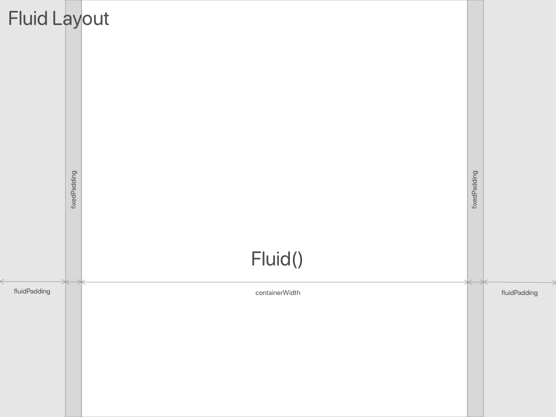
Based in the boostrap approach, FluidLayout calculates a padding content (fluid_padding) that changes depending on the parent size. The Fluid widget uses that padding to set its size
The screen sizes are divided in 6 breakpoints: xs, s, m, l, xl, and can be accessed through FluidLayout.of(context).fluidBreakpoint or context.breakpoint.
You can create values(int, num, objects, functions, ... whatever variable type) for diferrent screen sizes thanks to the class FluidValue. The easiest way is:
final value = context.fluid(defaultValue,
  xs: xsValue,  //if null xs would be defaultValue
  s:  sValue,   //if null s would be defaultValue
  m:  mValue,   //if null m would be defaultValue
  l:  lValue,   //if null l would be defaultValue
  xl: xlValue   //if null xl would be defaultValue
 )
Examples
FluidLayout & Fluid
See web example
class BasicFluidLayout extends StatelessWidget {
  @override
  Widget build(BuildContext context) {
    return Scaffold(
      backgroundColor: Colors.grey[200],
      body: Container(
        child: FluidLayout(
          child: Fluid(
            child: Container(
              color: Colors.blue,
              child: Center(
                child: Text(
                  'Fluid width',
                  style: TextStyle(color: Colors.white),
                ),
              ),
            ),
          ),
        ),
      ),
    );
  }
}
There is a fixed horizontalPadding param that can be changed to all the FluidLayout or just for a Fluid container
For CustomScrollView there is a SliverFluid equivalent to Fluid
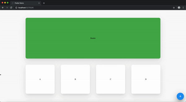
FluidGridView
FluidGridView(
  children: List.filled(
    100,
    FluidCell.withFluidHeight(
      size: context.fluid(3, m: 3, s: 4, xs: 6),
      heightSize: context.fluid(3, m: 3, s: 4, xs: 6),
      child: CustomCard(
        color: Colors.red,
        child: Center(child: Text('Item')),
      )),
    ),
)
Customizable params [double spacing, ScrollPhysics physics, bool shrinkWrap] and bool fluid
FluidCell has three methods to build the cell:
FluidCell.fit({size, child})FluidCell.withFluidHeight({size, heightSize, child})FluidCell.withFixedHeight({size, height, child})
For CustomScrollView there is a SliverFluidGrid equivalent to FluidGridView
Conditional Layout
See Conditional Layout web example
if(FluidLayout.of(context).fluidBreakpoint.isLargerThanM)
   return Container(color: Colors.red)
else
   return Container(color: Colors.red)
Remember you can use context.breakpoint as FluidLayout.of(context).fluidBreakpoint
Combine full width widgets with fluid layouts
Fluid layouts can be built everywhere inside the app and they will calculate their constraints based on their parents sizes, also they can combine very easily in cases we need full screen widgets.