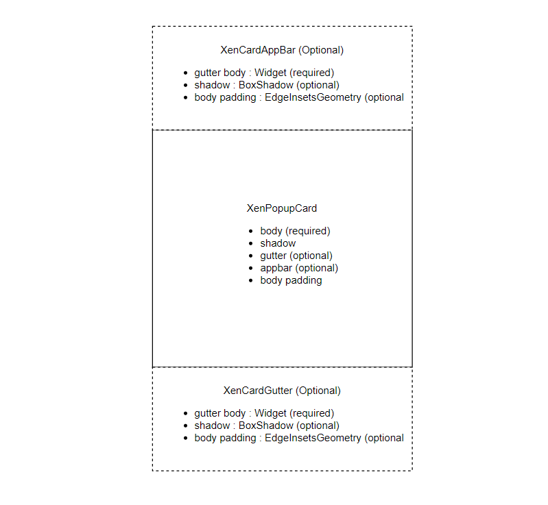
xen_popup_card
Stunnigly beautiful yet simple to use and customizeable popup card for flutter.
To see an example:
cd example/
flutter run --release
To use package:
import 'package:xen_popup_card/xen_card.dart';
Understanding with image
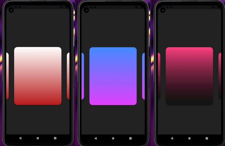
[Example] Screenshot for card with gutter only
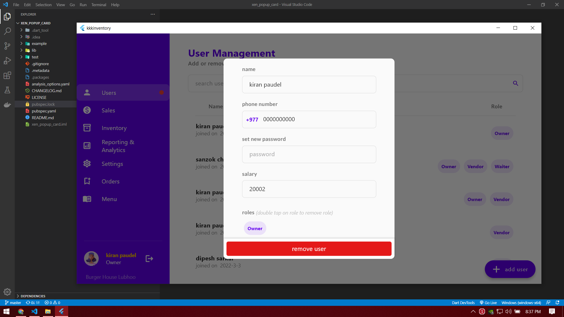
[Example] Screenshot for card with both gutter and appbar
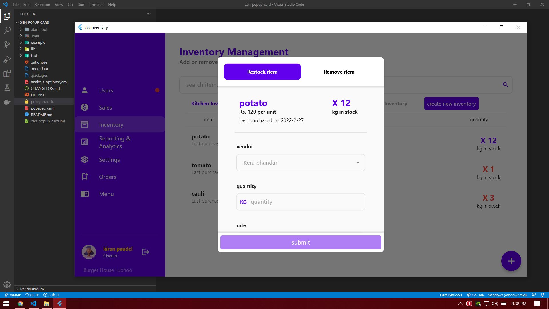
Gutter
XenCardGutter gutter = const XenCardGutter(
  child: Padding(
    padding: EdgeInsets.all(8.0),
    child: CustomButton(text: "close"),
  ),
);
App Bar
XenCardAppBar appBar = const XenCardAppBar(
  child: Text(
    "app bar",
    style: TextStyle(fontWeight: FontWeight.bold, fontSize: 28),
  ),
  shadow: BoxShadow(color: Colors.transparent),   // To remove shadow from appbar
);
XenPopupCard
XenPopupCard card = XenPopupCard(
  appBar: appBar,
  gutter: gutter,
  body: ListView(
    children: const [
      Text("body"),
    ],
  ),
);
[Example] popup card with only gutter
// card with gutter only
// no appbar
Widget cardWithGutterOnly() => TextButton(
      onPressed: () => showDialog(
        context: context,
        builder: (builder) => XenPopupCard(
          gutter: gutter,
          body: ListView(
            children: const [
              Text("body"),
            ],
          ),
        ),
      ),
      child: const Text("open card with  gutter only"),
    );
[Example] popup card with only appbar
// card with appbar only
// no gutter
Widget cardWithAppBarOnly() => TextButton(
      onPressed: () => showDialog(
        context: context,
        builder: (builder) => XenPopupCard(
          appBar: appBar,
          body: ListView(
            children: const [
              Text("body"),
            ],
          ),
        ),
      ),
      child: const Text("open card with appbar only"),
    );
[Example] popup card with only body
// card with body only
// no appbar and gutter
Widget cardWithBodyOnly() => TextButton(
      onPressed: () => showDialog(
        context: context,
        builder: (builder) => XenPopupCard(
          body: ListView(
            children: const [
              Text("body"),
            ],
          ),
        ),
      ),
      child: const Text("open card with body only"),
    );
[Example] popup card with both gutter and appbar
// card with both gutter and app bar
Widget cardWithGutterAndAppBar() => TextButton(
      onPressed: () => showDialog(
        context: context,
        builder: (builder) => XenPopupCard(
          appBar: appBar,
          gutter: gutter,
          body: ListView(
            children: const [
              Text("body"),
            ],
          ),
        ),
      ),
      child: const Text("open card with gutter and app bar"),
    );
Full working example
import 'package:flutter/material.dart';
import 'package:xen_popup_card/xen_card.dart';

void main() {
  runApp(const MaterialApp(home: ExampleApp()));
}

class ExampleApp extends StatefulWidget {
  const ExampleApp({Key? key}) : super(key: key);

  @override
  State<ExampleApp> createState() => _ExampleAppState();
}

class _ExampleAppState extends State<ExampleApp> {
  // APP BAR
  //
  // [XenCardAppBar]
  XenCardAppBar appBar = const XenCardAppBar(
    child: Text(
      "app bar",
      style: TextStyle(fontWeight: FontWeight.bold, fontSize: 28),
    ),
    // To remove shadow from appbar
    shadow: BoxShadow(color: Colors.transparent),
  );

  // GUTTER
  //
  // [XenCardGutter]
  XenCardGutter gutter = const XenCardGutter(
    child: Padding(
      padding: EdgeInsets.all(8.0),
      child: CustomButton(text: "close"),
    ),
  );

  @override
  Widget build(BuildContext context) {
    return Scaffold(
      body: Center(
        child: Column(
          mainAxisAlignment: MainAxisAlignment.spaceEvenly,
          children: <Widget>[
            cardWithGutterAndAppBar(),
            cardWithBodyOnly(),
            cardWithAppBarOnly(),
            cardWithGutterOnly(),
          ],
        ),
      ),
    );
  }

  // card with both gutter and app bar
  Widget cardWithGutterAndAppBar() => TextButton(
        onPressed: () => showDialog(
          context: context,
          builder: (builder) => XenPopupCard(
            appBar: appBar,
            gutter: gutter,
            body: ListView(
              children: const [
                Text("body"),
              ],
            ),
          ),
        ),
        child: const Text("open card with gutter and app bar"),
      );

  // card with body only
  // no appbar and gutter
  Widget cardWithBodyOnly() => TextButton(
        onPressed: () => showDialog(
          context: context,
          builder: (builder) => XenPopupCard(
            body: ListView(
              children: const [
                Text("body"),
              ],
            ),
          ),
        ),
        child: const Text("open card with body only"),
      );

  // card with appbar only
  // no gutter
  Widget cardWithAppBarOnly() => TextButton(
        onPressed: () => showDialog(
          context: context,
          builder: (builder) => XenPopupCard(
            appBar: appBar,
            body: ListView(
              children: const [
                Text("body"),
              ],
            ),
          ),
        ),
        child: const Text("open card with appbar only"),
      );

  // card with gutter only
  // no appbar
  Widget cardWithGutterOnly() => TextButton(
        onPressed: () => showDialog(
          context: context,
          builder: (builder) => XenPopupCard(
            gutter: gutter,
            body: ListView(
              children: const [
                Text("body"),
              ],
            ),
          ),
        ),
        child: const Text("open card with  gutter only"),
      );
}

// custom button
// ignore
class CustomButton extends StatelessWidget {
  const CustomButton({Key? key, required this.text, this.color})
      : super(key: key);

  final String text;
  final Color? color;

  @override
  Widget build(BuildContext context) {
    return InkWell(
      onTap: () => Navigator.pop(context),
      child: Material(
        borderRadius: BorderRadius.circular(5),
        color: const Color(0xff6200ee),
        child: Padding(
          padding: const EdgeInsets.all(8.0),
          child: FittedBox(
            fit: BoxFit.scaleDown,
            child: Center(
              child: Text(text,
                  style: const TextStyle(
                      fontSize: 17,
                      color: Colors.white,
                      fontWeight: FontWeight.w500)),
            ),
          ),
        ),
      ),
    );
  }
}