


Fluid action card Package
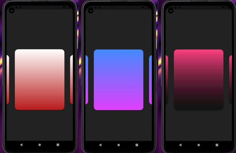
A Flutter package consisting of pre animated cards(containers) with fluid animation for freely adding user customized cards to the app with heavily customizable options for the cards adding up to an incredible UI experience.You can set the amount of cards for your screen to display without writing code for creating additonal cards and also writing your own animation mechanism.You can also add multiple texts,images in the card and also customize its color which is in gradient form with various attributes making it a complete package for modern frontend development.
Preview

Demo

Installation
You should have Flutter installed in your system.
Now in your terminal
Run this command:
$ flutter pub add fluid_action_card
Example and Usage

class MyApp extends StatelessWidget {
  // This widget is the root of your application.
  @override
  Widget build(BuildContext context) {
    return MaterialApp(
        title: 'Fluid Action card display',
        debugShowCheckedModeBanner: false,
        home: Scaffold(
          body: FluidActionCard(
            color1: Colors.pinkAccent,
            color2: Colors.black45,
            backgroundcolor: Colors.grey[900]!,
            borderRadius1: BorderRadius.circular(20),
            borderRadius2: BorderRadius.circular(20),
            height: 400.0,
            width: 240.0,
            cardCount: 6,
            Position: 250.0,
            shadow: BoxShadow(
              color: Colors.black12,
              blurRadius: 10.0,
              spreadRadius: 0.2,
              offset: Offset(0, 3),
            ),
            ontap: () {},
           ),
        )
      );
  }
}

To add images to the animated cards follow this procedure:
- First import the dependancy assets to pubspec.yaml
flutter:
  uses-material-design: true

  assets:
    - assets/images/
void main() => runApp(MyApp());

class MyApp extends StatelessWidget {
  // This widget is the root of your application.
  @override
  Widget build(BuildContext context) {
    return MaterialApp(
        title: 'Fluid Action card display',
        debugShowCheckedModeBanner: false,
        home: Scaffold(
          body: FluidActionCard(
            color1: Colors.greenAccent.shade400,
            color2: Colors.black12,
            backgroundcolor: Colors.grey[900]!,
            borderRadius1: BorderRadius.circular(20),
            borderRadius2: BorderRadius.circular(20),
            TextPosition_Top: 22.0,
            TextPosition_Down: 29.0,
            height: 400.0,
            width: 240.0,
            CardCount: 3,
            text1: Text(
              "Starts From",
              style: TextStyle(
                  color: Colors.white,
                  fontSize: 18.0,
                  fontStyle: FontStyle.italic),
            ),
            text2: Text(
              "300",
              style: TextStyle(
                color: Colors.white,
                fontSize: 20.0,
                fontWeight: FontWeight.w700,
                letterSpacing: 2.0,
              ),
            ),
            Position: 250.0,
            shadow: BoxShadow(
              color: Colors.black12,
              blurRadius: 10.0,
              spreadRadius: 0.2,
              offset: Offset(0, 3),
            ),
            assetimage: 'assets/images/Xbox.png',
            ontap: () {},
          ),
        ));
  }
}
Support the Library
You can support the library by liking it on pub, staring in on Github and reporting any bugs you encounter.