Multi Select Flutter
Multi Select Flutter is a package for easily creating multi-select widgets in a variety of ways.
Features
- Supports FormField features like validator.
- Neutral default design that can be altered to your heart's content.
- Choose between a Dialog or BottomSheet style widget.
- Easily switch the
listTypefrom LIST to CHIP. - Make your multi select
searchablefor larger lists.
Install
Add this to your pubspec.yaml file:
dependencies:
  multi_select_flutter: ^2.1.0
Usage
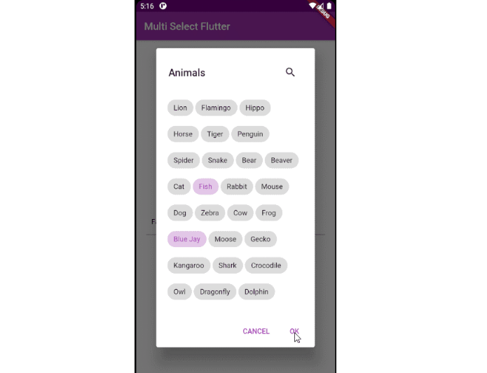
MultiSelectDialog
Can be used in the builder of showDialog() and triggered with your own button.
void _showMultiSelectDialog(BuildContext context) async {
  await showDialog(
    context: context,
    builder: (ctx) {
      return  MultiSelectDialog(
        items: _animals.map((e) => MultiSelectItem(e, e)).toList(),
        initialValue: _selectedAnimals,
        onConfirm: (values) {...},
      );
    },
  );
}
MultiSelectBottomSheet
Can be used in the builder of showModalBottomSheet() and triggered with your own button.
void _showMultiSelect(BuildContext context) async {
  await showModalBottomSheet(
    isScrollControlled: true, // required for min/max child size
    context: context,
    builder: (ctx) {
      return  MultiSelectBottomSheet(
        items: _animals.map((e) => MultiSelectItem(e, e)).toList(),
        initialValue: _selectedAnimals,
        onConfirm: (values) {...},
        maxChildSize: 0.8,
      );
    },
  );
}
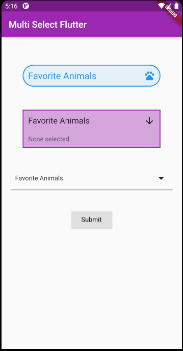
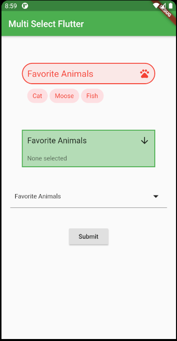
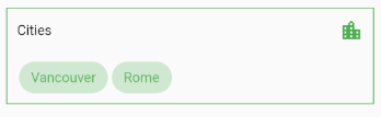
MultiSelectChipDisplay
This widget can be used alongside your own button, or it can be specified as a chipDisplay parameter of widgets like MultiSelectDialogField.
To use this widget effectively, make sure to set the state any time the source list is changed.
You can also remove items from the source list in the onTap function.
MultiSelectChipDisplay(
  items: _selectedAnimals.map((e) => MultiSelectItem(e, e)).toList(),
  onTap: (value) {
    setState(() {
      _selectedAnimals.remove(value);
    });
  },
),
When using the chipDisplay parameter as part of a MultiSelectDialogField for example, the MultiSelectChipDisplay still renders outside the BoxDecoration of the field as seen here:
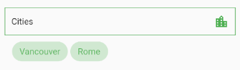
If you want to encapsulate the MultiSelectChipDisplay, wrap the MultiSelectDialogField in a Container and apply the decoration to that instead:
Container(
  decoration: BoxDecoration(...),
  child: MultiSelectDialogField(
    items: _items,
    chipDisplay: MultiSelectChipDisplay(...),
  ),
),
MultiSelectDialogField / MultiSelectBottomSheetField
These widgets provide an InkWell button which open the dialog or bottom sheet.
MultiSelectBottomSheetField(
  items: _animals.map((e) => MultiSelectItem(e, e.name)).toList(),
  listType: MultiSelectListType.CHIP,
  searchable: true,
  decoration: BoxDecoration(...),
  onConfirm: (values) {
    setState(() {
      _selectedAnimals = values;
    });
  },
  chipDisplay: MultiSelectChipDisplay(),
),
MultiSelectDialogFormField / MultiSelectBottomSheetFormField
These widgets are the FormField versions of MultiSelectDialogField and MultiSelectBottomSheetField. You can make use of FormField parameters such as validator and onSaved.
It comes with a default bottom-border that can be overriden with the decoration parameter.
MultiSelectDialogFormField(
	items: _animals.map((e) => MultiSelectItem(e, e.name)).toList(),
	key: _multiSelectKey,
	validator: (value) {
	  if (value == null || value.isEmpty) {
	    return  "Required";
	  }
	  return  null;
	},
	onConfirm: (values) {
	  setState(() {
	    _selectedAnimals = values;
	  });
	  _multiSelectKey.currentState.validate();
	},
),
Constructors
MultiSelectDialog
| Parameter | Type | Default | Description |
|---|---|---|---|
confirmText |
Text | Text("OK") |
Specifies the confirm button text. |
cancelText |
Text | Text("CANCEL") |
Specifies the cancel button text. |
height |
double | null |
Give the dialog a fixed height. |
initialValue |
List<dynamic> | null |
List of selected values. Required to retain values when re-opening the dialog. |
items |
List<MultiSelectItem<V>> | null |
The source list of options. |
listType |
MultiSelectListType | MultiSelectListType.LIST |
Change the listType. Can be either MultiSelectListType.LIST or MultiSelectListType.CHIP |
onSelectionChanged |
Function(List<dynamic>) | null |
Fires when an item is selected or unselected. |
onConfirm |
Function(List<dynamic>) |
null |
Fires when the confirm button is pressed. |
searchable |
bool | false |
Toggle search functionality within the dialog. |
title |
String | "Select" |
The title that is displayed at the top of the dialog. |
searchPlaceholder |
String | "Search" |
Set the placeholder text of the search field. |
selectedColor |
Color | null |
Set the color of the checkbox or chip items that are selected. |
colorator |
Color Function(V) | null |
Set the selected color of individual items based on their value. Applies to both chips and checkboxes. |
MultiSelectDialogField
MultiSelectDialogField has all the parameters of MultiSelectDialog plus these extra parameters:
| Parameter | Type | Default | Description |
|---|---|---|---|
barrierColor |
Color | null |
Set the color of the space outside the dialog. |
buttonText |
Text | "Select" |
Set text that is displayed on the button. |
buttonIcon |
Icon | Icons.arrow_downward |
Specify the button icon. |
chipDisplay |
MultiSelectChipDisplay | null |
Attach a MultiSelectChipDisplay to this field. |
decoration |
BoxDecoration | null |
Style the Container that makes up the field. |
MultiSelectBottomSheet
| Parameter | Type | Default | Description |
|---|---|---|---|
confirmText |
Text | Text("OK") |
Specifies the confirm button text. |
cancelText |
Text | Text("CANCEL") |
Specifies the cancel button text. |
initialChildSize |
double | 0.3 |
The initial height of the BottomSheet. |
initialValue |
List<dynamic> | null |
List of selected values. Required to retain values when re-opening the dialog. |
items |
List<MultiSelectItem<V>> | null |
The source list of options. |
listType |
MultiSelectListType | MultiSelectListType.LIST |
Change the listType. Can be either MultiSelectListType.LIST or MultiSelectListType.CHIP |
maxChildSize |
double | 0.6 |
Set the maximum height threshold of the BottomSheet. |
minChildSize |
double | 0.3 |
Set the minimum height threshold of the BottomSheet before it closes. |
onSelectionChanged |
Function(List<dynamic>) | null |
Fires when an item is selected or unselected. |
onConfirm |
Function(List<dynamic>) |
null |
Fires when the confirm button is pressed. |
searchable |
bool | false |
Toggle search functionality within the dialog. |
title |
String | "Select" |
The title that is displayed at the top of the dialog. |
searchPlaceholder |
String | "Search" |
Set the placeholder text of the search field. |
selectedColor |
Color | null |
Set the color of the checkbox or chip items that are selected. |
colorator |
Color Function(V) | null |
Set the selected color of individual items based on their value. Applies to both chips and checkboxes. |
MultiSelectBottomSheetField
MultiSelectBottomSheetField has all the parameters of MultiSelectBottomSheet plus these extra parameters:
| Parameter | Type | Default | Usage |
|---|---|---|---|
barrierColor |
Color | null |
Set the color of the space outside the BottomSheet. |
buttonIcon |
Icon | Icons.arrow_downward |
Specify the button icon. |
buttonText |
Text | "Select" |
Set text that is displayed on the button. |
chipDisplay |
MultiSelectChipDisplay | null |
Attach a MultiSelectChipDisplay to this field. |
decoration |
BoxDecoration | null |
Style the Container that makes up the field. |
shape |
ShapeBorder | RoundedRectangleBorder(borderRadius: BorderRadius.vertical(top: Radius.circular(15.0))) |
Apply a ShapeBorder to alter the edges of the BottomSheet. |
MultiSelectDialogFormField / MultiSelectBottomSheetFormField
These widgets have all the parameters of their non-FormField counterparts, plus these extra parameters which come from the FormField class:
| Parameter | Type | Default | Description |
|---|---|---|---|
autovalidate |
List<MultiSelectItem> | false |
If true, form fields will validate and update their error text immediately after every change. Default is false. |
key |
GlobalKey<FormFieldState> | null |
Can be used to call methods like _multiSelectKey.currentState.validate(). |
onSaved |
List<MultiSelectItem> | null |
A callback that is called whenever we submit the field (usually by calling the save method on a form. |
validator |
FormFieldValidator<List> | null |
Validation. See Flutter's documentation. |
MultiSelectChipDisplay
| Parameter | Type | Default | Description |
|---|---|---|---|
alignment |
Alignment | Alignment.centerLeft |
Change the alignment of the chips. |
chipColor |
Color | primaryColor |
Set the chip color. |
decoration |
BoxDecoration | null |
Style the Container that makes up the chip display. |
items |
List<MultiSelectItem> | null |
The source list of selected items. |
onTap |
Function(dynamic) | null |
Fires when a chip is tapped. |
textStyle |
TextStyle | null |
Style the text on the chips. |
opacity |
double | null |
Set the opacity of the chips. |
colorator |
Color Function(V) | null |
Set the chip color of individual items based on their value. |