password_validated_field
A package that lets you include a cool, nice looking and validated Password TextFormField in your app to enhance user experience. The package is fully & easily modifiable.
Customizable Attributes
Import package:password_validated_field/src/requirement_widget.dart and following fields are modifiable:
inputDecorationtextEditingControllertextInputActiononEditCompleteonFieldSubmittedfocusNodecursorColortextStyleactiveIconinActiveIconactiveRequirementColorinActiveRequirementColor
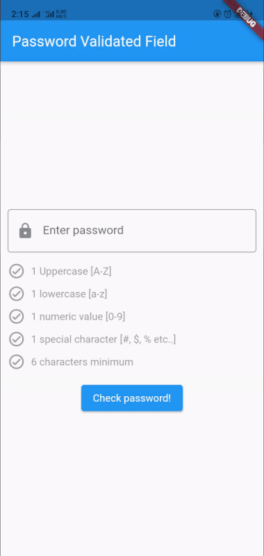
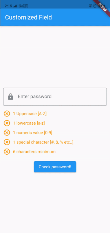
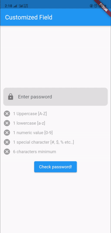
Here's how it looks
Below are few samples of what the package looks like.
Import the package and use package:password_validated_field/password_validated_field.dart
Simple usage
class Example extends StatefulWidget {
  const Example({Key? key}) : super(key: key);

  @override
  _ExampleState createState() => _ExampleState();
}

class _ExampleState extends State<Example> {
  // simple check
  bool _validPassword = false;

  // form key
  final _formKey = GlobalKey<FormState>();

  @override
  Widget build(BuildContext context) {
    return Scaffold(
      appBar: AppBar(
        title: Text("Password Validated Field"),
      ),
      body: Form(
        key: _formKey,
        child: Column(
          mainAxisAlignment: MainAxisAlignment.center,
          children: [
            _validPassword
                ? Text(
                    "Password Valid!",
                    style: TextStyle(fontSize: 22.0),
                  )
                : Container(),
            PasswordValidatedFields(), // password validated field from package
            ElevatedButton(
                onPressed: () {
                  if (_formKey.currentState!.validate()) {
                    setState(() {
                      _validPassword = true;
                    });
                  } else {
                    setState(() {
                      _validPassword = false;
                    });
                  }
                },
                child: Text("Check password!")),
          ],
        ),
      ),
    );
  }
}
Customized usage
class CustomizeFieldExample extends StatefulWidget {
  const CustomizeFieldExample({Key? key}) : super(key: key);

  @override
  _CustomizeFieldExampleState createState() => _CustomizeFieldExampleState();
}

class _CustomizeFieldExampleState extends State<CustomizeFieldExample> {
  // simple check
  bool _validPassword = false;

  // form key
  final _formKey = GlobalKey<FormState>();

  @override
  Widget build(BuildContext context) {
    return Scaffold(
      appBar: AppBar(
        title: Text("Customized Field"),
      ),
      body: Form(
        key: _formKey,
        child: Column(
          mainAxisAlignment: MainAxisAlignment.center,
          children: [
            _validPassword
                ? Text(
                    "Password Valid!",
                    style: TextStyle(fontSize: 22.0),
                  )
                : Container(),
            PasswordValidatedFields(
              inActiveIcon: Icons.cancel_outlined,
              activeIcon: Icons.check,
              inActiveRequirementColor: Colors.orange,
              activeRequirementColor: Colors.green,
            ), // password validated field from package
            ElevatedButton(
                onPressed: () {
                  if (_formKey.currentState!.validate()) {
                    setState(() {
                      _validPassword = true;
                    });
                  } else {
                    setState(() {
                      _validPassword = false;
                    });
                  }
                },
                child: Text("Check password!")),
          ],
        ),
      ),
    );
  }
}
More customized usage
class MoreCustomizedField extends StatefulWidget {
  const MoreCustomizedField({Key? key}) : super(key: key);

  @override
  _MoreCustomizedFieldState createState() => _MoreCustomizedFieldState();
}

class _MoreCustomizedFieldState extends State<MoreCustomizedField> {
  // simple check
  bool _validPassword = false;

  // form key
  final _formKey = GlobalKey<FormState>();

  @override
  Widget build(BuildContext context) {
    return Scaffold(
      appBar: AppBar(
        title: Text("Customized Field"),
      ),
      body: Form(
        key: _formKey,
        child: Column(
          mainAxisAlignment: MainAxisAlignment.center,
          children: [
            _validPassword
                ? Text(
                    "Password Valid!",
                    style: TextStyle(fontSize: 22.0),
                  )
                : Container(),
            PasswordValidatedFields(
              inActiveIcon: Icons.cancel,
              activeIcon: Icons.done_all,
              inputDecoration: InputDecoration(
                labelText: "Enter password",
                filled: true,
                fillColor: Colors.grey[300],
                prefixIcon: Icon(Icons.lock),
                enabledBorder: OutlineInputBorder(
                  borderSide: BorderSide(color: Colors.transparent),
                  borderRadius: BorderRadius.circular(10.0),
                ),
                focusedBorder: OutlineInputBorder(
                  borderSide: BorderSide(color: Colors.blue),
                  borderRadius: BorderRadius.circular(10.0),
                ),
                errorBorder: OutlineInputBorder(
                  borderSide: BorderSide(color: Colors.red),
                  borderRadius: BorderRadius.circular(10.0),
                ),
                focusedErrorBorder: OutlineInputBorder(
                  borderSide: BorderSide(color: Colors.red),
                  borderRadius: BorderRadius.circular(10.0),
                ),
              ),
            ), // password validated filed from package
            ElevatedButton(
                onPressed: () {
                  if (_formKey.currentState!.validate()) {
                    setState(() {
                      _validPassword = true;
                    });
                  } else {
                    setState(() {
                      _validPassword = false;
                    });
                  }
                },
                child: Text("Check password!")),
          ],
        ),
      ),
    );
  }
}
Modifying the package
You can easily modify the package according to your need.
Major attributes to look for:
RegExpat the bottom of validated_fieldonChangecallBack in validated_fieldrequirement_widgetin requirement_widgetrequirement_widgetchecks added in validated_field
RegExp modification
- 1 Uppercase
RegExp(r'[A-Z]') - 1 lowercase
RegExp(r'[a-z]') - 1 numeric value
RegExp(r'[0-9]') - 1 special character
RegExp(r'[!@#$%^&*(),.?":{}|<>]') - 6 character length
_pass.length >= 6
Combine RegExp that you would need to modify along with the above mentioned:
RegExp(r'^(?=.*?[A-Z])(?=.*?[a-z])(?=.*?[0-9])(?=.*?[!@#\$&*~]).{6,}$')
Complete Simple Example, here.