
FlexSeedScheme
A more flexible version of Flutter’s ColorScheme.fromSeed.
NOTE: This is a pre-release dev version of the final package. This version is designed to work with Flutter master 3.1.0-0.0.pre.2199 or later. It does not work with Flutter beta 3.3.0-0.5.pre or flutter stable 3.0.x. The first stable version of this package, intended for Flutter stable channel, will be released after Flutter 3.3.0 stable has been released.
Use this package like ColorScheme.fromSeed but with the following additional capabilities:
- Use separate key colors to generate seed based tonal palettes for primary, secondary and tertiary
colors in
ColorScheme. - Change the chroma limits and values used in the Material 3 default strategy for tonal palette generation in the Google HCT color space.
- Change which tones in the generated core tonal palettes are used by which
ColorSchemecolor. Changes are limited to the tones from correct core palette for eachColorSchemecolor, but any tone from it can be used. - Use two additional tonal palettes tones, 5 and tone 98. They can be used to offer more
fidelity in the dark and light end of the tonal palettes and mapped to
ColorSchemecolors when using custom tone mapping. Tone 98 is also available in web based Material 3 Theme Builder, but not included in Material 3 design guide, that explicitly mentions thirteen tones and excludes tone 98. With FlexSeedScheme you can use fifteen tones, including 98 and 5.
Background
This package was extracted from the customizable SeedColorScheme.fromSeeds engine in the
FlexColorScheme package to its own package.
This allows developers to use the same customizable ColorScheme seeding algorithms used by
FlexColorScheme without using the FlexColorScheme package. Starting with
FlexColorScheme version 6 and later, it depends on this package instead.
If you use FlexColorScheme version 6 or later, you do not need to add FlexSeedScheme to use its features, FlexColorScheme exports its API as well. If you use FlexColorScheme you typically do not need to use FlexSeedScheme directly, its usage is baked in and used based on how you configure FlexColorScheme.
Getting started
Add the flex_seed_scheme package to pubspec.yaml:
dart pub add flex_seed_scheme or flutter pub add flex_seed_scheme
Usage
Import the package to use it:
import 'package:flex_seed_scheme/flex_seed_scheme.dart';
Define seed colors that will be used to generate your seed generated ColorScheme.
// Define your seed colors.
const Color primarySeedColor = Color(0xFF6750A4);
const Color secondarySeedColor = Color(0xFF3871BB);
const Color tertiarySeedColor = Color(0xFF6CA450);
Make a more flexible seed generated ColorScheme using SeedColorScheme.fromSeeds. It works
like ColorScheme.fromSeed, but instead of only accepting a single seed color, it can use
three key colors as seed colors, one for each main color group in ColorScheme.
Chroma limits that differs from Material 3 defaults for its tonal palette generation
can also be defined. Additionally, tone mapping, that defines which tone is used by what
ColorScheme color can be customized, both are done via FlexTones passed in to tones.
Typically, you should use the same key colors and tones setup to produce the ColorScheme for
light and dark theme mode. This guarantees that the light and dark theme use identical generated
tonal palettes, and only vary based on which tones are used for what color in light and dark mode.
This results in matching light and dark theme colors. This is just the norm though, feel free
to experiment.
    // Make a light ColorScheme from the seeds.
    final ColorScheme schemeLight = SeedColorScheme.fromSeeds(
      brightness: Brightness.light,
      // Primary key color is required, like seed color ColorScheme.fromSeed.
      primaryKey: primarySeedColor,
      // You can add optional own seeds for secondary and tertiary key colors.
      secondaryKey: secondarySeedColor,
      tertiaryKey: tertiarySeedColor,
      // Tone chroma config and tone mapping is optional, if you do not add it
      // you get the config matching Flutter's Material 3 ColorScheme.fromSeed.
      tones: FlexTones.vivid(Brightness.light),
    );

    // Make a dark ColorScheme from the seeds.
    final ColorScheme schemeDark = SeedColorScheme.fromSeeds(
      brightness: Brightness.dark,
      primaryKey: primarySeedColor,
      secondaryKey: secondarySeedColor,
      tertiaryKey: tertiarySeedColor,
      tones: FlexTones.vivid(Brightness.dark),
    );
Separate key colors as seeds for the primary, secondary and tertiary colors in ColorScheme can
be provided to seed them from different key colors. If no key color for secondaryKey and/or
tertiaryKey are provided, they use primaryKey color as their seed color value.
If you only specify primaryKey color as seed, and no custom tones configuration, identical
ColorScheme result to ColorScheme.fromSeed is produced.
The default chroma limits in the HCT color space used for seed generated colors for secondary and
tertiary colors in ColorScheme.fromSeed have quite low chroma values. This makes the colors fairly
muted or pastel like. This is especially the case with secondary colors. This is by design in the
standard Material 3 color palette. You can tune this behavior by passing in a custom FlexTones
configuration to tones. There are pre-made configuration you can use, above
FlexTones.vivid was used. It is also easy to make completely custom configuration. Look in
FlexTones and use the pre-made definitions as inspiration for your own configs.
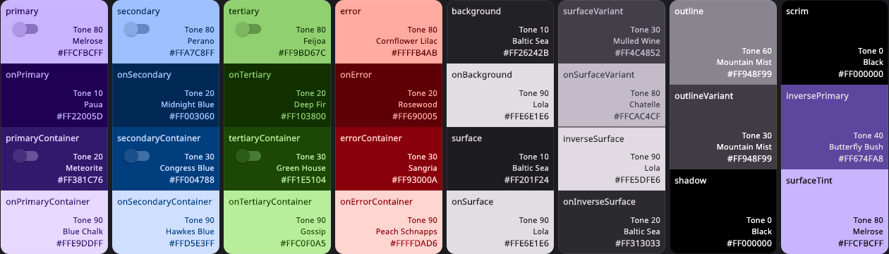
Using the above configuration the following core palettes are generated, in order from top to bottom:
- Primary tonal palette
- Secondary tonal palette
- Tertiary tonal palette
- Error tonal palette
- Neutral tonal palette
- Neutral variant tonal palette
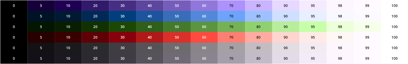
With the example FlexTones.vivid setup, the light ColorScheme is mapped as shown below:
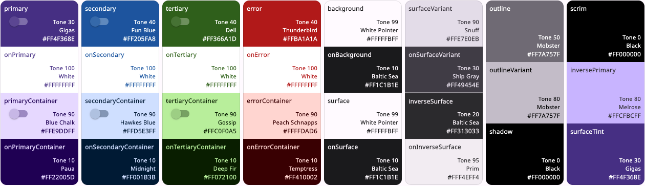
And the dark color scheme as:
Define ThemeData
In your MaterialApp you then define you light and dark mode themes using the seed
generated ColorSchemes just as you would with any other ColorScheme. For example:
  @override
    Widget build(BuildContext context) {
      return MaterialApp(
      debugShowCheckedModeBanner: false,
      title: 'SeedColorScheme.fromSeeds Demo',
      themeMode: ThemeMode.system,
      theme: ThemeData.from(
        colorScheme: schemeLight,
        useMaterial3: true,
      ),
      darkTheme: ThemeData.from(
        colorScheme: schemeDark,
        useMaterial3: true,
      ),
      home: HomePage(),
    );
  }
Override Color Values
All colors in the seed produced ColorScheme can be overridden by providing each ColorScheme
color property in SeedColorScheme.fromSeeds a given color value. This feature is equivalent to
ColorScheme.fromSeed.
This is typically used to assign a given color value to primary color, which is often used as app
brand color. When the brand color is used as primaryKey, and as a seed color, it typically does
not end up as the primary color in the seed generated ColorScheme. Having a given brand color as
primary color is often desired. The get the seed color as your primary brand color, assign the
color used as primaryKey to primary color as well.
    // Make a light ColorScheme from the seeds.
    final ColorScheme schemeLight = SeedColorScheme.fromSeeds(
      brightness: Brightness.light,
      // Use a "brand" seed color as primary color in the result.
      primary: primarySeedColor,
      //
      primaryKey: primarySeedColor,
      secondaryKey: secondarySeedColor,
      tertiaryKey: tertiarySeedColor,
      tones: FlexTones.vivid(Brightness.light),
    );
This strategy works well for the light mode ColorScheme, since the prominent brand color a company
has defined is typically intended to be printed on white paper. If you have secondary brand colors
that are to be used, using them as seeds for secondaryKey and tertiaryKey will work too.
How well they will fit and match the Material 3 color system needs if assigned to
secondary and tertiary directly as colors in SeedColorScheme.fromSeeds, will vary depending
on what colors they are.
Companies rarely have brand colors suited for good contrast in dark theme mode. in that case
prefer only using the same light mode brand colors as key colors to seed the dark mode
ColorScheme. If they do have dark mode specifications, and the colors are of same hue as
light mode, consider still using the light mode colors as seed source and only applying the
appropriate dark mode colors to primary, secondary and tertiary as needed.
If there is a spec that calls for completely different main colors in dark mode, using different
hues, then seeding from them and also setting primary, secondary and tertiary to these
color values is appropriate.
Accessibility
You can use FlexTones to create a seed generated ColorScheme, that is based on same colors
as your standard theme’s light and dark scheme colors, but uses a chroma configuration and tone
mapping setup that increases contrast further from standard light and dark theme setup.
There are two high contrast FlexTones configuration pre-made for this. They are called
FlexTones.highContrast colorful high contrast version, and FlexTones.ultraContrast a less
colorful version with more pure dark on light, and light ond dark result.
// Make a high contrast light ColorScheme from the seeds.
final ColorScheme schemeLightHc = SeedColorScheme.fromSeeds(
  brightness: Brightness.light,
  primaryKey: primarySeedColor,
  secondaryKey: secondarySeedColor,
  tertiaryKey: tertiarySeedColor,
tones: FlexTones.highContrast(Brightness.light),
);

// Make a ultra contrast dark ColorScheme from the seeds.
final ColorScheme schemeDarkHc = SeedColorScheme.fromSeeds(
  brightness: Brightness.dark,
  primaryKey: primarySeedColor,
  secondaryKey: secondarySeedColor,
  tertiaryKey: tertiarySeedColor,
  tones: FlexTones.ultraContrast(Brightness.dark),
);
If you then define equivalent ThemeData based on those schemes as your standard MaterialApp,
theme and darkTheme definitions, but assign them to highContrastTheme and
highContrastDarkTheme, you get more accessible themed colors that are based on same colors,
but with higher contrast, that are activated when users select high contrast theme in device
accessibility system settings.
      // Define accessibility high contrast versions using same color base.
      //
      highContrastTheme: ThemeData.from(
        colorScheme: schemeLightHc,
        useMaterial3: true,
      ),
      highContrastDarkTheme: ThemeData.from(
        colorScheme: schemeDarkHc,
        useMaterial3: true,
      ),
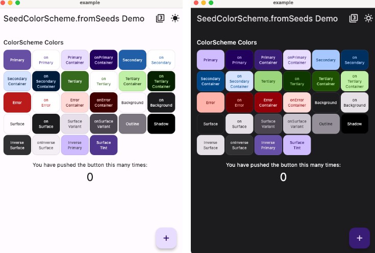
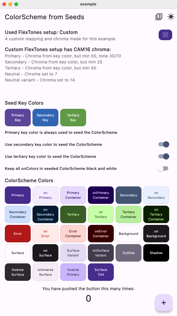
Example App
The included example app in light and dark theme mode using above color seeding and tone mapping.
| Light theme app | Dark theme app |
|---|---|
 |
 |