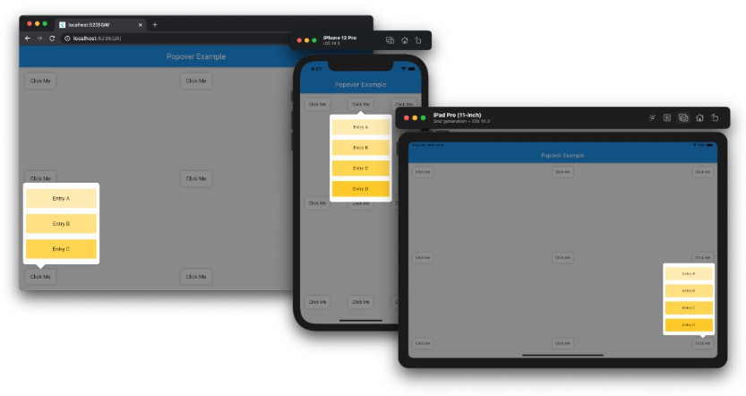
Popover
A popover is a transient view that appears above other content onscreen when you tap a control or in an area. Typically, a popover includes an arrow pointing to the location from which it emerged. Popovers can be nonmodal or modal. A nonmodal popover is dismissed by tapping another part of the screen or a button on the popover. A modal popover is dismissed by tapping a Cancel or other button on the popover.
Requirements
- Dart: 2.12.0+
- Flutter : 2.0.0+
Install
dependencies:
  popover: ^0.2.4
Example
See example/lib/main.dart.
import 'package:flutter/material.dart';
import 'package:popover/popover.dart';

class PopoverExample extends StatelessWidget {
  @override
  Widget build(BuildContext context) {
    return MaterialApp(
      home: Scaffold(
        appBar: AppBar(title: const Text('Popover Example')),
        body: const SafeArea(
          child: Padding(
            padding: EdgeInsets.all(16),
            child: Button(),
          ),
        ),
      ),
    );
  }
}

class Button extends StatelessWidget {
  const Button({Key key}) : super(key: key);

  @override
  Widget build(BuildContext context) {
    return Container(
      width: 80,
      height: 40,
      decoration: const BoxDecoration(
        color: Colors.white,
        borderRadius: BorderRadius.all(Radius.circular(5)),
        boxShadow: [BoxShadow(color: Colors.black26, blurRadius: 5)],
      ),
      child: GestureDetector(
        child: const Center(child: Text('Click Me')),
        onTap: () {
          showPopover(
            context: context,
            bodyBuilder: (context) => const ListItems(),
            onPop: () => print('Popover was popped!'),
            direction: PopoverDirection.top,
            width: 200,
            height: 400,
            arrowHeight: 15,
            arrowWidth: 30,
          );
        },
      ),
    );
  }
}

class ListItems extends StatelessWidget {
  const ListItems({Key key}) : super(key: key);

  @override
  Widget build(BuildContext context) {
    return Scrollbar(
      child: Padding(
        padding: const EdgeInsets.symmetric(vertical: 8),
        child: ListView(
          padding: const EdgeInsets.all(8),
          children: [
            InkWell(
              onTap: () {
                print('GestureDetector was called on Entry A');
                Navigator.of(context).pop();
              },
              child: Container(
                height: 50,
                color: Colors.amber[100],
                child: const Center(child: Text('Entry A')),
              ),
            ),
            const Divider(),
            Container(
              height: 50,
              color: Colors.amber[200],
              child: const Center(child: Text('Entry B')),
            ),
          ],
        ),
      ),
    );
  }
}
To see examples of the following package on a device or simulator:
cd example && flutter run