Pull-Down Button
pull_down_button is a rework of Flutter’s PopupMenuButton to be styled like Pop-Up & Pull-Down Buttons from iOS 14+ with some additional
customisation options.
Flutter availabilty:
Since this package uses new Flutter feature ThemeExtension for theming, minimum supported version is stable 3.0.0 or beta 2.13.0-0.
PullDownButton
PullDownButton is a widget used to show pull-down menu. Unlike PopupMenuButton, PullDownButton allows better customization of button that will be used to show pull-down menu via buttonBuilder builder function.
While pull-down menu is opened, button from where this menu was called will have lower opacity.
PullDownButton(
  itemBuilder: (context) => [
    PullDownMenuItem(
      title: 'Menu item',
      onTap: () => action(),
    ),
    const PullDownMenuDivider(),
    PullDownMenuItem(
      title: 'Menu item 2',
      onTap: () => action2(),
    ),
  ],
  position: PullDownMenuPosition.under,
  buttonBuilder: (context, showMenu) => CupertinoButton(
    onPressed: showMenu,
    padding: EdgeInsets.zero,
    child: const Icon(CupertinoIcons.ellipsis_circle),
  ),
);
| Parameters | Description | Value |
|---|---|---|
| itemBuilder | Called when the button is pressed to create the items to show in the menu. | required |
| buttonBuilder | Builder that provides BuildContext as well as showMenu function to pass to any custom button widget. |
required |
| onCanceled | Called when the user dismisses the pull-down menu. | optional |
| offset | The offset is applied relative to the initial position set by the position. |
Offset.zero |
| position | Whether the popup menu is positioned over or under the popup menu button. | PullDownMenuPosition.above |
| backgroundColor | The background color of pull-down menu. | optional |
backgroundColor usually has opacity in range of 0.7-0.8 so that menu has blur effect.
PullDownMenuPosition
The way PullDownButton positions its pull-down menu.
Available options:
- over
- under
- above
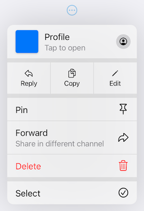
PullDownMenuItem
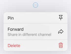
PullDownMenuItem is a widget used to create cupertino style pull-down menu item.
PullDownMenuItem(
  title: 'Add to favourites',
  onTap: () => action(),
  icon: CupertinoIcons.star,
),
| Parameters | Description | Value |
|---|---|---|
| onTap | Called when the menu item is tapped. | required |
| enabled | Whether the user is permitted to tap this item. | true |
| title | Title of this PullDownMenuItem. |
required |
| icon | Trailing icon of this PullDownMenuItem. |
optional |
| isDestructive | Whether this item represents destructive action. | false |
| iconSize | Size of trailing icon. | optional |
| textStyle | Title text style. | optional |
| destructiveColor | Color for destructive action. | optional |
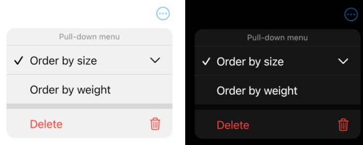
SelectablePullDownMenuItem
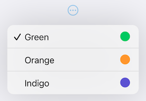
SelectablePullDownMenuItem is a widget used to create cupertino style pull-down menu item with selection state.
SelectablePullDownMenuItem(
  title: 'Order by size',
  selected: true,
  onTap: () => action(),
  icon: CupertinoIcons.chevron_down,
),
Note:
Based on guidelines, if menu items contains at least one tappable menu item of type SelectablePullDownMenuItem all of PullDownMenuItems should also be of type SelectablePullDownMenuItem (to insert additional padding so all items have same). Although, manual change of all PullDownMenuItems is not needed, it is done automatically.
SelectablePullDownMenuItem uses all of PullDownMenuItem parameters as well as a few SelectablePullDownMenuItem specific:
| Parameters | Description | Value |
|---|---|---|
| selected | Whether to display a checkmark next to the menu item. | false |
| checkmark | Checkmark icon. | optional |
| checkmarkWeight | Weight of checkmark icon. | optional |
| checkmarkSize | Size of checkmark icon | optional |
PullDownMenuDivider
PullDownMenuDivider is a widget used to create cupertino style pull-down menu divider (small or large).
const PullDownMenuDivider(),
or to create large divider:
const PullDownMenuDivider.large(),
There is also convenience method to wrap multiple menu items with small dividers:
...PullDownMenuDivider.wrapWithDivider([
  PullDownMenuItem(
    title: 'Menu item',
    onTap: () => action(),
  ),
  PullDownMenuItem(
    title: 'Menu item 2',
    onTap: () => action2(),
  ),
]),
| Parameters | Description | Value |
|---|---|---|
| dividerColor | Small divider color. | optional |
| largeDividerColor | Large divider color. | optional |
largeDividerColor is usually lighter than dividerColor.
PullDownMenuTitle
PullDownMenuTitle is a widget used to create cupertino style pull-down menu title (usually at the top of menu).
const PullDownMenuTitle(title: Text('Pull-down menu')),
| Parameters | Description | Value |
|---|---|---|
| title | Title widget. | required |
| titleStyle | Title widget style. | optional |
Theming
This package also provides additional customisation. By default, iOS15 theme is used, but it is also possible to override defaults with widget parameters (see above) or with PullDownButtonTheme theme extension.
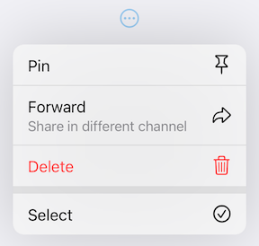
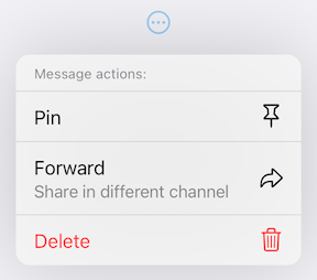
Default theme
| Light Theme | Dark Theme |
|---|---|
|
 |
PullDownButtonTheme
Usage
To use PullDownButtonTheme define it in your ThemeData as follows, PullDownButton will automatically used if defined:
ThemeData(
  ...,
  extensions: [
    PullDownButtonTheme(
      backgroundColor: Colors.grey,
      iconSize: 24,
      dividerColor: Colors.black,
    ),
  ],
),
| Parameters | Description | Value |
|---|---|---|
| backgroundColor | The background color of pull-down menu. | optional |
| dividerColor | Small divider color. | optional |
| largeDividerColor | Large divider color. | optional |
| destructiveColor | Color for destructive action. | optional |
| iconSize | Size of trailing icon. | optional |
| checkmark | Checkmark icon. | optional |
| checkmarkWeight | Weight of checkmark icon. | optional |
| checkmarkSize | Size of checkmark icon | optional |
| textStyle | Title text style. | optional |
| titleStyle | Title widget style. | optional |
backgroundColor usually has opacity in range of 0.7-0.8 so that menu has blur effect.
largeDividerColor is usually lighter than dividerColor.
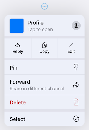
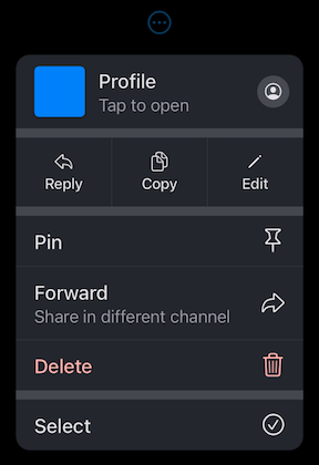
Here is example of using PullDownButtonTheme with Material 3 color scheme colors & text styles from Material 3 Menu specs.
| Custom Material 3 light theme | Custom Material 3 dark theme |
|---|---|
 |
 |
Contributions
Feel free to contribute to this project.
Please file feature requests and bugs at the issue tracker.
If you fixed a bug or implemented a feature by yourself, feel free to send a pull request.