Day Picker
A Flutter widget library which helps us to select days in a week.
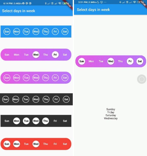
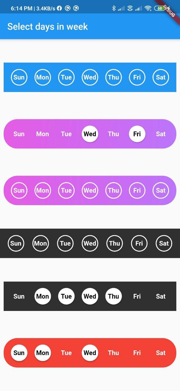
Screenshot
Usage
Add day_picker to your pubspec.yaml file.
    flutter:
      sdk: flutter
    day_picker: 1.0.1
import the package:
import 'package:day_picker/day_picker.dart';
Constructor for the day_picker is given below.
    SelectWeekDays({
    @required this.onSelect,
    this.backgroundColor,
    this.daysFillColor,
    this.daysBorderColor,
    this.selectedDayTextColor,
    this.unSelectedDayTextColor,
    this.border = true,
    this.boxDecoration,
    this.padding = 8.0,
    Key key,
  })  : assert(onSelect != null),
        super(key: key);
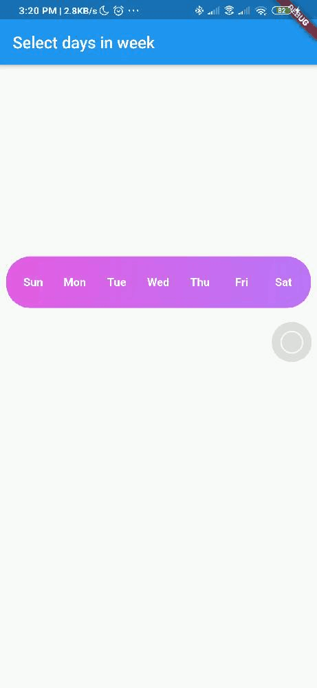
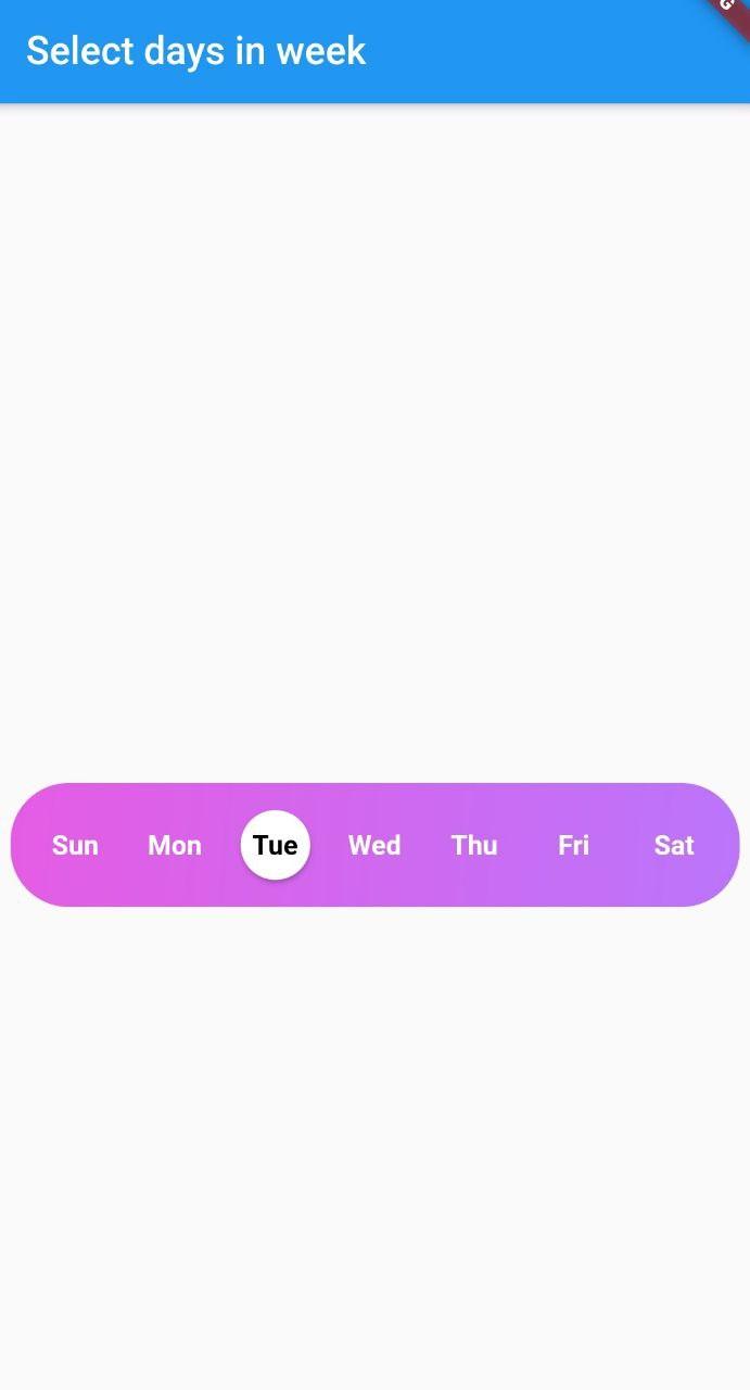
Example here creates a day_picker with below style [with Gradient and no borders].
  @override
  Widget build(BuildContext context) {
    return Scaffold(
      appBar: AppBar(
        title: Text("Select days in week"),
      ),
      body: Center(
        child: Padding(
          padding: const EdgeInsets.all(8.0),
          child: SelectWeekDays(
            border: false,
            boxDecoration: BoxDecoration(
              borderRadius: BorderRadius.circular(30.0),
              gradient: LinearGradient(
                begin: Alignment.topLeft,
                colors: [const Color(0xFFE55CE4), const Color(0xFFBB75FB)],
                tileMode:
                    TileMode.repeated, // repeats the gradient over the canvas
              ),
            ),
            onSelect: (values) { // <== Callback to handle the selected days
                print(values);
            },
          ),
        ),
      ),
    );
Pass a callback to the onSelect property with parameter of type List<String>.
Example:
void handleOnSelect(List<String> value){
    //TODO: Manipulate the List of days selected
    print(value);
}
Customization
| Property | Type | Description |
|---|---|---|
| onSelect | List<String> |
Callback invoked when days are selected |
| padding | double |
Padding between container and the buttons [by default it is 8.0] |
| boxdecoration | BoxDecoration |
provides variety of ways to style the background container[gradient, color, border radius] |
| backgroundColor | Color |
Property to change the color of the container |
| daysFillColor | Color |
Property to change the color of rounded buttons when the days are selected |
| daysBorderColor | Color |
Property to change the border color of rounded button |
| selectedDayTextColor | Color |
property to change the text color of the selected days |
| unSelectedDayTextColor | Color |
property to change the text color when the days are not selected |
| border | bool |
Set this property to false if border is not needed around the rounded buttons[by default this property will be true] |
Contributions
Contributions of any kind are more than welcome?! Feel free to fork and improve day_picker or open an issue.