search_field_autocomplete is a Flutter package that provides a customizable search field with autocomplete suggestions. It is designed to make it easy to implement autocomplete functionality in your Flutter applications.

Features
- Display autocomplete suggestions as the user types.
- Customize the appearance of the suggestion list.
- Control the number of suggestions displayed in the viewport.
- Support for iOS-style search fields (Cupertino) and Material Design search fields.
- Customize sorting and filtering of suggestions.
- Optional scrollbar for long suggestion lists.
- Callbacks for handling user interactions with suggestions.
- Highly customizable with various styling options.
Usage
import the package in your Dart code:
import 'package:search_field_autocomplete/search_field_autocomplete.dart';
SearchFieldAutoComplete<String>(
      suggestions: [
        SearchFieldAutoCompleteItem<String>('Apple', item: 'apple'),
        SearchFieldAutoCompleteItem<String>('Banana', item: 'banana'),
        SearchFieldAutoCompleteItem<String>('Cherry', item: 'cherry'),
        SearchFieldAutoCompleteItem<String>('Date', item: 'date'),
        SearchFieldAutoCompleteItem<String>('Fig', item: 'fig'),
      ],
      onSuggestionSelected: (value) {
        // Handle the selected suggestion
        print('Selected: $value');
      },
);
- For more details and examples, see:
- Example 1
Important Parameters
focusNode
- The [FocusNode] for managing the focus of the search field.
suggestions
- A list of suggestions for the SearchFieldAutoComplete. Each suggestion should have a unique searchKey.
sorter
-
A custom sorter function for sorting search suggestions. This function is responsible for sorting and filtering the search suggestions based on the user’s input. The [sorter] function takes two parameters:
-
[value]: A string representing the user’s input.
-
[suggestions]: A list of [SearchFieldAutoCompleteItem] representing the search suggestions. The function should return a sorted list of suggestions based on the provided [value].
-
The function should return a sorted list of suggestions based on the provided [value].
  SearchFieldAutoComplete<T>(
  sorter: (query, suggestions) {
    // You can customize the sorting logic here.
    // Sort and filter suggestions based on 'value'.
    // Return the sorted list of suggestions.
  },
)
-
For more details and examples, see:
itemHeight
- The height of each suggestion item in the list.
maxSuggestionsInViewPort
- The number of suggestions to display in the viewport. Defaults to 5, but adapts if suggestions are fewer.
controller
- The TextEditingController for the SearchFieldAutoComplete.
inputType
- The keyboard type for the search field.
offset
- The offset for the suggestion list from the SearchFieldAutoComplete.
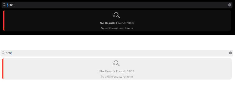
emptyBuilder
- The widget to display when the search returns empty results.
- when retrieve ‘null’ will display –> DefaultEmptySuggestionsWidget.


-
Messages
noResultFoundandtry Different Search termwill be displayed in different languages based on the user’s locale. -
For more details and examples, see:
autoCorrect
- Controls whether to enable auto-correction, defaults to
true.
suggestionDirection
- The direction in which suggestions appear, defaults to [SuggestionDirection.down].
suffixIcon
- An optional suffix icon to be displayed on the right side of the [TextField].
onSuffixTap
- A callback function that is triggered when the [suffixIcon] is tapped.
suffixInsets
- Insets to apply to the [suffixIcon]. You can use this to control the spacing around the [suffixIcon].
searchStyle
- The [TextStyle] for the search input.
suggestionStyle
- The [TextStyle] for suggestions when no child is provided.
suggestionState
- The state of suggestions, defaults to SuggestionState.expand.
suggestionAction
- The action to perform when a suggestion is tapped.
suggestionsDecoration
- The decoration for the suggestion list, including properties like [BoxShadow].
suggestionItemBuilder
-This property allows you to provide a function that builds and customizes widget of each suggestion item in the list. The function provides two parameters.
onSuggestionSelected
- A callback function when a suggestion is tapped.
enabled
- A flag to enable or disable the SearchFieldAutoComplete.
onSubmitted
- A callback function when the SearchFieldAutoComplete is submitted.
onChanged
- A callback function when the SearchFieldAutoComplete is changed.
onTap
- A callback function when the SearchFieldAutoComplete is tapped.
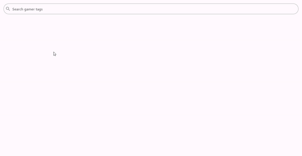
placeholder
- The hint text displayed in the search field.
initialValue
- The initial value to be selected for the SearchFieldAutoComplete. It must be present in [suggestions].
scrollbarProperties
- Represents optional properties for a scrollbar.
Example
For a more detailed example of how to use this package, check out the example directory in this repository.
Contributing
Contributions are welcome! If you encounter any issues or have suggestions for improvements, please open an issue or create a pull request on GitHub.
License
This package is licensed under the MIT License – see the LICENSE file for details.