Feature Notifier
Notify your users of new features within your app after an update.
What this package offers?
- Display notifications about new features.
- Once a notification is closed by the user, it won’t come up again except you programatically persist it.
- Create your custom notification by accessing methods that let you persist and change the state of your custom notification based on user interactions.
Example Gallery
 |
 |
|---|---|
 |
 |
Usage
Add it to your package’s pubspec.yaml file
feature_notifier: latest
import feature notifier into your code
import 'package:feature_notifier/feature_notifier.dart';
Initialize
Initialize and await feature notifier in your main() function by calling FeatureNotifier.init(). Not doing this can cause side effects that might tamper with expected behaviour.
void main() async {
  await FeatureNotifier.init();
  runApp(const MyApp());
}
Feature Notifiers
There are four(4) unique and highly customizable feature notifiers available in this package with slightly different implementations.
1. Bar Notifier
Returns a simple and customizable horizontal bar.
FeatureBarNotifier(
  title: "We just released a new feature!",
  featureKey: 2,
  onClose: () {},
  onTapCard: () {},
  showIcon: true,
)
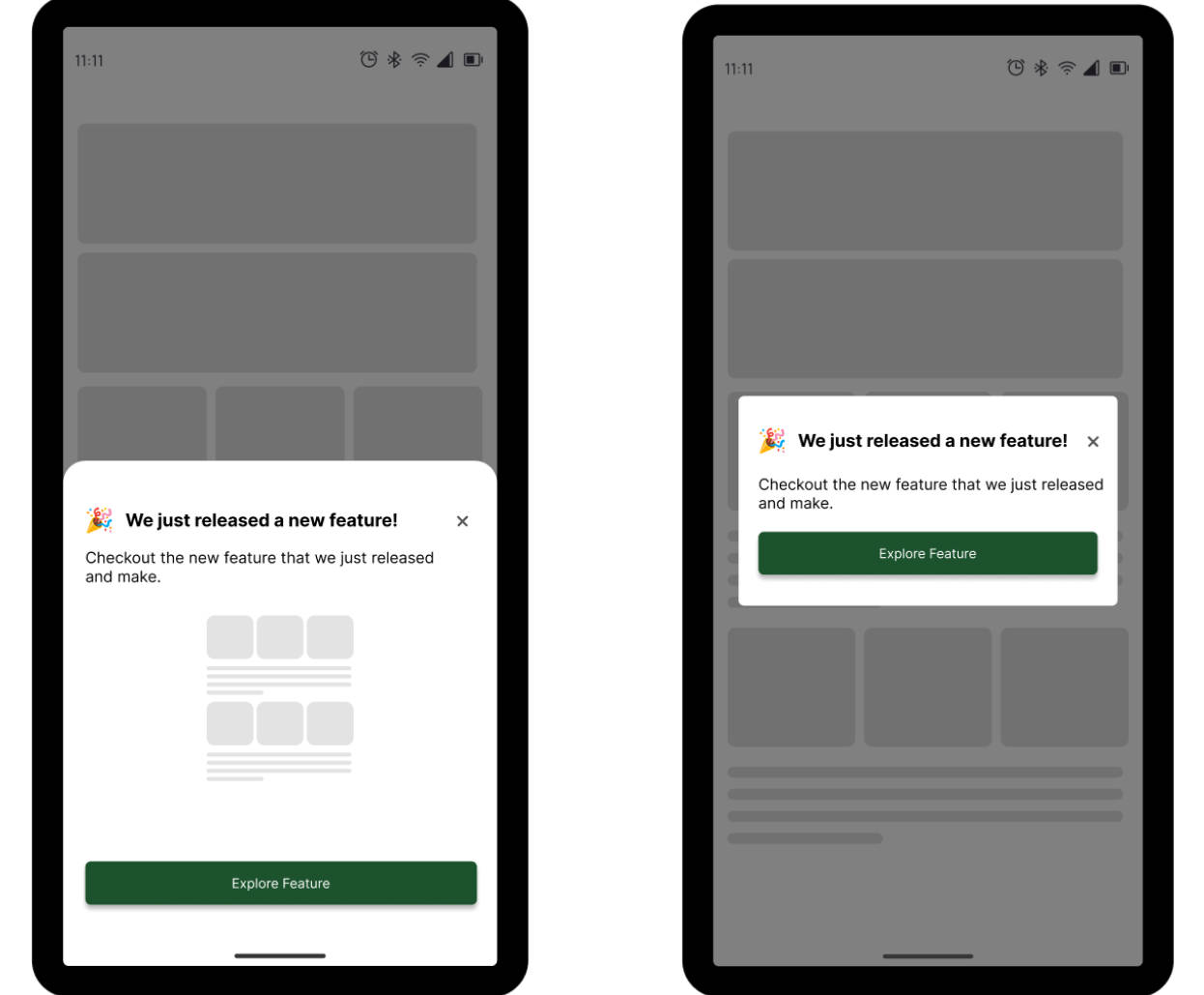
2. Card Notifier
Returns a simple and customizable Card
FeatureCardNotifier(
  title: "We just released a new feature!",
  description: "Checkout the nwq feature that we just released and make."
  featureKey: 2,
  onClose: () {},
  onTapCard: () {},
  showIcon: true,
  //use the hasButton parameter to display a button
  hasButton:true,
)
3. Alert Dialog Notifier
Returns a simple and customizable alert dialog.
FeatureAlertNotifier.notify(
  context,
  title: "We just released a new feature!",
  description: "Checkout the nwq feature that we just released and make."
  onClose: () {},
  featureKey: 3,
  hasButton: true,
);
A common use-case for the alert dialog notifier to be shown is when a screen has completed its build and marked has built. Hence, you will need to access the WidgetsBinding.instance.addPostFrameCallback() callback method within the initState() of your stateful widget to evoke the notify() method on the FeatureAlertNotifier.
void initState() {
  super.initState();
  WidgetsBinding.instance.addPostFrameCallback((_) {
    print("Build Completed");
    FeatureAlertNotifier.notify(
      context,
      title: "We just released a new feature!",
      description: "Checkout the nwq feature that we just released and make."
      onClose: () {},
      featureKey: 3,
      hasButton: true,
    );
  });
}
4. Bottom Modal Sheet Notifier

Returns a simple and customizable bottom modal sheet.
FeatureBottomModalSheetNotifier.notify(
  context,
  title: "We just released a new feature!",
  description: "Checkout the nwq feature that we just released and make."
  onClose: () {},
  featureKey: 3,
  hasButton: true,
);
Just as with the alert dialog notifier, common use-case for the alert notifier to be shown is when a screen has completed it build and marked has built. Hence, you will need to access the WidgetsBinding.instance.addPostFrameCallback() callback method within the initState() of your stateful widget to evoke the notify() method of the FeatureAlertNotifier.
void initState() {
  super.initState();
  WidgetsBinding.instance.addPostFrameCallback((_) {
    print("Build Completed");
    FeatureBottomModalSheetNotifier.notify(
      context,
      title: "Alert Notifier",
      description: "Modal sheet is a good way to display a feature",
      onClose: () {},
      featureKey: 3,
      hasButton: true,
    );
  });
}
Creating Custom Notifier
The feature notifier package offers out of the box methods that allow you to create your custom notifications and manipulate state.
The following methods are handy for creating a custom notifier UI along with its persisting functionality.
-
FeatureNotifier.close()Closes your custom Feature Notifier widget. To update the state and remove the currently displayed widget from the widget tree, you need to use the
FeatureNotifier.isClosed()method which returns a bool, to read the value of your currently displayed or closed feature notifier, and show or hide your custom widget accordingly. -
FeatureNotifier.isClosed()Checks whether a particular feature notifier (custom or not) has been closed.
This is helpful when you want to update the state of your UI to show or hide a custom feature notifier that is opened (
isClosed() is false) or has been closed (isClosed() is true) respectively. -
FeatureNotifier.persist()Keeps a particular feature notifier alive after it has been previously closed. It does this by accepting the
featureKeyas a parameter so that the particular feature can be uniquely identified. Call this method when you want to reset theisClosed()value tofalse. This is useful when you want to choose to display a feature notifier after a new login, which means that this method has to be called when the user logs out so that it can be persisted. -
FeatureNotifier.persistAll()Keeps all feature notifiers alive after they have been previously closed.. Call this method when you want to reset the
isClosed()value tofalsefor all the feature notifiers. This is useful when you want to choose to display all feature notifiers after a new login, which means that this method has to be called when the user logs out so that all values can be persisted/reset. To persist a single feature notifier, use theFeatureNotifier.persist()and pass in thefeatureKeyto identify the feature to be persisted.
Parameters
Here is a list of parameters that you can use to customize your feature notifier classes and methods.
 int featureKey; /// to uniquely identify a feature
 String title;
 Color? titleColor;
 double? titleFontSize;
 String description;
 Color? descriptionColor;
 double? descriptionFontSize;
 String? buttonText;
 Color? buttonTextColor;
 double? buttonTextFontSize;
 Color? buttonBackgroundColor;
 Widget? icon;
 bool? showIcon;
 void Function() onClose;
 void Function()? onTapButton;
 Color? backgroundColor;
Color? strokeColor;
 double? strokeWidth;
 void Function() onTapCard;
 bool? hasButton;
Contribution
Of course the project is open source, and you can contribute to it repository link
- If you found a bug, open an issue.
- If you have a feature request, open an issue.
- If you want to contribute, submit a pull request.