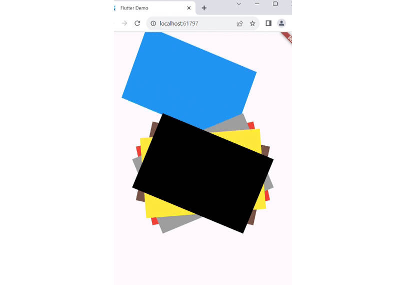
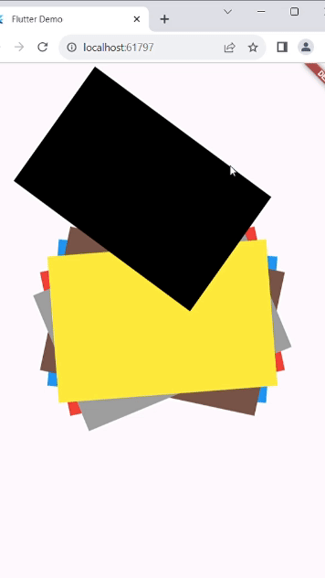
Polaroid Carousel
A unique Flutter package for creating a polaroid-style carousel with item animations that slide from front to back or back to front. Add a touch of nostalgia to your Flutter app by using this package to display your content in a fun and interactive way.
Features
- Front-to-back and back-to-front item sliding animations using order property.
- Customizable carousel item rotation (x,y,z) and translation direction (left,right,top,bottom).
- Smooth animation curves for a delightful user experience.
Installation
To use this package, follow these steps:
- Add the latest version of the package to your
pubspec.yamlfile and rundart pub get:
   dependencies:
     polaroid_carousel: ^1.0.0
- Import the package in your Dart code and use it in your Flutter app:
import 'package:polaroid_carousel/polaroid_carousel.dart';
Usage
Here’s an example of how to use the PolaroidCarousel widget in your Flutter application:
- This widget accepts a list of widgets and displays them in animation. If you desire a specific rotation for each item, wrap each child with a transform and specify the desired rotation angle using rotateZ() like in Example.
class Example extends StatelessWidget {
  const Example({Key? key}) : super(key: key);

  @override
  Widget build(BuildContext context) {
    List<Widget> list = [
      Container(
        height: 200,
        width: 300,
        color: Colors.black,
      ),
      Container(
        height: 200,
        width: 300,
        color: Colors.blue,
      ),
      Container(
        height: 200,
        width: 300,
        color: Colors.brown,
      ),
      Container(
        height: 200,
        width: 300,
        color: Colors.red,
      ),
      Container(
        height: 200,
        width: 300,
        color: Colors.grey,
      ),
      Container(
        height: 200,
        width: 300,
        color: Colors.yellow,
      ),
    ];

    return Scaffold(
      body: Center(
          child: PolaroidCarousel(
          //these to property are necessary

          // value to which list item translate
          // advice : if the children are rotated like the example and you are not able to specify the translateFactor
          // then the max translateFactor should be √((childHeight^2, childWidth^2)) of child with maximum size
          //but try to adjust translateFactor according to your need
          translateFactor: 360,

          children: list,

          // these properties are optional

          // duration: const Duration(seconds: 1),
          // rotate: const Rotate(x: 0.001,y: 0.02,z: 0.001),
          // curve: Curves.easeInOut,
          // order: Order.frontToBack,
          // translate: Translate.top,
          ),
      ),
    );
  }
}
Examples
Check out the Example for different use cases and ideas on how to use the PolaroidCarousel widget in your app.
Detail Explanation
You can find the full article on this package on Medium.
Contributing
If you find a bug or have a feature request, please open an issue. Contributions are welcome!
License
This package is licensed under the MIT License. See the LICENSE file for details.