flutter_button
Flutter Custom, Text, 3D, Social media button's package.
flutter_button extension contains:
- 3D Button,
- Anime Press Button, Hover Button, Like Button, Opacity Button
- Custom FAB, Star FAB.
- Facebook Auth Button, Circle FB Auth Button, Magical FB Auth Button, Google Auth Button, Circle GG Auth Button, Magical GG Auth Button, Github Auth Button, Circle GI Auth Button, Magical Gi Auth Button, Twitter Auth Button, Circle TW Auth Button, Magical TW Auth Button,
- Text Button, Gradient Text Button.
Installation and Usage.
add this line on the pubspec.yaml
dependencies:
  ...
  flutter_button: ^0.0.2
OKI let's start using flutter_button ?
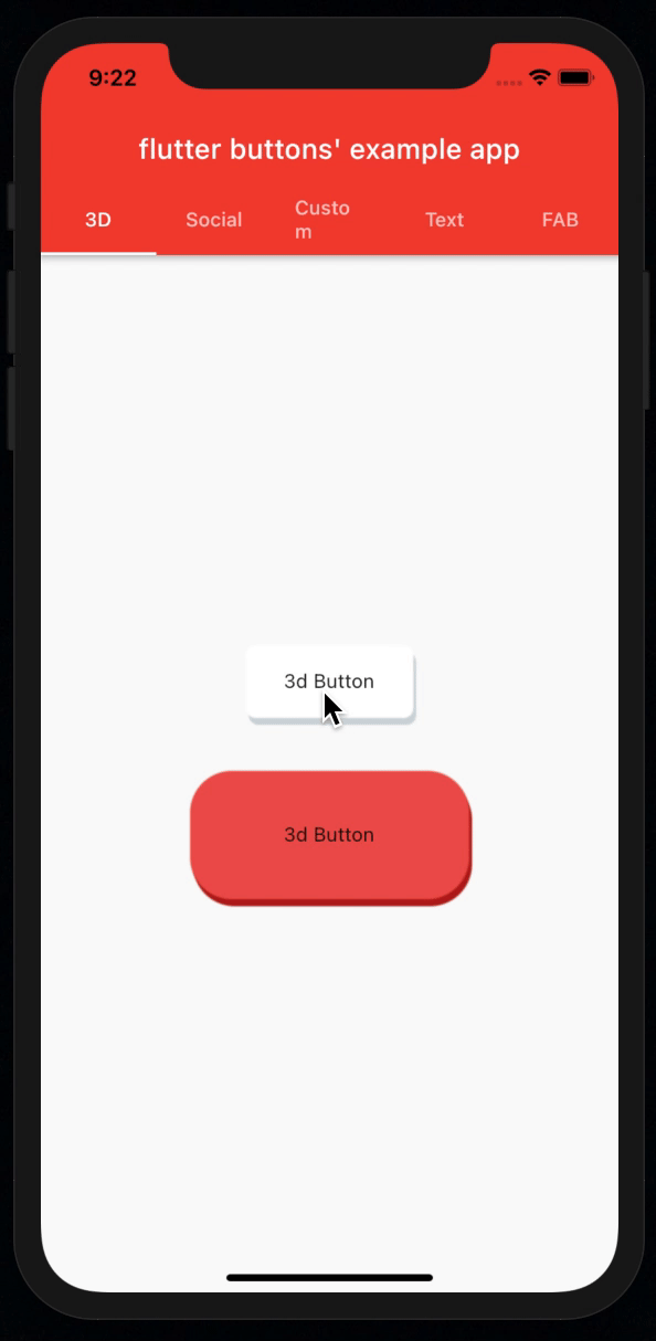
? 3D Button usage
Default Mode
import 'package:flutter_button/3d/3d_button.dart';

Button3D(
 onPressed: () {},
 child: Text("3d Button"),
),
3D Buttons With the custom properties
import 'package:flutter_button/3d/3d_button.dart';

 Button3D(
 style: StyleOf3dButton(
    backColor: Colors.red[900],
    topColor: Colors.red[400],
    borderRadius: BorderRadius.circular(30),
 ),
  height: 100,
  width: 200,
  onPressed: () {},
  child: Text("3d Button"),
),
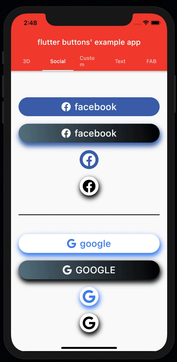
⚛︎ Social Auth Buttons
Default Mode of facebook auth button
import 'package:flutter_button/social/facebook_auth_button.dart';

 FacebookAuthButton(
  onTap: () {},
  borderRadius: BorderRadius.circular(30),
),
Facebook Auth Button with custom properties
import 'package:flutter_button/social/facebook_auth_button.dart';

FacebookAuthButton(
 onTap: () {},
 wGradientColors: true,
 wOpacity: true,
 borderRadius: BorderRadius.circular(30),
 opacityValue: .4,
 gradientColors: [
  Colors.black,
  Colors.blueGrey,
],
shadows: [
  BoxShadow(
   spreadRadius: 1.5,
   blurRadius: 10,
   offset: Offset(2, 8),
   color: Colors.black,
  ),
 ],
)   ,
Default Mode of Google Auth Button
import 'package:flutter_button/social/google_auth_button.dart';

GoogleAuthButton(
 onTap: () {},
 borderRadius: BorderRadius.circular(30),
 shadows: [
   BoxShadow(
    spreadRadius: 1.5,
    blurRadius: 10,
    offset: Offset(2, 7),
    color: Color(0xff4285F4),
 ),
]
,),
Google Auth Button with custom properties
import 'package:flutter_button/social/google_auth_button.dart';

GoogleAuthButton(
 onTap: () {},
 wGradientColors: true,
 wOpacity: true,
 upperCasedTitle: true,
 iconColor: Colors.white,
 titleColor: Colors.white,
 borderRadius: BorderRadius.circular(30),
 opacityValue: .5,
 gradientColors: [
   Colors.black,
   Colors.blueGrey,
 ],
 shadows: [
   BoxShadow(
    spreadRadius: 1.5,
    blurRadius: 10,
    offset: Offset(2, 7),
    color: Color(0xff4285F4),
  ),
 ]
),
Default Mode of github auth button
import 'package:flutter_button/social/github_auth_button.dart';

GithubAuthButton(
 borderRadius: BorderRadius.circular(30),
 onTap: () {},
),
Github Auth Button with custom properties
import 'package:flutter_button/social/github_auth_button.dart';

GithubAuthButton(
 onTap: () {},
 wGradientColors: true,
 wOpacity: true,
 iconColor: Colors.black,
 titleColor: Colors.black,
 iconSize: 30,
 borderRadius: BorderRadius.circular(30),
 opacityValue: .4,
 gradientColors: [
  Colors.white,
  Colors.white,
 ],
 shadows: [
    BoxShadow(
      spreadRadius: 1.5,
      blurRadius: 10,
      offset: Offset(0.5, 6),
      color: Colors.black,
    ),
  ],
),
Default Mode of Twitter auth button
import 'package:flutter_button/social/twitter_auth_button.dart';

TwitterAuthButton(
  borderRadius: BorderRadius.circular(30),
  onTap: () {},
),
Twitter Auth Button with custom properties
import 'package:flutter_button/social/twitter_auth_button.dart';

TwitterAuthButton(
  onTap: () {},
  wGradientColors: true,
  wOpacity: true,
  iconColor: Colors.black,
  titleColor: Colors.black,
  iconSize: 30,
  borderRadius: BorderRadius.circular(30),
  opacityValue: .4,
  gradientColors: [
    Colors.white,
    Colors.white,
  ],
  shadows: [
    BoxShadow(
      spreadRadius: 1.5,
      blurRadius: 10,
      offset: Offset(0.5, 6),
      color: Colors.black,
    ),
   ],
),
Circular Auth Buttons
import 'package:flutter_button/social/facebook_auth_button.dart';

CircularFBAuthButton(
  borderRadius: BorderRadius.circular(30),
  onTap: () {},
  shadows: [
    BoxShadow(
     spreadRadius: 1.5,
     blurRadius: 10,
     offset: Offset(2, 6),
     color: Colors.black,
    ),
  ],
),
import 'package:flutter_button/social/google_auth_button.dart';

CircularGGAuthButton(
  borderRadius: BorderRadius.circular(30),
  onTap: () {},
  shadows: [
    BoxShadow(
     spreadRadius: 1.5,
     blurRadius: 10,
     offset: Offset(2, 6),
     color: Color(0xff4285F4),
    ),
  ],
),
Github
import 'package:flutter_button/social/github_auth_button.dart';

CircularGIAuthButton(
  backgorundColor: Colors.white,
  opacityValue: .7,
  wOpacity: true,
  wBorder: true,
  iconColor: Colors.black,
  shadows: [
    BoxShadow(
      spreadRadius: 1,
      blurRadius: 10,
      offset: Offset(0.5, 3),
      color: Colors.black,
    ),
  ],
  borderRadius: BorderRadius.circular(30),
  onTap: () {},
),
import 'package:flutter_button/social/twitter_auth_button.dart';

 CircularTWAuthButton(
  borderRadius: BorderRadius.circular(30),
  onTap: () {},
  wOpacity: true,
),
// you of course can customize for yourself this button button i like this button with the default style
Magical Auth Buttons
import 'package:flutter_button/social/facebook_auth_button.dart';

MagicalFBButton(
  title: "Sign In With Facebook",
  opacityValue: .5,
  onTap: () {},
),
import 'package:flutter_button/social/google_auth_button.dart';

MagicalGGButton(
  title: "Sign In With Google",
  opacityValue: .5,
  onTap: () {},
),
Github
import 'package:flutter_button/social/github_auth_button.dart';

MagicalGIButton(
 title: "Sign In With Google",
 opacityValue: .5,
 onTap: () {},
),
import 'package:flutter_button/social/twitter_auth_button.dart';

MagicalTWButton(
 title: "Sign In With Twitter",
 opacityValue: .5,
 onTap: () {},
),
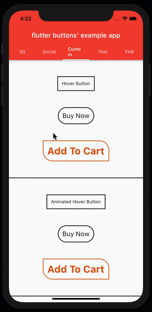
? Custom Buttons: Hover, like, Opacity, Animation, Insta doubletap like...
? Hover Button:
Default mode
import 'package:flutter_button/custom/hover_button.dart';

HoverButton(
  title: "Hover Button",
  onTap: () {},
),
All properties used version
import 'package:flutter_button/custom/hover_button.dart';

HoverButton(
  onTap: () {},
  title: "Add To Cart",
  titleSize: 30,
  titleColor: Colors.orange[900],
  spashColor: Colors.yellow,
  tappedTitleColor: Colors.black,
  fontWeight: FontWeight.bold,
  borderColor: Colors.orange[900],
  borderRadius: BorderRadius.only(
  bottomLeft: Radius.circular(30),
  topRight: Radius.circular(30),
 ),
),
? Animated Hover Button:
Default mode
import 'package:flutter_button/custom/hover_button.dart';

AnimatedHoverButton(
  title: "Animated Hover Button",
  onTap: () {},
),
All properties used version
import 'package:flutter_button/custom/hover_button.dart';

AnimatedHoverButton(
 onTap: () {},
 title: "Add To Cart",
 titleSize: 30,
 duration: Duration(milliseconds: 500),
 titleColor: Colors.orange[900],
 spashColor: Colors.yellow,
 tappedTitleColor: Colors.black,
 fontWeight: FontWeight.bold,
 borderColor: Colors.orange[900],
 borderRadius: BorderRadius.only(
  bottomLeft: Radius.circular(30),
  topRight: Radius.circular(30),
 ),
),
❤️ Like Button:
Default mode
import 'package:flutter_button/custom/like_button.dart';

LikeButton(
  onTap: () {},
),
All properties used version
import 'package:flutter_button/custom/like_button.dart';

LikeButton(
  icon: Icons.home,
  deactiveColor: Colors.grey,
  activeColor: Colors.purple,
  deactiveSize: 50,
  activeSize: 55,
  curve: Curves.easeInExpo,
  onTap: () {},
),
? Opacity Button:
import 'package:flutter_button/custom/opacity_button.dart';

OpacityButton(
  onTap: () {},
  opacityValue: .3,
  child: Image.network(
    'https://picsum.photos/id/1/200/300',
    height: 60,
  ),
),
⭐️ Animation Button:
import 'package:flutter_button/custom/anime_press_button.dart';

AnimePressButton(
  borderRadius: BorderRadius.circular(100),
  color: Colors.red,
  wGradient: true,
  gradientColors: [
    Colors.pink,
    Colors.purpleAccent,
  ],
  title: "Animation Button",
  titleColor: Colors.white,
),
❤️ Insta DoubleTap Love Button:
Default Usage
import 'package:flutter_button/custom/insta_love_button.dart';

InstaLoveButton(
  image: NetworkImage("https://picsum.photos/200/300"),
  onTap: () {},
),
All Properties used mode and with asset's image
import 'package:flutter_button/custom/insta_love_button.dart';

InstaLoveButton(
  iconColor: Colors.red,
  icon: Icons.favorite_border,
  size: 80,
  height: 250,
  //width: MediaQuery.of(context).size.width,
  curve: Curves.bounceInOut,
  duration: Duration(seconds: 1),
  image: AssetImage("assets/photo.png"),
  //image: NetworkImage("https://picsum.photos/200/300"),
  onTap: () {},
),
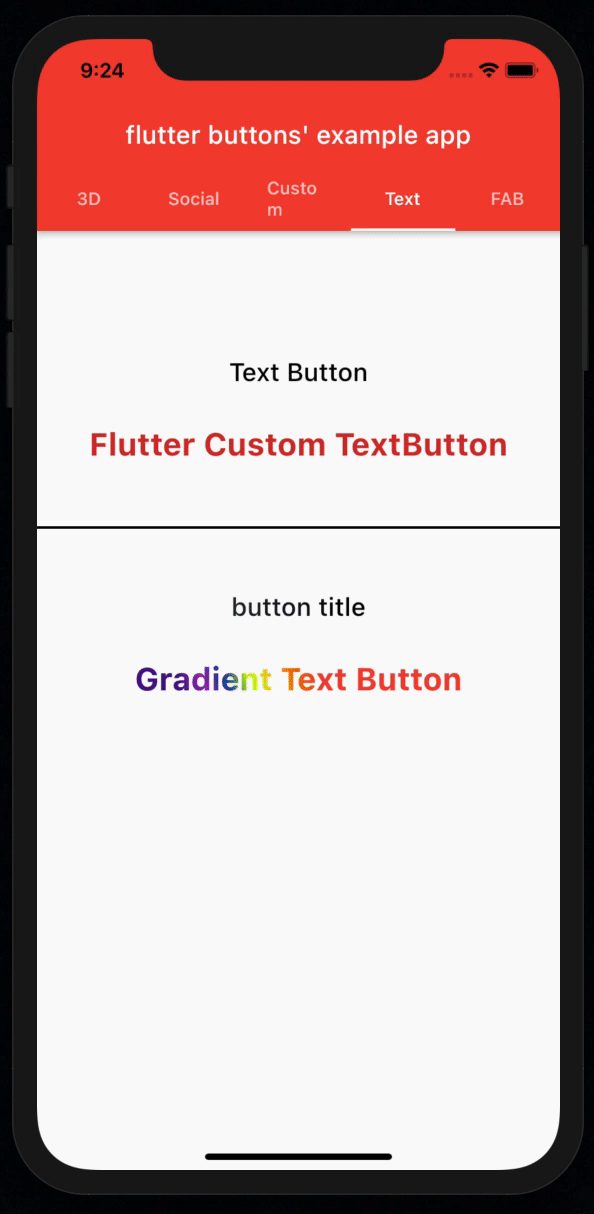
? Text Buttons
Normal Text Button:
import 'package:flutter_button/text/text_button.dart';

FlutterTextButton(
  onTap: () {},
  title: "Flutter Normal TextButton",
  defaultSize: 25,
  textAlign: TextAlign.center,
  pressedSize: 22,
  color: Colors.red[700],
  fontWeight: FontWeight.bold,
  // [locale:] Whathever you want
  // [fontFamily:] type your fontFamily
),
?️? Gradient text button:
import 'package:flutter_button/text/gradient_text_button.dart';

GradientTextButton(
  onTap: () {},
  title: "Gradient Text Button",
  gradientColors: [
    Colors.red,
    Colors.orange[800],
    Colors.yellow[700],
    Colors.limeAccent[400],
    Colors.blue[900],
    Colors.purple,
    Colors.purple[900]
  ],
  beginGradient: Alignment.topCenter,

  /// [endGradient: ...] also you can add this endGradient function
  defaultSize: 25,
  textAlign: TextAlign.center,
  pressedSize: 22,
  fontWeight: FontWeight.bold,
  /// [locale:] Whathever you wanna
  /// [fontFamily:] type your fontFamily
),
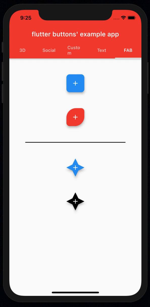
? Floating Action Buttons
⚫️ Custom FAB
Default Mode
import 'package:flutter_button/fabs/custom_fab.dart';

CustomFAB(
 child: Icon(Icons.add),
 onTap: () {},
)
Custom Fab with all properties
import 'package:flutter_button/fabs/custom_fab.dart';

CustomFAB(
 onTap: () {},
 child: Icon(Icons.add),
 backgroundColor: Colors.red,
 splashColor: Colors.black,
 hoverColor: Colors.blueGrey,
 topLeftRadius: 30,
 bottomRightRadius: 30,
 /// Also you can add this property [bottomLeftRadius:]
 /// And this [topRightRadius:]
),
⭐️ Star FAB
Default Mode
import 'package:flutter_button/fabs/star_fab.dart';

StarFAB(
 child: Icon(Icons.add),
 onTap: () {},
),
Custom Fab with all properties
import 'package:flutter_button/fabs/star_fab.dart';

StarFAB(
 backgroundColor: Colors.black,
 child: Icon(Icons.add),
 splashColor: Colors.red,
 elevation: 5,
 onTap: () {},
),
if you wanna to look this package's full usage exapmle, check the example repo which one is down to this package's repository: example repository.