draggable_customized_btn_navy_bar

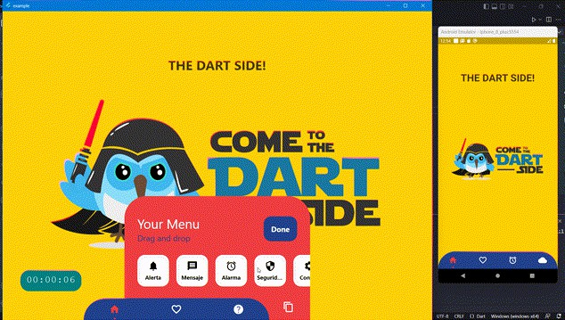
A bottom navigation bar that you can customize with the options you need, without any limits. You can also customize the appearance of the navigation bar.
The package is solving a problem with package bottom_personalized_dot_bar as it solves i’s issues and issues can be summarized in the following points:
- it’s old and the owner didn’t update it since 3 years.
- Some exception was caught by gestures.
- no clear definition for the max number and min number of displayed items.
- forget changes that take places in the displayed and hidden items in eah run, so the user setup will be forgetten once the app is closed.
- not cross platform.
The Btn Nav bat is very beautiful and many people likes it so much. For these reasons I build this package for public to help them to add this beautful btn nav bar to their projets. I wish this will help you.
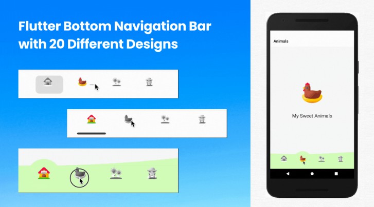
Live Preview
.gif)
Supported platforms
- Flutter Android
- Flutter iOS
- Flutter web
- Flutter desktop
Package Structure

Null Safe!!
Hint: The package is supporting null safety

Package overview
- Drag and Drop your options!
- Change icon , background , text , item , item background ….. colors
- Control the max number and minimum number od displayed items
- Listen to events ‘Sort, Insert and Delete’
- Dynamically change the selected option
- Save the modified setup (changes in items and it’s indices) in shared preferences
- Custom options
- Unlimit options
- supports all the platforms [android- iOS – web – linux – mac – windows]
- And more …
Getting Started
First of all, Depend on the package.
dependencies:
  ...
  draggable_customized_btn_navy_bar: ^0.0.1 #Add the latest version
Then import the package in your dart file
import 'package:draggable_customized_btn_navy_bar/draggable_customized_btn_navy_bar.dart';
Basic Setup
String _itemSelected = 'item-1';
...
..
.
Scaffold(
  body: Stack(
    children: <Widget>[
      .... // Your App Home
      DraggableCustomizedBtnNavyBar(
          keyItemSelected: _itemSelected,
          hiddenItems: <DraggableCustomizedDotBarItem>[
              DraggableCustomizedDotBarItem('item-4', icon: Icons.cloud, name: 'Nube', onTap: (itemSelected) { /* event selected */ }),
              DraggableCustomizedDotBarItem('item-5', icon: Icons.access_alarm, name: 'Alarma', onTap: (itemSelected) { /* event selected */ }),
              DraggableCustomizedDotBarItem('item-6', icon: Icons.message, name: 'Mensaje', onTap: (itemSelected) { /* event selected */ }),
              DraggableCustomizedDotBarItem('item-7', icon: Icons.notifications, name: 'Alerta', onTap: (itemSelected) { /* event selected */ }),
              DraggableCustomizedDotBarItem('item-8', icon: Icons.security, name: 'Seguridad', onTap: (itemSelected) { /* event selected */ }),
              DraggableCustomizedDotBarItem('item-9', icon: Icons.help, name: 'Ayuda', onTap: (itemSelected) { /* event selected */ }),
              DraggableCustomizedDotBarItem('item-10', icon: Icons.settings, name: 'Config.', onTap: (itemSelected) { /* event selected */ }),
          ],
          items: <DraggableCustomizedDotBarItem>[
              DraggableCustomizedDotBarItem('item-1', icon: Icons.sentiment_very_satisfied, name: 'Flutter', onTap: (itemSelected) { /* event selected */ }),
              DraggableCustomizedDotBarItem('item-2', icon: Icons.favorite_border, name: 'Favorito', onTap: (itemSelected) { /* event selected */ }),
              DraggableCustomizedDotBarItem('item-3', icon: Icons.face, name: 'Perfil', onTap: (itemSelected) { /* event selected */ }),
          ],
      ),
    ],
  ),
);
Customization
DraggableCustomizedBtnNavyBar
| Attribute | Description |
|---|---|
items |
List of items to be displayed in the navigation bar |
hiddenItems |
List of items that will be hidden |
maximumNumberOfDisplayItems |
max number of displayed items – default:5 |
onDisplayedStackOverflows |
function to be done if the user want to add item to the displayed items and he reaches to the max diplayed number of items – default : showSnackBar. onDisplayedStackOverflows: () { /* Your action */ } |
minimumNumberOfDisplayedItems |
min number of displayed items – default:1 |
onDisplayedStackIsEmpty |
function to be done if the user want to remove item from the displayed items and he reaches to the min diplayed number of items – default : showSnackBar . onDisplayedStackIsEmpty: () { /* Your action */ } |
keyItemSelected |
Item key that is selected |
width |
Navigation bar width |
height |
Navigation bar height |
borderRadius |
Navigation bar radius |
selectedColorIcon |
Selected Icon color |
unSelectedColorIcon |
Unselected Icon color |
navigatorBackground |
Navigator Container Background color |
settingBackground |
Setting Container Background color (Hidden items) |
iconSetting |
Settings button icon |
iconSettingColor |
Settings button icon color |
settingTitleText |
Setting Title Text |
settingTitleColor |
Setting Title color |
settingSubTitleText |
Setting Sub-Title Text |
settingSubTitleColor |
Setting Sub-Title color |
doneText |
Done button Text |
textDoneColor |
Text Done Color |
buttonDoneColor |
Button done color |
hiddenItemBackground |
Background of hidden item |
iconHiddenColor |
Icon Hidden Color |
textHiddenColor |
Text Hidden Color |
dotColor |
Selection Indicator Color (Dot |
boxShadow |
Shadow of container |
onOrderHideItems |
Event when you sort the hidden options, this has as parameter the list of hidden options with the new order. onOrderHideItems: (List<BottomPersonalizedDotBarItem> hiddenItems) { /* Your action */ } |
onOrderItems |
Event when ordering browser options, this has as parameter the list of options with the new order onOrderItems: (List<BottomPersonalizedDotBarItem> items) { /* Your action */ } |
onAddItem |
Event when you add a new option to the navigation bar, this has as parameters the item you add and the list of options. onAddItem: (BottomPersonalizedDotBarItem itemAdd, List<BottomPersonalizedDotBarItem> items) { /* Your action */ } |
onRemoveItem |
Event when you delete an option from the navigation bar, this has as parameters the element to delete and the list of hidden options. onRemoveItem: (BottomPersonalizedDotBarItem itemRemove, List<BottomPersonalizedDotBarItem> hiddenItems) { /* Your action */ } |
DraggableCustomizedDotBarItem
| Attribute | Description |
|---|---|
keyItem |
Unique key |
icon |
Item icon |
name |
Item name |
onTap |
Event with you press the item. onTap: (String keyItem) { /* Your action */ } |
License & Accesability
- This is the first version of my package so if you see any problems you’re free to open an issue.

Contributing
Pull requests are welcome. For major changes, please open an issue first to discuss what you would like to change.