Light and Dark mode with cubit
This project will explain how we can implement the light and dark mode with Cubit state management architecture.
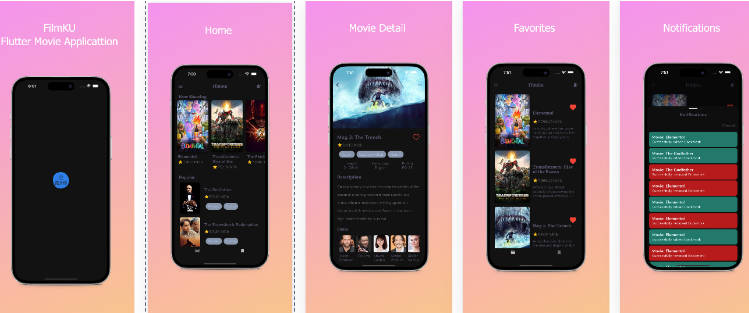
Project Created & Maintained By
Getting Started
The easiest way to add theme support in application by using the Cubit state management. In this demo we are updating the backgorund color and text color for button and lables.
Dependencies
- Bloc: Used
flutter_bloclibrary for state management. Bloc - Shared Preference: Used
shared_preferenceslibrary for local storage. Shared Preference
Folder and Class structure
.
├── ...
├── Cubit                        # This folder hold all cubit sub folders.
│   └── theme_module             # This folder will hold two sub folder provider and states.
│         ├── provider           # This folder will hold them cubit class.
│         └── states  		 # This folder will hold theme state class.
│
├── theme                        # This folder hold all the themes related classes.
│   ├── base_theme               # This an abstract class for color setup
│   ├── dark_theme               # This class will have all dark theme colors and extend the base_theme class.
│   ├── light_theme              # This class will have all light theme colors and extend the base_theme class.
│   ├── theme_colors             # All colors will define in this class. For light mode, LightThemeColors class and for dark mode, DarkThemeColors is being used for color declaration.
│   └── enum                     # Delcared the theme enum in this class.
└── ...
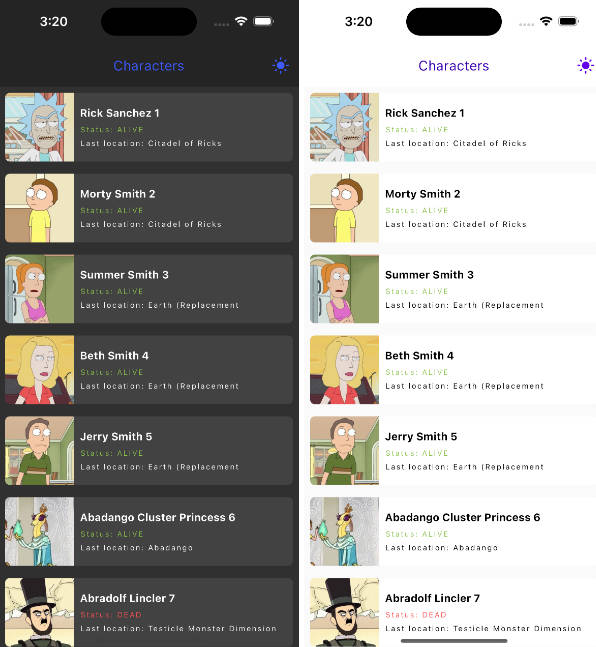
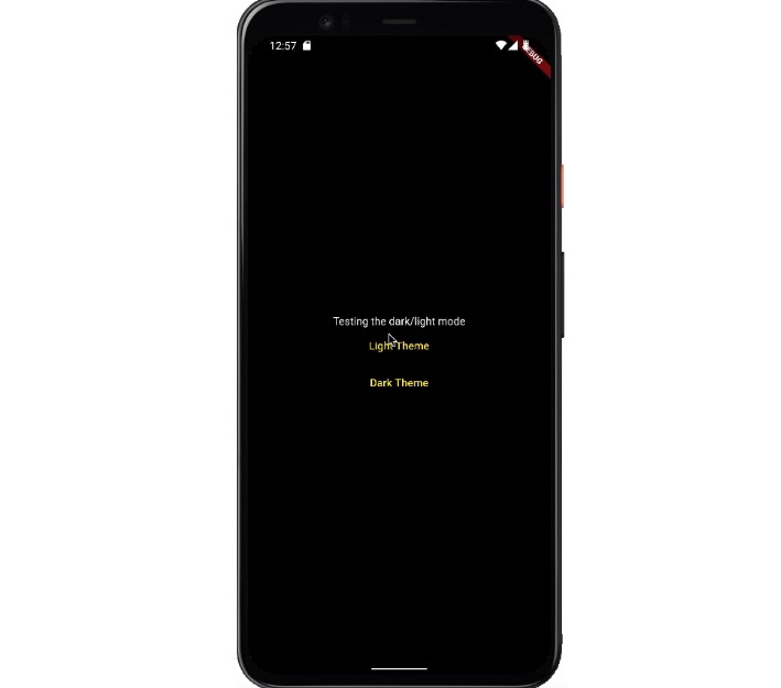
Demo
Screen.Recording.2022-04-19.at.12.56.41.PM.mov