Search Appbar Tool
Search Appbar Tool have easy components for your fixed search bar. This tool provide you customizable widgets.

Getting Started
Search Appbar Tool have four customizable widget. these widgets :
-SearchAppBar()
-DefaultBody()
  -defaultBody
  -normalSearchBody:
  -defaultSearchBody:
SearchAppBar() Widget
This widget should be in appBar section in Scaffold.
      Scaffold(
      appBar: SearchAppBar(
        controller: controller,
        callBack: (value) {},
      ),
As you see you will need to give TextFieldController and TextField onChange metod. That’s enough for Appbar working but you can customize this widget for example…
      SearchAppBar(
          //customize features
          suffixIconColor: Colors.red,
          textFieldHeight: 36,
          contentPadding: const EdgeInsets.all(8),
          leadingIconBtnColor: Colors.blue,
          prefixIconColor: Colors.green,
          fillColor: Colors.purple,
          hintText: 'Hello again!',
          prefixIcon: Icons.not_started,
          suffixIcon: Icons.not_started,
          inputBorder: InputBorder.none,
          hintTextStyle: const TextStyle(),

          //required
          controller: controller,
          callBack: (value) => ,
        )
DefaultBody() Widget
This widget should be in body section in Scaffold.
      Scaffold(
      body: DefaultBody(
          defaultBody: const Center(
            child: Text('Default body'),
          ),
        ),
      );
DefaultBody widget need to widget that defaultBody. Also appBar need to body for reactions. you can add all kinds of widgets into defaultBody section. But don’t forget defaultBody are your main app body.
normalSearchBody, defaultSearchBody Widgets Features
you can not add these widgets but if you add them, you can write your project more easily. Let’s see…
      Scaffold(
      body: DefaultBody(
          defaultBody: const Center(
            child: Text('Default body'),
          ),
        ),
        defaultSearchBody: const Center(
            child: Text('Default Search Body'),
        ),
        normalSearchBody: const Center(
            child: Text('Normal Search Body'),
        ),
      );
Firstly I said defaultBody feature is a main body in your app. Other features are related to textField onTap and onChange methods.
If user tap on textField section, defaultSearchBody will work. This widget similar to defaultBody only activated by pressed. You can add ‘suggestion’ or ‘past search’ pages here.
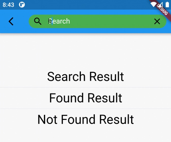
If user write on textField normalSearchBody will work. This widget similir to defaultBody only changed by change textField. You can add ‘search results’, ‘found’ or ‘not found’ pages here.
Result
defaultBody View

defaultSearchBody View

normalSearchBody View