Preview a TextStyle based on Material Design’s Typography
Features
Ever been confused by TextStyle names? text_style_preview allows you to easily preview TextStyle

Getting started
Add dependency to your pubspec file
dependencies:
  text_style_preview: <latest version>
Usage
Basic usage
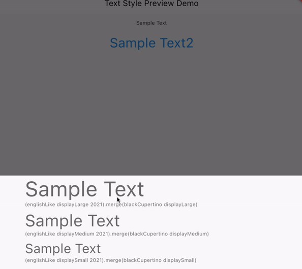
Wrap Text widget with TextStylePreview widget.
const TextStylePreview(
  child: Text('Sample Text'),
),
Advanced usage
You can customize the Preview by specifying the Style, etc.
TextStylePreview(
  initScaleCategory: ScaleCategory.headlineSmall,
  applyCustomStyle: (textStyle) => textStyle.apply(
    color: Colors.blue,
    fontSizeFactor: 1.5,
  ),
  // set stye like this
  style: TextStylePreviewStyle(
    modalHeight: 300,
    barrierColor: Colors.transparent,
    showDivider: true,
    descriptionBuilder: (scaleCategory, textStyle) =>
        scaleCategory.name,
  ),
  child: const Text('Sample Text2'),
),
ThemeExtension
With ThemeExtension, you can use the same style throughout the app!
@override
Widget build(BuildContext context) {
  return MaterialApp(
    theme: ThemeData(
      useMaterial3: true,
      primarySwatch: Colors.red,
      // set default stye like this
      extensions: const [
        TextStylePreviewStyle(
          showDivider: false,
        ),
      ],
    ),
    home: const TextStylePreviewDemoScreen(),
  );
}