Persistent Bottom Navigation Bar
A persistent/static bottom navigation bar for Flutter.
NOTE: Those migrating from pre 2.0.0 version should check the latest Readme and instructions as there are many breaking changes introduced in the 2.0.0 update
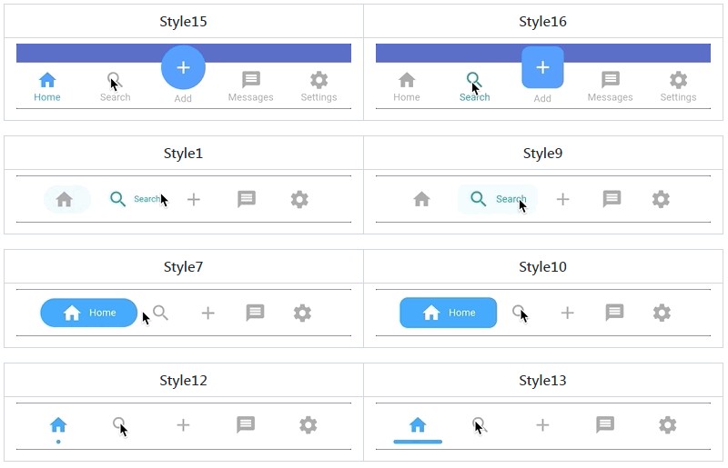
Styles
| Style15 | Style16 |
|---|---|
 |
 |
| Style1 | Style9 |
|---|---|
 |
 |
| Style7 | Style10 |
|---|---|
 |
 |
| Style12 | Style13 |
|---|---|
 |
 |
| Style3 | Style6 |
|---|---|
 |
 |
| Neumorphic | Neumorphic without subtitle |
|---|---|
 |
 |
Note: These do not include all style variations
Features
- Highly customizable
persistentbottom navigation bar. - Ability to push new screens with or without bottom navigation bar.
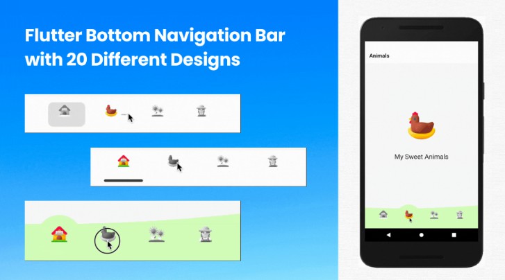
- 20 styles for the bottom navigation bar.
- Includes functions for pushing screen with or without the bottom navigation bar i.e. pushNewScreen() and pushNewScreenWithRouteSettings().
- Based on flutter’s Cupertino(iOS) bottom navigation bar.
- Can be
translucentfor a particular tab. - Custom styling for the navigation bar. Click here for more information.
- Handles hardware/software Android back button.
Getting Started
In your flutter project add the dependency:
dependencies:
  persistent_bottom_nav_bar: any
Import the package:
import 'package:persistent_bottom_nav_bar/persistent_tab_view.dart';
Persistent bottom navigation bar uses PersistentTabController as its controller. Here is how to declare it:
PersistentTabController _controller;

_controller = PersistentTabController(initialIndex: 0);
The main widget then to be declared is PersistentTabView. NOTE: This widget includes SCAFFOLD (based on CupertinoTabScaffold), so no need to declare it. Following is an example for demonstration purposes:
class MyApp extends StatelessWidget {
  const MyApp({Key key}) : super(key: key);

  @override
  Widget build(BuildContext context) {
    return PersistentTabView(
        context,
        controller: _controller,
        screens: _buildScreens(),
        items: _navBarsItems(),
        confineInSafeArea: true,
        backgroundColor: Colors.white, // Default is Colors.white.
        handleAndroidBackButtonPress: true, // Default is true.
        resizeToAvoidBottomInset: true, // This needs to be true if you want to move up the screen when keyboard appears. Default is true.
        stateManagement: true, // Default is true.
        hideNavigationBarWhenKeyboardShows: true, // Recommended to set 'resizeToAvoidBottomInset' as true while using this argument. Default is true.
        decoration: NavBarDecoration(
          borderRadius: BorderRadius.circular(10.0),
          colorBehindNavBar: Colors.white,
        ),
        popAllScreensOnTapOfSelectedTab: true,
        popActionScreens: PopActionScreensType.all,
        itemAnimationProperties: ItemAnimationProperties( // Navigation Bar's items animation properties.
          duration: Duration(milliseconds: 200),
          curve: Curves.ease,
        ),
        screenTransitionAnimation: ScreenTransitionAnimation( // Screen transition animation on change of selected tab.
          animateTabTransition: true,
          curve: Curves.ease,
          duration: Duration(milliseconds: 200),
        ),
        navBarStyle: NavBarStyle.style1, // Choose the nav bar style with this property.
    );
  }
}
    List<Widget> _buildScreens() {
        return [
          MainScreen(),
          SettingsScreen()
        ];
    }
    List<PersistentBottomNavBarItem> _navBarsItems() {
        return [
            PersistentBottomNavBarItem(
                icon: Icon(CupertinoIcons.home),
                title: ("Home"),
                activeColorPrimary: CupertinoColors.activeBlue,
                inactiveColorPrimary: CupertinoColors.systemGrey,
            ),
            PersistentBottomNavBarItem(
                icon: Icon(CupertinoIcons.settings),
                title: ("Settings"),
                activeColorPrimary: CupertinoColors.activeBlue,
                inactiveColorPrimary: CupertinoColors.systemGrey,
            ),
        ];
    }
Navigator Functions
Note: You still can use regular Navigator functions like ‘pushNamed’ but be sure to check the argument routeAndNavigatorSettings your PersistentBottomNavBarItem for route settings and some other navigator related properties
To push a new screen, use the following functions to control the visibility of bottom navigation bar on a particular screen. You can use your own logic to implement platform-specific behavior. One of the solutions could be to use the property withNavBar and toggle it according to the Platform.
In platform-specific behavior, while pushing a new screen, on Android it will push the screen WITHOUT the bottom navigation bar but on iOS it will persist the bottom navigation bar. This is the default behavior specified by each platform.
    PersistentNavBarNavigator.pushNewScreen(
        context,
        screen: MainScreen(),
        withNavBar: true, // OPTIONAL VALUE. True by default.
        pageTransitionAnimation: PageTransitionAnimation.cupertino,
    );
    PersistentNavBarNavigator.pushNewScreenWithRouteSettings(
        context,
        settings: RouteSettings(name: MainScreen.routeName),
        screen: MainScreen(),
        withNavBar: true,
        pageTransitionAnimation: PageTransitionAnimation.cupertino,
    );
If you are pushing a new modal screen, use the following function:
    PersistentNavBarNavigator.pushDynamicScreen(
        context,
        screen: HomeModalScreen(),
        withNavBar: true,
    );
Some Useful Tips
-
Pop to any screen in the navigation graph for a given tab:
    Navigator.of(context).popUntil((route) {
        return route.settings.name == "ScreenToPopBackTo";
    });
-
Pop back to first screen in the navigation graph for a given tab:
Navigator.of(context).popUntil(ModalRoute.withName("/"));
    Navigator.of(context).pushAndRemoveUntil(
      CupertinoPageRoute(
        builder: (BuildContext context) {
          return FirstScreen();
        },
      ),
      (_) => false,
    );
-
To push bottom sheet on top of the Navigation Bar, use showModalBottomScreen and set it’s property
useRootNavigatorto true. See example project for an illustration.
Custom Navigation Bar Styling
If you want to have your own style for the navigation bar, follow these steps:
-
Declare your custom widget. Please keep in mind that you will have to handle the function
onSelectedItemand the integerselectedIndexyourself to maintain full functionality. Also please note that you can define your own model for the navigation bar item instead of the providedPersistentBottomNavBarItem. See this example below for better understanding:class CustomNavBarWidget extends StatelessWidget { final int selectedIndex; final List<PersistentBottomNavBarItem> items; // NOTE: You CAN declare your own model here instead of `PersistentBottomNavBarItem`. final ValueChanged<int> onItemSelected; CustomNavBarWidget( {Key key, this.selectedIndex, @required this.items, this.onItemSelected,}); Widget _buildItem( PersistentBottomNavBarItem item, bool isSelected) { return Container( alignment: Alignment.center, height: 60.0, child: Column( mainAxisAlignment: MainAxisAlignment.center, crossAxisAlignment: CrossAxisAlignment.center, mainAxisSize: MainAxisSize.min, children: <Widget>[ Flexible( child: IconTheme( data: IconThemeData( size: 26.0, color: isSelected ? (item.activeColorSecondary == null ? item.activeColorPrimary : item.activeColorSecondary) : item.inactiveColorPrimary == null ? item.activeColorPrimary : item.inactiveColorPrimary), child: item.icon, ), ), Padding( padding: const EdgeInsets.only(top: 5.0), child: Material( type: MaterialType.transparency, child: FittedBox( child: Text( item.title, style: TextStyle( color: isSelected ? (item.activeColorSecondary == null ? item.activeColorPrimary : item.activeColorSecondary) : item.inactiveColorPrimary, fontWeight: FontWeight.w400, fontSize: 12.0), )), ), ) ], ), ); } @override Widget build(BuildContext context) { return Container( color: Colors.white, child: Container( width: double.infinity, height: 60.0, child: Row( mainAxisAlignment: MainAxisAlignment.spaceAround, children: items.map((item) { int index = items.indexOf(item); return Flexible( child: GestureDetector( onTap: () { this.onItemSelected(index); }, child: _buildItem( item, selectedIndex == index), ), ); }).toList(), ), ), ); } }
-
In the main
PersistentTabViewwidget, set thenavBarStyleproperty asNavBarStyle.customand pass on the custom widget you just created in thecustomWidgetproperty like this:class MyApp extends StatelessWidget { const MyApp({Key key}) : super(key: key); @override Widget build(BuildContext context) { return PersistentTabView.custom( context, controller: _controller, itemCount: items.length, // This is required in case of custom style! Pass the number of items for the nav bar. screens: _buildScreens(), confineInSafeArea: true, handleAndroidBackButtonPress: true, onItemSelected: (int) { setState(() {}); // This is required to update the nav bar if Android back button is pressed }, customWidget: CustomNavBarWidget( // Your custom widget goes here items: _navBarsItems(), selectedIndex: _controller.index, onItemSelected: (index) { setState(() { _controller.index = index; // NOTE: THIS IS CRITICAL!! Don't miss it! }); }, ), ); } }
NOTE: In the 'onSelected' function of the customWidget, don't forgot to change the index of the controller -
Done! As we can see, some of the other properties like
iconSize,itemsare not required here so you can skip those properties. To control the bottom padding of the screen, usebottomScreenPadding. If you give too muchbottomScreenPaddingbut less height in the custom widget or vice versa, layout issues might appear.
For better understanding, refer to the example project in the official git repo.


