neumorphic.flutter
Implementation of Neumorphism user interface consisting of sets of principles and widgets for the Flutter framework
 |
 |
Getting Started
In your flutter project add the dependency:

dependencies:
  neumorphic: any
Check out library documentation (latest stable).
Api
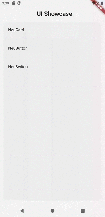
Now implemented some widgets:
- NeuCard
- NeuButton
- NeuSwitch
- NeuText
- NeuTextField
- NeuBackButton
- NeuAppBar
- NeuApp
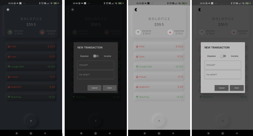
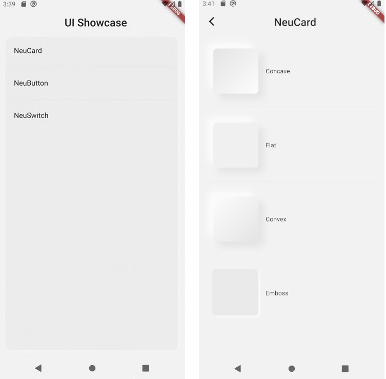
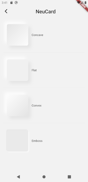
NeuCard
It is container like a Material merged with Container, but implements Neumorphism
NeuCard(
  // State of Neumorphic (may be convex, flat & emboss)
  curveType: CurveType.concave,

  // Elevation relative to parent. Main constituent of Neumorphism
  bevel: 12,

  // Specified decorations, like `BoxDecoration` but only limited
  decoration: NeumorphicDecoration(
    borderRadius: BorderRadius.circular(8)
  ),

  // Other arguments such as margin, padding etc. (Like `Container`)
  child: Text('Container')
)
NeuButton
Button automatically when pressed toggle the status of NeumorphicStatus from concave to convex and back
NeuButton(
  onPressed: () {
    print('Pressed !');
  },
  child: Text('Button'),
);
NeuSwitch
Remade CupertinoSlidingSegmentedControl which follows Neumorphism
NeuSwitch<int>(
  onValueChanged: (val) {
    setState(() {
      switchValue = val;
    });
  },
  groupValue: switchValue,
  children: {
    0: Padding(
      padding: EdgeInsets.symmetric(vertical: 24, horizontal: 8),
      child: Text('First'),
    ),
    1: Padding(
      padding: EdgeInsets.symmetric(vertical: 24, horizontal: 8),
      child: Text('Second'),
    ),
  },
);
NeuText
It is a Text Widget which can implement Neumorphism. parentColor, spread, depth, style, emboss are properties of this widget which can be modified to obtain different effects.
NeuText('Lorem Ipsum')
NeuTextField
It is a Text editing widget like Material's TextField which has a few more properties like
the support to use a custom selection control.
NeuTextField(
  controller: _controller,
  decoration: InputDecoration(
    border: OutlineInputBorder(),
    labelText: 'Write',
  ),
)
NeuBackButton
A Neumorphic design back button.
Used by NeuAppBar.
NeuAppBar
A Neumorphic design appBar.
This app bar consists of a leading Widget & a title Widget.
App bars are typically used in the Scaffold.appBar property, which places the app bar as a fixed-height widget at the top of the screen.
NeuAppBar(
  title: Text('This is title'),
)
NeuApp
NeumorphicApp implements instance of WidgetsApp which utilizes NeuThemeData for adding themes to your app.
The NeuThemeData also adds ThemeData to the widget tree, so you don't have to worry about using MaterialApp again. Material widgets won't have side-effects.
You can access the current Neumorphic NeuThemeData using NeuTheme.of(context). You can also use
Theme.of(context) to get ThemeData.
NeumorphicApp(
  theme: NeumorphicThemeData(
    brightness: Brightness.dark,
    primaryColor: Colors.blueGrey,
    curveType: curveType.concave,
    lightSource: LightSource.topLeft, // Not implemented yet
  ),
  home: Scaffold(
    appBar: NeuAppBar(
      title: const Text('NeumorphicApp Theme'),
    ),
  ),
)
Limitations
- Not all widgets currently utilize
NeuThemeData. This will be changed in later updates of this package. NeuTextFieldcurrently isn't much different than material'sTextField.
You can make support requests or report problems here on Neumorphic's github issue page.