Multi Select Flutter

Multi Select Flutter is a package for creating multi-select widgets in a variety of ways.
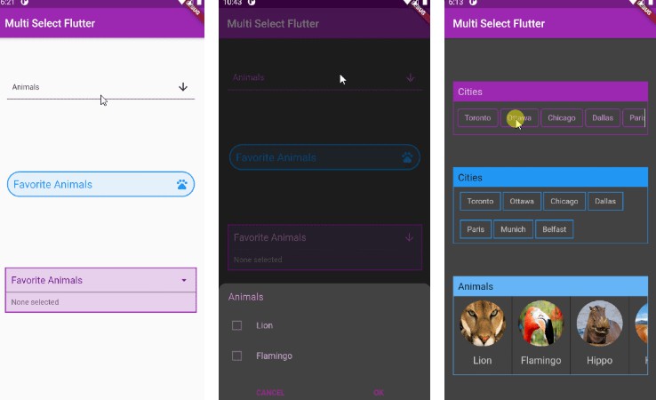
 Dialog |
 BottomSheet |
 ChoiceChip |
|---|
Features
- Supports FormField features like validator.
- Neutral default design that can be altered to your heart’s content.
- Choose between Dialog, BottomSheet, or ChoiceChip style widgets.
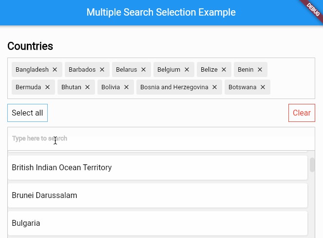
- Make your multi select
searchablefor larger lists.
Install
Add this to your pubspec.yaml file:
dependencies:
  multi_select_flutter: ^3.1.8
Usage
MultiSelectDialogField / MultiSelectBottomSheetField


These widgets provide an InkWell button which open the dialog or bottom sheet and are equipped with FormField features. You can customize it to your liking using the provided parameters.
To store the selected values, you can use the onConfirm parameter. You could also use onSelectionChanged for this.
By default these widgets render a MultiSelectChipDisplay below the field. This can be overridden with the chipDisplay parameter or removed completely by using chipDisplay: MultiSelectChipDisplay.none().
MultiSelectDialogField(
  items: _animals.map((e) => MultiSelectItem(e, e.name)).toList(),
  listType: MultiSelectListType.CHIP,
  onConfirm: (values) {
    _selectedAnimals = values;
  },
),
MultiSelectDialog / MultiSelectBottomSheet


If you prefer to create your own button for opening the dialog or bottom sheet, you may do so and then make a call to a function like this:
MultiSelectDialog can be used in the builder of showDialog().
void _showMultiSelect(BuildContext context) async {
  await showDialog(
    context: context,
    builder: (ctx) {
      return  MultiSelectDialog(
        items: _items,
        initialValue: _selectedAnimals,
        onConfirm: (values) {...},
      );
    },
  );
}
MultiSelectBottomSheet can be used in the builder of showModalBottomSheet().
void _showMultiSelect(BuildContext context) async {
  await showModalBottomSheet(
    isScrollControlled: true, // required for min/max child size
    context: context,
    builder: (ctx) {
      return  MultiSelectBottomSheet(
        items: _items,
        initialValue: _selectedAnimals,
        onConfirm: (values) {...},
        maxChildSize: 0.8,
      );
    },
  );
}
MultiSelectChipDisplay
To display the selected items, this widget can be used alongside your own button or it can be specified as a chipDisplay parameter of widgets like MultiSelectDialogField.
You can also remove items from the source list in the onTap function.
MultiSelectChipDisplay(
  items: _selectedAnimals.map((e) => MultiSelectItem(e, e)).toList(),
  onTap: (value) {
    setState(() {
      _selectedAnimals.remove(value);
    });
  },
),
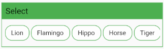
A MultiSelectChipDisplay that is part of a MultiSelectDialogField still renders outside the BoxDecoration of the MultiSelectDialogField as seen here:
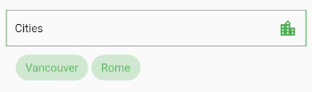
If you want to encapsulate the MultiSelectChipDisplay, wrap the MultiSelectDialogField in a Container and apply the decoration to that instead:
Container(
  decoration: BoxDecoration(...),
  child: MultiSelectDialogField(
    items: _items,
    chipDisplay: MultiSelectChipDisplay(...),
  ),
),
MultiSelectChipField
This widget is similar to MultiSelectChipDisplay, except these chips are the primary interface for selecting items.
MultiSelectChipField<Animal>(
  items: _items,
  icon: Icon(Icons.check),
  onTap: (values) {
    _selectedAnimals = values;
  },
),
Using itemBuilder to create custom items:
MultiSelectChipField<Animal>(
  items: _items,
  key: _multiSelectKey,
  validator: (values) {...}
  itemBuilder: (item, state) {
    // return your custom widget here
    return InkWell(
      onTap: () {
        _selectedAnimals.contains(item.value)
			      ? _selectedAnimals.remove(item.value)
			      : _selectedAnimals.add(item.value);
	      state.didChange(_selectedAnimals);
	      _multiSelectKey.currentState.validate();
	    },
	    child: Text(item.value.name),
    );
  },
),
The itemBuilder param takes a function that will create a widget for each of the provided items.
In order to use validator and other FormField features with custom widgets, you must call state.didChange(_updatedList) any time the list of selected items is updated.
Using scrollControl to auto scroll:
MultiSelectChipField(
  items: _items,
  scrollControl: (controller) {
    _startAnimation(controller);
  },
)

// waits 5 seconds, scrolls to end slow, then back fast
void _startAnimation(ScrollController controller) {
  // when using more than one animation, use async/await
  Future.delayed(const Duration(milliseconds: 5000), () async {
    await controller.animateTo(
      controller.position.maxScrollExtent,
      duration: Duration(milliseconds: 8000),
      curve: Curves.linear);

    await controller.animateTo(
      controller.position.minScrollExtent,
      duration: Duration(milliseconds: 1250),
      curve: Curves.fastLinearToSlowEaseIn);
  });
}
Constructors
MultiSelectDialog


| Parameter | Type | Description |
|---|---|---|
backgroundColor |
Color | Set the background color of the dialog. |
cancelText |
Text | Specifies the cancel button text. |
checkColor |
Color | Set the color of the check in the checkbox. |
closeSearchIcon |
Icon | Icon(Icons.close) |
confirmText |
Text | Specifies the confirm button text. |
colorator |
Color | Function(V) Set the selected color of individual items based on their value. Applies to both chips and checkboxes. |
height |
double | Give the dialog a fixed height. |
initialValue |
List<V> | List of selected values. Required to retain values when re-opening the dialog. |
items |
List<MultiSelectItem<V>> | The source list of options. |
itemsTextStyle |
TextStyle | Specifies the style of text on chips or list tiles. |
listType |
MultiSelectListType | Change the listType. Can be either MultiSelectListType.LIST or MultiSelectListType.CHIP |
onSelectionChanged |
Function(List<V>) | Fires when an item is selected or unselected. |
onConfirm |
Function(List) | Fires when the confirm button is pressed. |
searchable |
bool | Enables search functionality within the dialog. |
searchHintStyle |
TextStyle | Style the text of the search hint. |
searchIcon |
Icon | The icon button that shows the search field. |
searchHint |
String | Set the placeholder text of the search field. |
searchTextStyle |
TextStyle | Style the search text. |
selectedColor |
Color | Set the color of the checkbox or chip items that are selected. |
title |
Widget | The title that is displayed at the top of the dialog. |
unselectedColor |
Color | Set the color of the chip body or checkbox border while not selected. |
MultiSelectDialogField


MultiSelectDialogField has all the parameters of MultiSelectDialog plus these extra parameters:
| Parameter | Type | Description |
|---|---|---|
autovalidateMode |
AutovalidateMode | If enabled, form fields will validate and update their error text immediately after every change. Default is disabled. |
barrierColor |
Color | Set the color of the space outside the dialog. |
buttonText |
Text | Set text that is displayed on the button. |
buttonIcon |
Icon | Specify the button icon. |
chipDisplay |
MultiSelectChipDisplay | Override the default MultiSelectChipDisplay that belongs to this field. |
decoration |
BoxDecoration | Style the Container that makes up the field. |
key |
GlobalKey<FormFieldState> | Access FormFieldState methods. |
onSaved |
List<MultiSelectItem> | A callback that is called whenever we submit the field (usually by calling the save method on a form. |
validator |
FormFieldValidator<List> | Validation. See Flutter’s documentation. |
MultiSelectBottomSheet


| Parameter | Type | Description |
|---|---|---|
cancelText |
Text | Specifies the cancel button text. |
checkColor |
Color | Set the color of the check in the checkbox. |
confirmText |
Text | Specifies the confirm button text. |
closeSearchIcon |
Icon | The icon button that hides the search field . |
colorator |
Color Function(V) | Set the selected color of individual items based on their value. Applies to both chips and checkboxes. |
initialChildSize |
double | The initial height of the BottomSheet. Default is 0.3 |
initialValue |
List<V> | List of selected values. Required to retain values when re-opening the BottomSheet. |
items |
List<MultiSelectItem<V>> | The source list of options. |
itemsTextStyle |
TextStyle | Specifies the style of text on chips or list tiles. |
listType |
MultiSelectListType | MultiSelectListType.LIST |
maxChildSize |
double | Set the maximum height threshold of the BottomSheet. Default is 0.6 |
minChildSize |
double | Set the minimum height threshold of the BottomSheet before it closes. Default is 0.3 |
onSelectionChanged |
Function(List<V>) | Fires when an item is selected or unselected. |
onConfirm |
Function(List) | Fires when the confirm button is pressed. |
searchable |
bool | Toggle search functionality within the BottomSheet. |
searchHint |
String | Set the placeholder text of the search field. |
searchHintStyle |
TextStyle | Style the text of the search hint. |
searchIcon |
Icon | The icon button that shows the search field. |
searchTextStyle |
TextStyle | Style the search text. |
selectedColor |
Color | Set the color of the checkbox or chip items that are selected. |
title |
Widget | The title that is displayed at the top of the BottomSheet. |
unselectedColor |
Color | Set the color of the chip body or checkbox border while not selected. |
MultiSelectBottomSheetField


MultiSelectBottomSheetField has all the parameters of MultiSelectBottomSheet plus these extra parameters:
| Parameter | Type | Description |
|---|---|---|
autovalidateMode |
AutovalidateMode | If enabled, form fields will validate and update their error text immediately after every change. Default is disabled. |
backgroundColor |
Color | Set the background color of the BottomSheet. |
barrierColor |
Color | Set the color of the space outside the BottomSheet. |
buttonIcon |
Icon | Specify the button icon. |
buttonText |
Text | Set text that is displayed on the button. |
chipDisplay |
MultiSelectChipDisplay | Override the default MultiSelectChipDisplay that belongs to this field. |
decoration |
BoxDecoration | Style the Container that makes up the field. |
key |
GlobalKey<FormFieldState> | Can be used to call methods like _multiSelectKey.currentState.validate(). |
onSaved |
List<MultiSelectItem> | A callback that is called whenever we submit the field (usually by calling the save method on a form. |
shape |
ShapeBorder | Apply a ShapeBorder to alter the edges of the BottomSheet. Default is a RoundedRectangleBorder with top circular radius of 15. |
validator |
FormFieldValidator<List> | Validation. See Flutter’s documentation. |
MultiSelectChipField


| Parameter | Type | Description |
|---|---|---|
autovalidateMode |
AutovalidateMode | If enabled, form fields will validate and update their error text immediately after every change. Default is disabled. |
chipColor |
Color | Set the chip color. |
chipShape |
ShapeBorde | Define a ShapeBorder for the chips. |
closeSearchIcon |
Icon | The icon button that hides the search field . |
colorator |
Color Function(V) | Set the selected chip color of individual items based on their value. |
decoration |
BoxDecoration | Style the surrounding Container. |
headerColor |
Color | Set the header color. |
height |
double | Set the height of the selectable area. |
icon |
Icon | The icon to display prior to the chip label. |
initialValue |
List<V> | List of selected values before any interaction. |
itemBuilder |
Function(MultiSelectItem<V>, FormFieldState<List<V>>) | Build a custom widget that gets created dynamically for each item. |
items |
List<MultiSelectItem<V>> | The source list of options. |
key |
GlobalKey<FormFieldState> | Can be used to call methods like _multiSelectKey.currentState.validate(). |
onSaved |
List<MultiSelectItem> | A callback that is called whenever the field is submitted (usually by calling the save method on a form. |
onTap |
Function(V) | Fires when a chip is tapped. |
scroll |
bool | Enables horizontal scrolling. |
scrollBar |
HorizontalScrollBar | Define a scroll bar. |
scrollControl |
Function(ScrollController) | Make use of the ScrollController to automatically scroll through the list. |
searchable |
bool | Toggle search functionality. |
searchHint |
String | Set the placeholder text of the search field. |
searchHintStyle |
TextStyle | Style the text of the search hint. |
searchIcon |
Icon | The icon button that shows the search field. |
searchTextStyle |
TextStyle | Style the search text. |
selectedChipColor |
Color | Set the color of the chip items that are selected. |
selectedTextStyle |
TextStyle | Set the TextStyle on selected chips. |
showHeader |
bool | Determines whether to show the header. |
textStyle |
TextStyle | Style the text on the chips. |
title |
Widget | The title that is displayed in the header. |
validator |
FormFieldValidator<List> | Validation. See Flutter’s documentation. |
MultiSelectChipDisplay

| Parameter | Type | Description |
|---|---|---|
alignment |
Alignment | Change the alignment of the chips. Default is Alignment.centerLeft. |
chipColor |
Color | Set the chip color. |
colorator |
Color Function(V) | Set the chip color of individual items based on their value. |
decoration |
BoxDecoration | Style the Container that makes up the chip display. |
height |
double | Set a fixed height. |
icon |
Icon | The icon to display prior to the chip label. |
items |
List<MultiSelectItem> | The source list of selected items. |
onTap |
Function(V) | Fires when a chip is tapped. |
scroll |
bool | Enables horizontal scroll instead of wrap. |
scrollBar |
HorizontalScrollBar | Enable the scroll bar. |
shape |
ShapeBorder | Define a ShapeBorder for the chips. |
textStyle |
TextStyle | Style the text on the chips. |
Contributing
Pull requests are welcome. For major changes, please open an issue first to discuss what you would like to change.# multi_select_flutter