Flutter DropdownSearch
Flutter simple and robust DropdownSearch with item search feature, making it possible to use an offline item list or filtering URL for easy customization.
Key Features
- Online and offline items
- Searchable dropdown
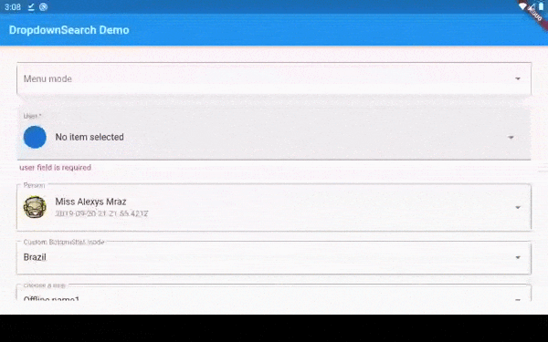
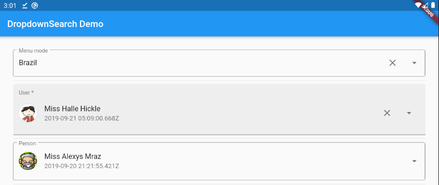
- Three dropdown mode: Menu/ BottomSheet/ Dialog
- Material dropdown
- Easy customizable UI
- Handle Light and Dark theme
- Easy implementation into statelessWidget
packages.yaml
dropdown_search: <lastest version>
Import
import 'package:dropdown_search/dropdown_search.dart';
Simple implementation
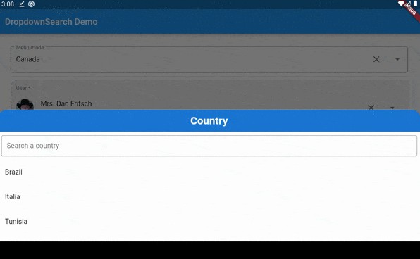
DropdownSearch<String>(
    mode: Mode.MENU,
    showSelectedItem: true,
    items: ["Brazil", "Italia (Disabled)", "Tunisia", 'Canada'],
    label: "Menu mode",
    hint: "country in menu mode",
    popupItemDisabled: (String s) => s.startsWith('I'),
    onChanged: print,
    selectedItem: "Brazil"),
customize showed field (itemAsString)
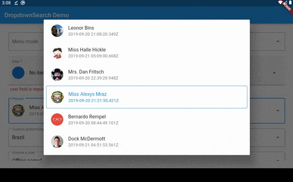
DropdownSearch<UserModel>(
  label: "Name",
  onFind: (String filter) => getData(filter),
  itemAsString: (UserModel u) => u.userAsStringByName(),
  onChanged: (UserModel data) => print(data),
),

DropdownSearch<UserModel>(
  label: "Name",
  onFind: (String filter) => getData(filter),
  itemAsString: (UserModel u) => u.userAsStringById(),
  onChanged: (UserModel data) => print(data),
),
customize Filter Function
DropdownSearch<UserModel>(
  label: "Name",
  filterFn: (user, filter) => user.userFilterByCreationDate(filter),
  onFind: (String filter) => getData(filter),
  itemAsString: (UserModel u) => u.userAsStringByName(),
  onChanged: (UserModel data) => print(data),
),
customize Search Mode
DropdownSearch<UserModel>(
  mode: Mode.BOTTOM_SHEET,
  label: "Name",
  onFind: (String filter) => getData(filter),
  itemAsString: (UserModel u) => u.userAsString(),
  onChanged: (UserModel data) => print(data),
),
Validation
DropdownSearch(
  items: ["Brazil", "France", "Tunisia", "Canada"],
  label: "Country",
  onChanged: print,
  selectedItem: "Tunisia",
  validator: (String item) {
    if (item == null)
      return "Required field";
    else if (item == "Brazil")
      return "Invalid item";
    else
      return null;
  },
);
Endpoint implementation (using Dio package)
DropdownSearch<UserModel>(
  label: "Name",
  onFind: (String filter) async {
    var response = await Dio().get(
        "http://5d85ccfb1e61af001471bf60.mockapi.io/user",
        queryParameters: {"filter": filter},
    );
    var models = UserModel.fromJsonList(response.data);
    return models;
  },
  onChanged: (UserModel data) {
    print(data);
  },
);
Layout customization
You can customize the layout of the DropdownSearch and its items. EXAMPLE
| Properties | Description |
|---|---|
label |
DropDownSearch label |
showSearchBox |
show/hide the search box |
isFilteredOnline |
true if the filter on items is applied onlie (via API) |
showClearButton |
show/hide clear selected item |
items |
offline items list |
selectedItem |
selected item |
onFind |
function that returns item from API |
onChanged |
called when a new item is selected |
dropdownBuilder |
to customize list of items UI |
popupItemBuilder |
to customize selected item |
validator |
function to apply the validation formula |
searchBoxDecoration |
decoration for the search box |
popupBackgroundColor |
background color for the dialog/menu/bottomSheet |
popupTitle |
Custom widget for the popup title |
itemAsString |
customize the fields the be shown |
filterFn |
custom filter function |
enabled |
enable/disable dropdownSearch |
mode |
MENU / DIALOG/ BOTTOM_SHEET |
maxHeight |
the max height for dialog/bottomSheet/Menu |
dialogMaxWidth |
the max width for the dialog |
showSelectedItem |
manage selected item visibility (if true, the selected item will be highlighted) |
compareFn |
Function(T item, T selectedItem), custom comparing function |
dropdownSearchDecoration |
DropdownSearch input decoration |
emptyBuilder |
custom layout for empty results |
loadingBuilder |
custom layout for loading items |
errorBuilder |
custom layout for error |
autoFocusSearchBox |
the search box will be focused if true |
popupShape |
custom shape for the popup |
autoValidateMode |
handle auto validation mode |
onSaved |
An optional method to call with the final value when the form is saved via |
validator |
An optional method that validates an input. Returns an error string to display if the input is invalid, or null otherwise. |
clearButton |
customize clear button widget |
dropDownButton |
customize dropdown button widget |
dropdownBuilderSupportsNullItem |
If true, the dropdownBuilder will continue the uses of material behavior. This will be useful if you want to handle a custom UI only if the item !=null |
popupItemDisabled |
defines if an item of the popup is enabled or not, if the item is disabled, it cannot be clicked |
popupBarrierColor |
set a custom color for the popup barrier |
searchBoxController |
search box controller |
clearButtonBuilder |
custom clear button builder |
dropdownButtonBuilder |
custom dropdown button builder |
onBeforeChange |
callback executed before applying value change |
searchDelay |
delay before searching |
Attention
To use a template as an item type, and you don't want to use a custom fonction itemAsString and compareFn you need to implement toString, equals and hashcode, as shown below:
class UserModel {
  final String id;
  final DateTime createdAt;
  final String name;
  final String avatar;

  UserModel({this.id, this.createdAt, this.name, this.avatar});

  factory UserModel.fromJson(Map<String, dynamic> json) {
    if (json == null) return null;
    return UserModel(
      id: json["id"],
      createdAt:
          json["createdAt"] == null ? null : DateTime.parse(json["createdAt"]),
      name: json["name"],
      avatar: json["avatar"],
    );
  }

  static List<UserModel> fromJsonList(List list) {
    if (list == null) return null;
    return list.map((item) => UserModel.fromJson(item)).toList();
  }

  ///this method will prevent the override of toString
  String userAsString() {
    return '#${this.id} ${this.name}';
  }

  ///this method will prevent the override of toString
  bool userFilterByCreationDate(String filter) {
    return this?.createdAt?.toString()?.contains(filter);
  }

  ///custom comparing function to check if two users are equal
  bool isEqual(UserModel model) {
    return this?.id == model?.id;
  }

  @override
  String toString() => name;
}