ars_progress_dialog
Customizable progress dialog for Flutter applications with smooth animation for background dim color and blur.
Getting Started
Install
Add dependency to pubspec.yaml file :
ars_progress_dialog: 0.0.1
Run this command :
$ flutter pub get
Import
Import class in your project :
import 'package:ars_progress_dialog/ars_progress_dialog.dart';
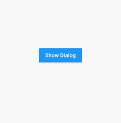
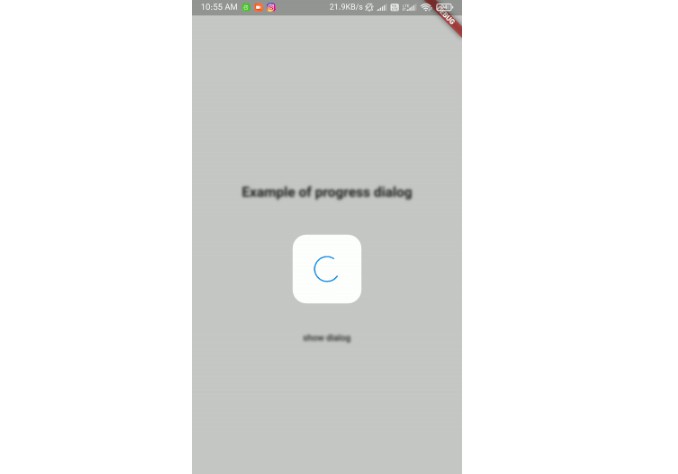
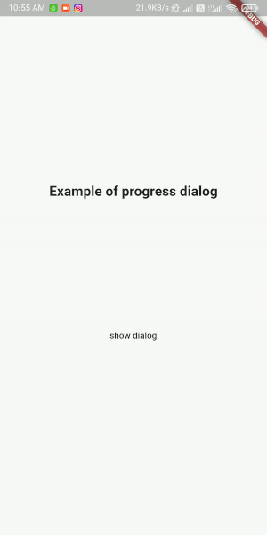
Showing Dialog
Show simple progress dialog :
ArsProgressDialog progressDialog = ArsProgressDialog(
	context,
	blur: 2,
	backgroundColor: Color(0x33000000),
	animationDuration: Duration(milliseconds: 500));

	progressDialog.show(); // show dialog
	progressDialog.dismiss(); //close dialog
Customize loading widget :
 ArsProgressDialog customProgressDialog = ArsProgressDialog(
	 context,
	 blur: 2,
	 backgroundColor: Color(0x33000000),
	 loadingWidget: Container(
		 width: 150,
		 height: 150,
		 color: Colors.red,
		 child: CircularProgressIndicator(),
    ));
Properties
| Name | Type | Description | Default |
|---|---|---|---|
| backgroundColor | Color | Dialog dim(background) Color | Color (0x99000000) |
| blur | double | Blur amount of dialog background | 0 |
| dismissable | bool | Setting this true lets user dismiss dialog by touching outside of it. | true |
| onDismiss | Function | This function triggers when user dismisses dialog. | - |
| loadingWidget | Widget | Dialog's widget. You can use your own widget when showing dialog. | simple widget |
| useSafeArea | bool | Setting this to false makes dialog background fullscreen but when you set it true blur and background color will not apply on status bar, navigation bar and ... | false |
| animationDuration | Duration | This duration defines how much will take for blur and background color to appear. | Duration (milliseconds : 300) |