group_button
Flutter custom widget to make a group buttons.
Included Radio and CheckBox buttons models.
Getting Started
Follow these steps to use this package
Add dependency
dependencies:
  group_button: ^2.4.1 #latest version
Add import package
import 'package:group_button/group_button.dart';
Easy to use
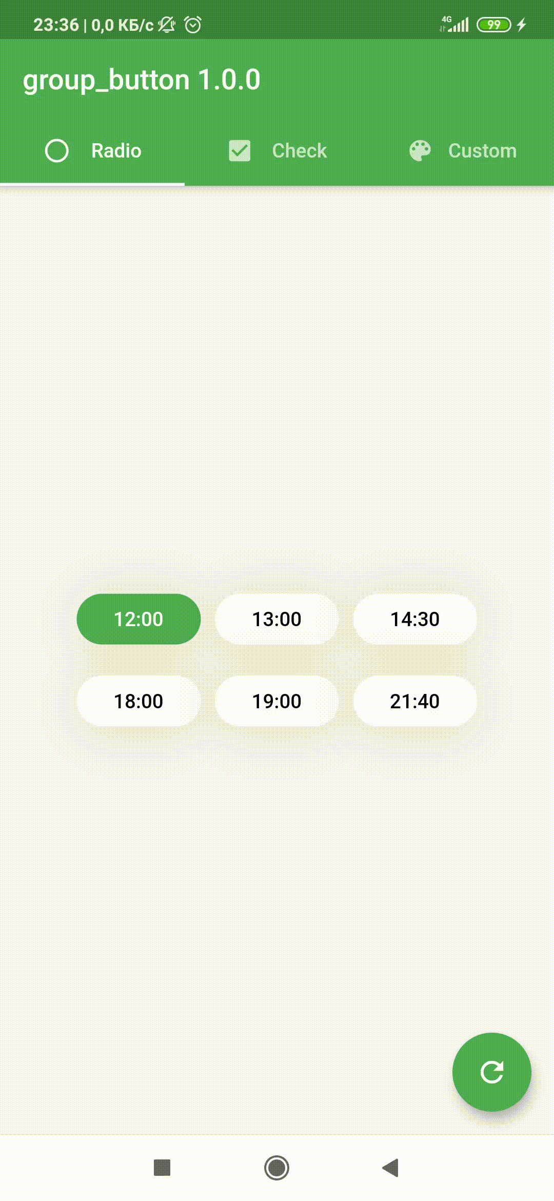
Simple example of use GroupButton
Put this code in your project at an screen and learn how it works
GroupButton(
    isRadio: false,
    spacing: 10,
    onSelected: (index, isSelected) => print('$index button is selected'),
    buttons: ["12:00", "13:00", "14:30", "18:00", "19:00", "21:40"],
)
Customize
In order to customize your buttons inside GroupButton you can use code below
This code includes all the fields used in GroupButton
GroupButton(
    spacing: 5,
    isRadio: false,
    direction: Axis.horizontal,
    onSelected: (index, isSelected) =>
          print('$index button is ${isSelected ? 'selected' : 'unselected'}'),
    buttons: ["Dart","Kotlin","Java","Swift","Objective-C","Python","JS"],
    selectedButtons: [0, 1], /// [List<int>] after 2.2.1 version
    selectedTextStyle: TextStyle(
        fontWeight: FontWeight.w600,
        fontSize: 16,
        color: Colors.red,
    ),
    unselectedTextStyle: TextStyle(
        fontWeight: FontWeight.w600,
        fontSize: 14,
        color: Colors.grey[600],
    ),
    selectedColor: Colors.white,
    unselectedColor: Colors.grey[300],
    selectedBorderColor: Colors.red,
    unselectedBorderColor: Colors.grey[500],
    borderRadius: BorderRadius.circular(5.0),
    selectedShadow: <BoxShadow>[BoxShadow(color: Colors.transparent)],
    unselectedShadow: <BoxShadow>[BoxShadow(color: Colors.transparent)],
)
Examples
You can check more examples of using this package here
Attributes
| Attribute | Annotation |
|---|---|
| buttons | [String] list that will be displayed on buttons in the [GroupButton] |
| selectedButtons | [List] that will be set initial selected buttons in the [GroupButton] when [isRadio] is false |
| selectedButton | [int] that will be set initial selected button in the [GroupButton] when [isRadio] is true |
| onSelected | Callback [Function] works by clicking on a group elementReturn int [index] of selected button and [isSelected] if [isRadio] = false |
| isRadio | bool variable for switching between modes [ChackBox] and [Radio]if the [isRadio] = true, only one button can be selectedif the [isRadio] = false, you can select several at once |
| direction | The direction of arrangement of the buttons in [GroupButton] |
| spacing | The spacing between buttons inside [GroupButton] |
| selectedTextStyle | [TextStyle] of text of selected button(s) |
| unselectedTextStyle | [TextStyle] of text of unselected buttons |
| selectedColor | background [Color] of selected button(s) |
| unselectedColor | background [Color] of unselected buttons |
| selectedBorderColor | border [Color] of selected button(s) |
| unselectedBorderColor | border [Color] of unselected buttons |
| borderRadius | [BorderRadius] of buttonsHow much the button will be rounded |
| selectedShadow | list of selected button(s) [BoxShadow] |
| unselectedShadow | list of unselected buttons [BoxShadow] |
| mainGroupAlignment | How the buttons should be placed in the main axis in a layout [MainGroupAlignment] |
| crossGroupAlignment | How the buttons should be placed along the cross axis in a layout [CrossGroupAlignment] |
| groupRunAlignment | How the button runs themselves should be placed the cross axis in a layout [GroupRunAlignment] |
For help getting started with Flutter, view online documentation, which offers tutorials, samples, guidance on mobile development, and a full API reference.