Blurry Dialog
Features
- Display simple blurry dialog popup
- Offer built-in themes
- Possibility to create you custom dialog
- button click handler callbacks
Getting started
To use the blurry dialog package you need to add it in pubspec file
dependencies:
	blurry: ^1.0.0
Usage
Parameters
///the dialog popup title, required in all blurry class constructors
final  String title;


///the dialog description text
///required in all blurry class constructors
final  String description;


///the cancel button text, by default it's 'Cancel'
final  String cancelButtonText;


///the confirm button (primary button) text string
final  String confirmButtonText;


///the dialog theme color
///will be applied on buttons and icon
///not available in default types constructors (info, error, warning, success)
late  Color? themeColor;


///function invoked when the primary button is pressed
///required in all constructors
final  Function onConfirmButtonPressed;


///the callback that will be invoked when pressing on cancel button
final  Function? onCancelButtonPressed;


///the icon that will be rendered in the dialog
///required only when using the default constructor
late  IconData icon;
Examples
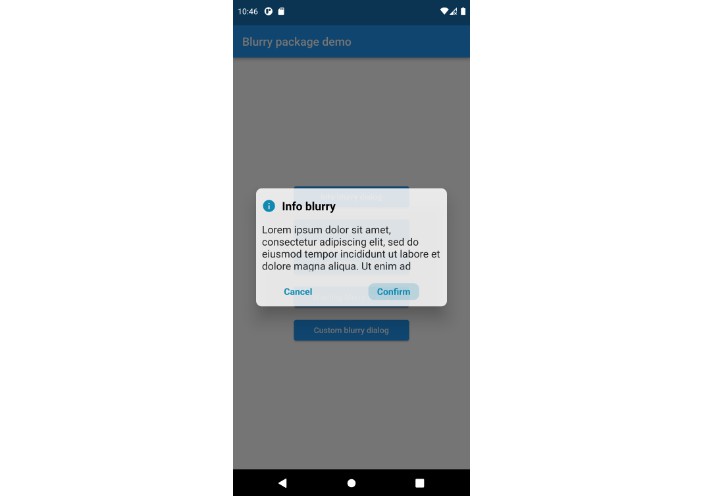
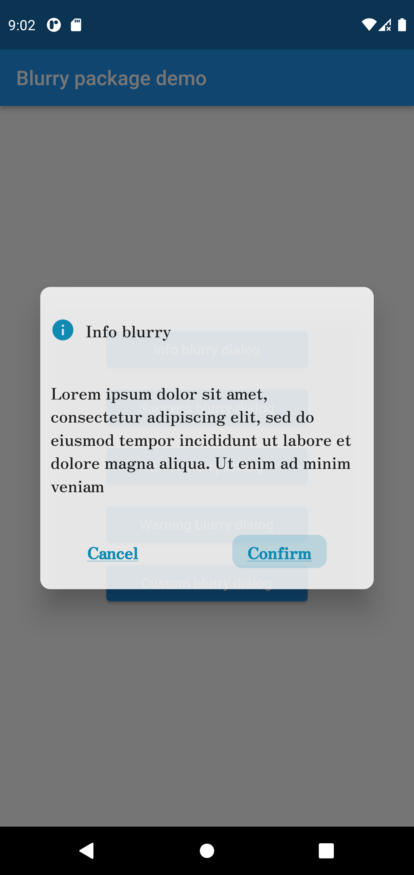
Info style blurry package
Blurry.info(
	title:  'Info blurry',
	description:
	'Lorem ipsum dolor sit amet, consectetur adipiscing elit, sed do eiusmod tempor incididun',
	confirmButtonText:  'Confirm',
	onConfirmButtonPressed: () {
		print('hello world');
	})
.show(context);
Success style blurry package
Blurry.success(
	title:  'Success blurry',
	description:
	'Lorem ipsum dolor sit amet, consectetur adipiscing elit, sed do eiusmod tempor incididun',
	confirmButtonText:  'Confirm',
	onConfirmButtonPressed: () {
		print('hello world');
	})
.show(context);

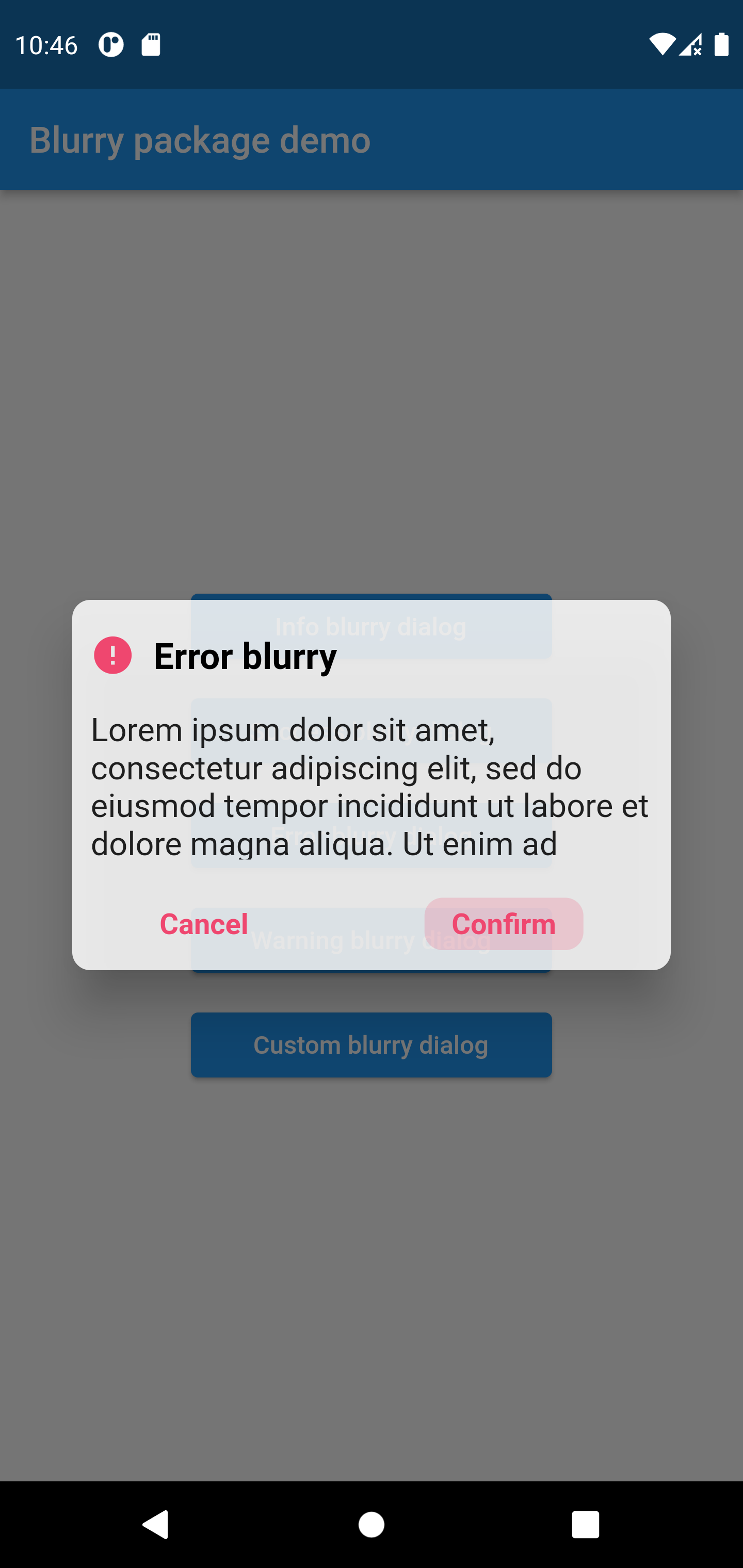
Error style blurry package
Blurry.error(
	title:  'Error blurry',
	description:
	'Lorem ipsum dolor sit amet, consectetur adipiscing elit, sed do eiusmod tempor incididun',
	confirmButtonText:  'Confirm',
	onConfirmButtonPressed: () {
		print('hello world');
	})
.show(context);
Warning style blurry package
Blurry.warning(
	title:  'Warning blurry',
	description:
	'Lorem ipsum dolor sit amet, consectetur adipiscing elit, sed do eiusmod tempor incididun',
	confirmButtonText:  'Confirm',
	onConfirmButtonPressed: () {
		print('hello world');
	})
.show(context);

Custom style blurry package
Blurry(
	icon:  Icons.verified_user,
	themeColor:  Colors.purple,
	title:  'Custom blurry',
	description: 'Lorem ipsum dolor sit amet, consectetur adipiscing elit',
	confirmButtonText:  'Confirm',
	onConfirmButtonPressed: () {})
.show(context);

Contribution
Of course the project is open source, and you can contribute to it repository link
- If you found a bug, open an issue.
- If you have a feature request, open an issue.
- If you want to contribute, submit a pull request.