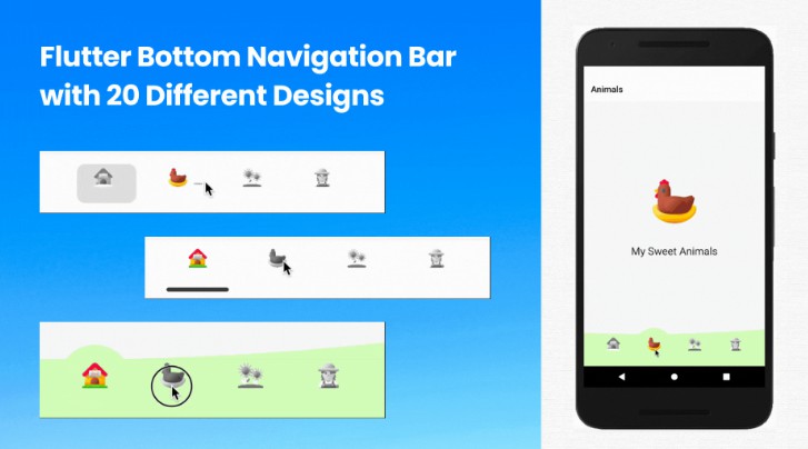
Cuberto Bottom Bar
Flutter plugin - CubertoBottomBar.
Cuberto Bottom bar Gif- Default Style

Cuberto Bottom bar Gif- Faded Style

Getting Started
dependencies:
  ...
  cuberto_bottom_bar: ^0.0.2
Limitations
For now this is limited to more than 1 tab, and less than 5. So 2-4 tabs.
textColor will only be applied in the case of STYLE_NORMAL,
in case of STYLE_FADED_BACKGROUND the tabColor will be set as textColor,(if tabColor is not set inactiveColor will be set)
manually drawer or endDrawer has to be added and then respective drawer has to be added in CubertoBottomBar (
CubertoDrawer.NO_DRAWER for no drawer, CubertoDrawer.START_DRAWER for drawer and CubertoDrawer.END_DRAWER for endDrawer)
By default the drawer overlaps the CubertoBottomBar, for that margin: EdgeInsets.only(bottom: 60.0) has been added. (Please check with the example)
The values in onTabChangedListener: (position, title, color) (position, title and color are null at the beginning), but gets the value once the tab is clicked.
Basic Usage
Adding the widget
bottomNavigationBar: CubertoBottomBar(
        inactiveIconColor: inactiveColor,
        tabStyle: CubertoTabStyle.STYLE_FADED_BACKGROUND, // By default its CubertoTabStyle.STYLE_NORMAL
        initialSelection: 0, // By default its 0
        drawer: CubertoDrawer.NO_DRAWER, // By default its NO_DRAWER (Availble START_DRAWER and END_DRAWER as per where you want to how the drawer icon in Cuberto Bottom bar)
        tabs: [
          TabData(
              iconData: Icons.home,
              title: "Home",
              tabColor: Colors.deepPurple),
          TabData(
              iconData: Icons.search,
              title: "Search",
              tabColor: Colors.pink),
          TabData(
              iconData: Icons.access_alarm,
              title: "Alarm",
              tabColor: Colors.amber),
          TabData(
              iconData: Icons.settings,
              title: "Settings",
              tabColor: Colors.teal),
        ],
        onTabChangedListener: (position, title, color) {
          setState(() {
            currentPage = position;
            currentTitle = title;
            currentColor = color;
          });
        },
      ),
TabData
iconData -> Icon to be used for the tab
title -> String to be used for the tab
tabColor: -> Colors to be used for background and label when STYLE_FADED_BACKGROUND is choosed
onClick -> Optional function to be used when the circle itself is clicked, on an active tab
Attributes
required
tabs -> List of TabData objects
onTabChangedListener -> Function to handle a tap on a tab, receives int position, String title and Color tabColor (if not set will return inactiveIconColor in both STYLE_NORMAL and STYLE_FADED_BACKGROUND)
optional
initialSelection -> Defaults to 0
inactiveIconColor -> Defaults to null, derives from Theme
textColor -> Defaults to Colors.white
barBackgroundColor -> Defaults to null, derives from Theme
tabStyle -> Defaults to CubertoTabStyle.STYLE_NORMAL
drawer -> Defaults to CubertoDrawer.NO_DRAWER (can be set as CubertoDrawer.START_DRAWER or CubertoDrawer.END_DRAWER as per the need for the placement of drawer icon)
key -> Defaults to null
Theming
The bar will attempt to use your current theme out of the box, however you may want to theme it. Here are the attributes:
Cuberto Bottom Bar Theming - STYLE_FADED_BACKGROUND

Cuberto Bottom Bar Theming - STYLE_NORMAL

Showcase
Using this package in a live app, let me know and I'll add you app here.