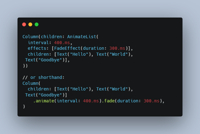
Hyper Effects
Hyper Effects is a Flutter package inspired from SwiftUI’s syntax to create beautiful effects in Flutter. With just a few lines of code after your widget, you can add any number of effects and transitions with ease.
Demo: hyper-effects-demo.web.app
Features
- ? Compact Syntax: Write a single line of code for a whole suite of complex effects.
- ? Animate Everything: No animation controllers or tweening needed. Animate any widget with a line of code.
- ? Scroll Transitions: Control how your widgets look based on their position in a scroll view.
- ? Pointer transitions: No gesture detectors or state management required. Control how your widgets look based on pointer events.
- ? Easy Integration: Missing an effect? The API is designed to be simple and easy to extend.
Examples
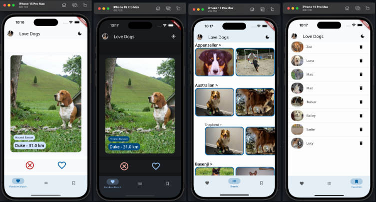
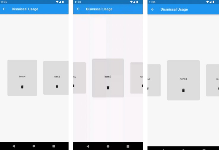
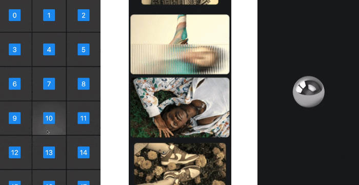
Scroll Transition |
Scroll Wheel |
Scroll Blur |
Windows Hover Effect |

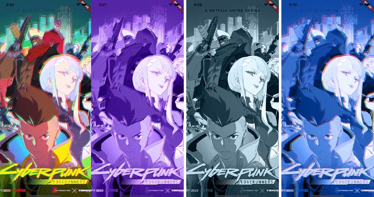
Scroll Color Filter |
Spring Animation |
Getting started
Installation
Add this package to your dependencies in your pubspec.yaml file:
dependencies:
  hyper_effects: <latest_version>
or run following command in your project directory:
flutter pub add hyper_effects
Usage
For any widget you have, you can append any number of effects and transitions to it using the extensions like so:
@override
Widget build(BuildContext context) {
  return Container(
    color: Colors.blue,
  ).opacity(myCondition ? 0 : 1);
}
However, this will not animate the effect. This will only wrap the widget with the specific effect and use the value provided.
To animate the effects, you need to call the animate method on the widget like so:
@override
Widget build(BuildContext context) {
  return Container(
    color: Colors.blue,
  )
      .opacity(myCondition ? 0 : 1)
      .animate(toggle: myCondition);
}
toggle is a parameter of type Object. It’s inspired from SwiftUI’s value parameter on its animation modifier.
Whenever the value of toggle changes, the effect will animate to the new value. In this case, myCondition is the
toggle value. You can use any object as a toggle value, but you will likely want to use the same object that you use to
control the condition of the effect as it is the point in which the effect should animate.
HyperEffects takes heavy inspiration from SwiftUI in that it attempts to provide Apple-like default values for everything, that means that by default, animations are of 350ms duration and use Apple’s custom easeInOut curve. The result is a very smooth and natural feeling animation that is very reminiscent of Apple’s style.
Despite having really nice default values, the API of course allows you to customize the animation to your liking. You can do so by your own duration and curve.
@override
Widget build(BuildContext context) {
  return Container(
    color: Colors.blue,
  )
      .opacity(myCondition ? 0 : 1)
      .animate(
        toggle: myCondition,
        duration: const Duration(milliseconds: 200),
        curve: Curves.easeOutQuart,
      );
}
You can combine and chain any number of effects like so:
@override
Widget build(BuildContext context) {
  return Container(
    color: Colors.blue,
  )
      .opacity(myCondition ? 0 : 1)
      .blur(myCondition ? 10 : 0)
      .scale(myCondition ? 0.5 : 1)
      .translateX(myCondition ? 100 : 0)
      .animate(toggle: myCondition);
}
Since these are convenient extensions, you can use the effects as Widgets using the apply method like so:
@override
Widget build(BuildContext context) {
  return OpacityEffect(
    opacity: myCondition ? 0 : 1,
  ).apply(
    context,
    BlurEffect(
      blur: myCondition ? 10 : 0,
    ).apply(
      context,
      ScaleEffect(
        scale: myCondition ? 0.5 : 1,
      ).apply(
        context,
        TranslateEffect(
          offset: Offset(myCondition ? 100 : 0, 0),
        ).apply(
          context,
          Container(
            color: Colors.blue,
          ),
        ),
      ),
    ),
  );
}
Transitions
Transitions are a special type of effect that allows you to control how your widgets look based on some continuous value. For example, you can control the opacity of a widget based on its position in a scroll view or based on the pointer position.
Transitions use a builder pattern to provide you with an event property that gives you active information about the
state of a transition for your widget. You can use this information to control how your widget looks, and it will
animate automatically based on the effects you use inside.
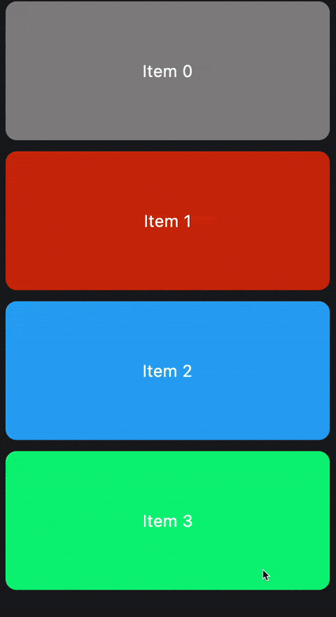
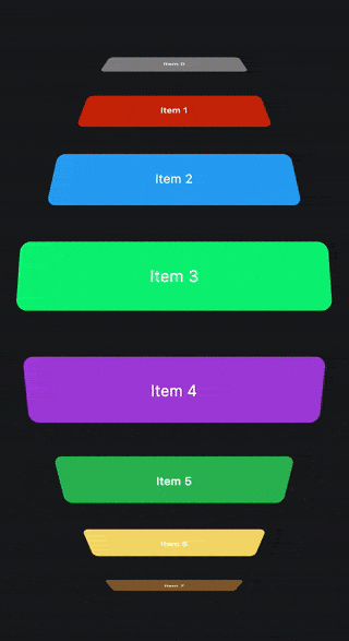
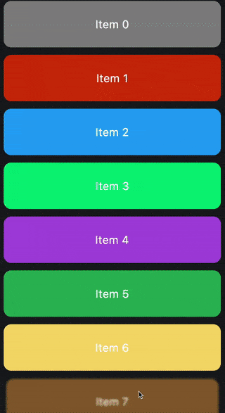
Scroll Transitions
Scroll transitions are transitions that are based on the position of a widget in a scroll view. You can use the
scrollTransition extension on any widget to add a scroll transition to it.
  @override
  Widget build(BuildContext context) {
    return ListView.builder(
      itemBuilder: (context, index) {
        return Container(
          width: 350,
          height: 100,
          margin: const EdgeInsets.symmetric(horizontal: 16, vertical: 8),
          alignment: Alignment.center,
          decoration: BoxDecoration(
            color: randomColor(index),
            borderRadius: BorderRadius.circular(16),
          ),
          child: Text(
            'Item $index',
            style: const TextStyle(
              fontSize: 24,
              color: Colors.white,
            ),
          ),
        ).scrollTransition(
          (context, widget, event) => widget
              .blur(
                switch (event.phase) {
                  ScrollPhase.identity => 0,
                  ScrollPhase.topLeading => 10,
                  ScrollPhase.bottomTrailing => 10,
                },
              )
              .scale(
                switch (event.phase) {
                  ScrollPhase.identity => 1,
                  ScrollPhase.topLeading => 0.9,
                  ScrollPhase.bottomTrailing => 0.9,
                },
              ),
        );
      },
    );
  }
In a scroll transition, the phase is a ScrollPhase enum that determines the view-state of a widget in a scroll view.
ScrollPhase.identityis when the widget is fully viewable in the scroll view.ScrollPhase.topLeadingis when the widget is partially viewable from the top/left, IE: It’s leaving the top or left of the scroll view.ScrollPhase.bottomTrailingis when the widget is partially viewable from the bottom/right, IE: It’s leaving the bottom or right of the scroll view.
In addition to the ScrollPhase, the event also provides screenOffsetFraction which is a double value between -1, 0
and 1 that represents the progress the scroll view is moving away from the center of the scroll view.
- If the widget is near the center of the scroll view, the value tends towards 0.
- As the widget moves towards the ceiling of the scroll view, the value tends towards 1. It clamps to 1 when the item is fully out of the scroll view.
- As the item moves towards the floor of the scroll view, the value tends towards -1. It clamps to -1 when the item is fully out of the scroll view.
Caution
Be careful when using screenOffsetFraction as it can be a bit tricky to use. The way transitions work
internally is that they lerp to and from a specific internal value. That value for scroll transitions is the
ScrollPhase.
With that in mind, despite the fact that you can use phase to animte your widgets easily with the extensions, for
other properties likescreenOffsetFraction, you will need to use the manual Effects API to animate them.
  @override
  Widget build(BuildContext context) {
    return ListView.builder(
      itemBuilder: (context, index) {
        return Container(
          width: 350,
          height: 100,
          margin: const EdgeInsets.symmetric(horizontal: 16, vertical: 8),
          alignment: Alignment.center,
          decoration: BoxDecoration(
            color: randomColor(index),
            borderRadius: BorderRadius.circular(16),
          ),
          child: Text(
            'Item $index',
            style: const TextStyle(
              fontSize: 24,
              color: Colors.white,
            ),
          ),
        ).scrollTransition((context, widget, event) => TransformEffect(
              rotateX: -90 * event.screenOffsetFraction * pi / 180,
              translateY: (event.screenOffsetFraction * -1) * 200,
              translateZ: event.screenOffsetFraction.abs() * 100,
              scaleX: 1 - (event.screenOffsetFraction.abs() / 2),
              depth: 0.002,
            ).apply(context, widget));
      },
    );
  }
When using the manual Effects API directly, you can use any parameter and manipulate their values as much as you like in the above example, whereas with the convenient extensions API, you may be limited to using the internally
animated value. In scroll transitions, the internally animated value is the phase property.
Pointer Transitions
Pointer transitions are transitions that provide events based on the pointer’s position either locally or globally depending on configuration. This transition has many configurable parameters that allow you to control how the transition should output its values in its builder.
@override
Widget build(BuildContext context) {
  return Container(
    decoration: const BoxDecoration(
      color: Colors.blue,
    ),
  ).pointerTransition(
        (context, child, event) => child.translateXY(
      event.valueOffset.dx / 2,
      event.valueOffset.dy / 2,
      fractional: true,
    ),
  );
}
In the above example, the container will move half the distance of the pointer’s movement in the x and y axis. The
fractional parameter is set to true, which means that the widget will move by multiplying its size by the value
provided. If fractional is set to false, the widget will move by the value provided directly in pixels.
value is a double parameter that represents the distance of the pointer device from the origin.
A value of zero is when the pointer device is at the origin.
A value of 1 or -1 is when the pointer device is at the farthest point from the origin.
This value is the average of the valueOffset‘s x and y values.
valueOffset is an Offset parameter very similar to value but provides more information about the individual x and
y axes. It’s The distance of the pointer device from the origin as an offset.
A value offset of (0, 0) is when the pointer device is at the origin.
A value offset of (1, 1) is when the pointer device is at the farthest point from the origin.
isInsideBounds is a boolean parameter that decides whether the pointer is inside the bounds of the widget or not.
position is the raw position of the pointer. It’s the position of the pointer device from the top left corner of the
target. The target depends on the configurations below.
Pointer Transition Properties
When using the pointer transition, you can provide multiple parameters to control its behavior, which is reflected back
in the event provided to the builder.
  Widget pointerTransition(
    PointerTransitionBuilder builder, {
    Alignment origin = Alignment.center,
    bool useGlobalPointer = false,
    bool transitionBetweenBounds = true,
    bool resetOnExitBounds = true,
    Curve curve = appleEaseInOut,
    Duration duration = const Duration(milliseconds: 125),
  }) {
    return PointerTransition(
      builder: builder,
      origin: origin,
      useGlobalPointer: useGlobalPointer,
      transitionBetweenBounds: transitionBetweenBounds,
      resetOnExitBounds: resetOnExitBounds,
      curve: curve,
      duration: duration,
      child: this,
    );
  }
origin is an Alignment parameter that determines the origin to transform the pointer position around.
- If the origin is set to
Alignment.center, as the pointer moves away from the center of the screen, thevaluewill increase. - If the origin is set to
Alignment.topLeft, as the pointer moves away from the top left corner of the screen, thevaluewill increase.
useGlobalPointer is a boolean parameter that determines whether the pointer position should be calculated globally
or locally. If set to true, the pointer position will be calculated from the top left corner of the screen. If set to
false, the pointer position will be calculated from the top left corner of the widget.
transitionBetweenBounds is a boolean parameter that determines whether the transition should animate between the
bounds of the widget or not. If set to true, the transition will trigger the internal animation to reset when the
pointer moves in and out of the bounds of the widget. If set to false, the transition will snap instantly to
the new values when the pointer moves in and out of the bounds of the widget.
resetOnExitBounds is a boolean parameter that determines whether this transition should reset the position of the
child back to a value of zero when the pointer device is outside the bounds of the widget. transitionBetweenBounds
decides whether the transition should animate or not.
curve is a Curve parameter that determines the curve of the internal when transitioning between bounds animation.
duration is a Duration parameter that determines the duration of the internal when transitioning between bounds.
Caution
Like the scroll transition, be careful when using value and valueOffset as it can be a bit tricky to use. The
pointer transition internally uses the value property to internally lerp between values. This means that if you use
other properties and expect them to transition perfectly, you may get unexpected results sometimes.
Demo: hyper-effects-demo.web.app
You are welcome to contribute on this package. See CONTRIBUTING.md for details.
Authors
 Birju Vachhani Birju Vachhani |
 Saad Ardati Saad Ardati |
Feel free to join our Discord server for any inquiries or support: https://discord.gg/yrahEhCqTJ
License
BSD 3-Clause License

Copyright (c) 2023, Hyperdesigned

Redistribution and use in source and binary forms, with or without
modification, are permitted provided that the following conditions are met:

1. Redistributions of source code must retain the above copyright notice, this
   list of conditions and the following disclaimer.

2. Redistributions in binary form must reproduce the above copyright notice,
   this list of conditions and the following disclaimer in the documentation
   and/or other materials provided with the distribution.

3. Neither the name of the copyright holder nor the names of its
   contributors may be used to endorse or promote products derived from
   this software without specific prior written permission.

THIS SOFTWARE IS PROVIDED BY THE COPYRIGHT HOLDERS AND CONTRIBUTORS "AS IS"
AND ANY EXPRESS OR IMPLIED WARRANTIES, INCLUDING, BUT NOT LIMITED TO, THE
IMPLIED WARRANTIES OF MERCHANTABILITY AND FITNESS FOR A PARTICULAR PURPOSE ARE
DISCLAIMED. IN NO EVENT SHALL THE COPYRIGHT HOLDER OR CONTRIBUTORS BE LIABLE
FOR ANY DIRECT, INDIRECT, INCIDENTAL, SPECIAL, EXEMPLARY, OR CONSEQUENTIAL
DAMAGES (INCLUDING, BUT NOT LIMITED TO, PROCUREMENT OF SUBSTITUTE GOODS OR
SERVICES; LOSS OF USE, DATA, OR PROFITS; OR BUSINESS INTERRUPTION) HOWEVER
CAUSED AND ON ANY THEORY OF LIABILITY, WHETHER IN CONTRACT, STRICT LIABILITY,
OR TORT (INCLUDING NEGLIGENCE OR OTHERWISE) ARISING IN ANY WAY OUT OF THE USE
OF THIS SOFTWARE, EVEN IF ADVISED OF THE POSSIBILITY OF SUCH DAMAGE.