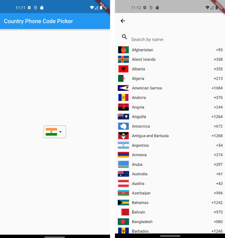
CountryListPicker for Flutter customizable country selection package with multi-languages support.


Installation
Run this command:
With Flutter:
$ flutter pub add country_list_picker
This will add a line like this to your package's pubspec.yaml (and run an implicit flutter pub get):
dependencies:
  country_list_picker: ^1.0.1
Alternatively, your editor might support flutter pub get. Check the docs for your editor to learn more.
Now in your Dart code, you can use:
import 'package:country_list_picker/country_list_picker.dart'
Usage
import  'package:country_list_picker/country_list_picker.dart';
void  main() {
    //simple code
    CountryListPicker(
          onCountryChanged: ((value) {
              // do something
          }),
          onChanged: (value) {
             // do something
          },
}
Getting started
Supported 250 countries with common/offical name, iso_3166_1_alpha2, iso_3166_1_alpha3, dialing_code, default_number_length, default_number_format, local_number_sample.
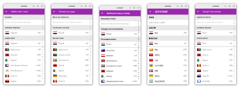
Supported languages:
- Arabic
- Chinese
- Croatian
- Czech
- English
- Estonian
- Finnish
- French
- German
- Hungarian
- Italian
- Japanese
- Korean
- Persian
- Polish
- Portuguese
- Russian
- Slovak
- Spanish
- Swedish
- Urdu
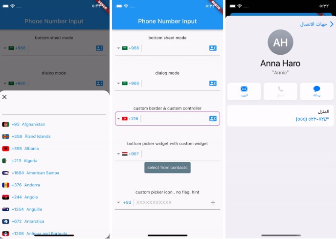
Picker Paramters
| Parameter | Type | Default | Description |
|---|---|---|---|
onCountryChanged |
ValueChanged? |
null |
This is a callback function that is invoked when the selected country is changed, which can be used to access the newly selected country. |
onChanged |
ValueChanged? |
null |
This is a callback function that is invoked when the phone number in the input field changes, which can be used to access the new phone number. |
initialCountry |
Countries |
Countries.Egypt |
Sets the initial country that is selected when the widget is first rendered. |
language |
Languages |
Languages.English |
Sets the display language for the widget. |
textDirection |
TextDirection |
-- | Sets the text direction for the widget depending on the language direction. |
displayName |
Names |
Names.common |
Determines whether the country name displayed is common or official. |
localCountry |
Countries |
null |
Refer to local device which will define by you. |
countryNameTextStyle |
TextStyle |
TextStyle(fontSize: 15, color: Colors.grey) |
Text style for the country name display. |
isShowFlag |
bool |
true |
Determines the visibility of the flag icon. A value of true will display the flag icon, while a value of false will hide it. |
flagSize |
Size |
true |
size of the flag icon. It has a default value Size (40,40) |
isShowDiallingCode |
bool |
true |
Determines whether the dialling code should be displayed or not. If true, the dialling code will be displayed. If false, it will be hidden. |
isShowDownIcon |
bool |
true |
Determines whether the flag icon should be displayed or not. If true, the flag icon will be displayed. If false, it will be hidden. |
isShowCountryName |
bool |
true |
Determines whether the country name should be displayed or not. If true, the country name will be displayed. If false, it will be hidden. |
isShowInputField |
bool |
true |
Determines whether the phone number input field should be displayed or not. If true, the phone number input field will be displayed. If false, it will be hidden. |
iconDown |
Icon |
Icon(Icons.keyboard_arrow_down, size: 24) |
Determines whether the dropdown arrow icon should be displayed or not. If true, the dropdown arrow icon will be displayed. If false, it will be hidden. |
diallCodeStyle |
TextStyle |
TextStyle(fontSize: 16, fontWeight: FontWeight.bold) |
Text style for the dialling code display. |
border |
InputBorder |
UnderlineInputBorder() |
Border of the phone number input field. |
inputTheme |
InputThemeData |
See Input Paramters section | Theme data for the phone number input field. |
dialogTheme |
DialogThemeData |
See Dialog Paramters section | Theme data for the country selection dialog. |
    CountryListPicker(
        onCountryChanged: ((value) {
            // do something
        }),
        onChanged: (value) {
            // do something
        },
        initialCountry: Countries.Egypt,
        language: Languages.Arabic,
        isShowDownIcon: picker.isDownIcon,
        isShowCountryTitle: false,   // if you need to hide country title
        displayName: Names.offical,  // if you need to display country offical name
    )
Input Paramters
| Parameter | Type | Default | Description |
|---|---|---|---|
obscureText |
bool |
false |
Determines if the text input should be obscured or not. |
obscuringCharacter |
String |
"*" | The character used to obscure the text input. |
style |
TextStyle |
TextStyle(fontSize: 16) |
The text style for the input field. |
hintText |
String |
Enter your phone number |
The hint text to be displayed when the input field is empty. |
hintStyle |
TextStyle |
TextStyle(fontSize: 16, color: Color(0xFF9E9E9E)) |
text style for the hint text. |
border |
InputBorder |
InputBorder.none |
The border style for the input field. |
mask |
String |
"### #### ###" | The mask used to format the text input. |
you can set mask and hintString to default value of each country using onCountryChanged.
    String _hintString ="";
    String _mask ="";
    CountryListPicker(
        onCountryChanged: ((value) {
            _hintString = value.local_number_sample;
            _mask = value.default_number_format;lue
            // do something
        }),
        onChanged: (value) {
            // do something
        },
        inputTheme: InputThemeData(
            hintText: _hintString
            hintStyle: input.hintTextStyle,
            border:  InputBorder.UnderlineInputBorder
            mask: _mask,
          ),
    )
Dialog Paramters
| Parameter | Type | Default | Description |
|---|---|---|---|
isShowFlag |
bool |
Determines whether the flag icon should be displayed. A value of true will display the flag icon, while a value of false will hide it. | |
isShowDiallCode |
bool |
Determines whether the dialling code should be displayed. A value of true will display the dialling code, while a value of false will hide it. | |
isShowFloatButton |
bool |
Determines whether the floating button should be displayed. A value of true will display the floating button, while a value of false will hide it. | |
isShowSearchTile |
bool |
Determines whether the search tile should be displayed. A value of true will display the search tile, while a value of false will hide it. | |
isShowLastPickTile |
bool |
Determines whether the last pick tile should be displayed. A value of true will display the last pick tile, while a value of false will hide it. | |
isShowAlphabetsBar |
bool |
Determines whether the alphabets bar should be displayed. A value of true will display the alphabets bar, while a value of false will hide it. | |
backgroundColor |
Color |
background color for the dialog. | |
textStyle |
TextStyle |
text style for the text displayed in the dialog. The default value is TextStyle(fontSize: 16). |
|
appBar |
PreferredSizeWidget |
Appbar dialog to be displayed on top of the screen. | |
tileHeight |
double |
height of the tiles. The default value is 50 |
|
alphabetsBarTheme |
AlphabetsBarThemeData |
theme data for the alphabets bar. | |
tilesTheme |
TilesThemeData |
theme data for the tiles. |
    CountryListPicker(
        onCountryChanged: ((value) {
            // do something
        }),
        onChanged: (value) {
            // do something
        },
        dialogTheme: DialogThemeData(
            isShowFlag: false,          // <- hide dialog flags
            isShowDialCode: false,      // <- hide dial code
            isShowFloatButton: false,   // <- hide float button
            isShowSearchTile: false,    // <- hide search tile
            isShowLastPickTile: false,  // <- hide last pick tile
            isShowAlphabetsBar: false,  // <- hide alphabets bar
    )
Alphabets Paramters
| Parameter | Type | Default | Description |
|---|---|---|---|
backgroundColor |
Color |
Colors.transparent |
The background color of unselected alphabet item |
style |
TextStyle |
TextStyle(fontSize: 12) |
The text style of the alphabet item text. |
selectedBackgroundColor |
Color |
Colors.transparent |
The background color of alphabet item. |
selectedStyle |
TextStyle |
TextStyl(fontSize: 18, fontWeight: FontWeight.bold) |
The text style of the selected alphabet item text. |
Note that: the Country List Picker doesn't support alpabets bar with Chinese, Japanese and Korean languages.
   CountryListPicker(
       onCountryChanged: ((value) {
           // do something
       }),
       onChanged: (value) {
           // do something
       },
       dialogTheme: DialogThemeData(
           alphabetsBarTheme: AlphabetsBarThemeData(
             backgroundColor: Colors.transparent,
             selectedBackgroundColor: Colors.green,  //<- change background of selected item
             // style: ,           // to change unselected alphabet items text style
             // selectedStyle: ,   // to change selected alphabet items text style
           ),
   )
Dialog Tiles Paramters
| Parameter | Type | Default | Description |
|---|---|---|---|
backgroundColor |
Color |
Theme.of(context).colorScheme.surface |
The background color of the tile. |
style |
TextStyle |
TextStyle(fontSize: 16, fontWeight: FontWeight.bold) |
The text style of the title text. |
currentLocationTileTitle |
String |
"Current Location" | The title of the tile for current location. |
lastPickIcon |
Icon |
Icon(Icons.check) |
The icon for the last pick tile. |
lastPickTitle |
String |
"Last Pick" | The title of the last pick tile. |
searchHint |
String |
"name/dial code..." | The hint text for the search bar. |
searchHintStyle |
TextStyle |
TextStyle(fontSize: 16, color: Color(0xFF9E9E9E) |
The text style of the search hint text. |
searchTitle |
String |
"Search" | The title of the search bar. |
if you need to show CurrentLocationTile, you must set the localCountry value to country what you want.
Features and bugs
Please file feature requests and bugs at the [issue tracker][tracker].
issue tracker