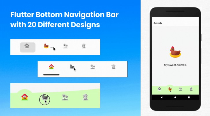
ff_navigation_bar
A highly configurable navigation bar with emphasis for the selected item.
Add dependency
dependencies:
  ff_navigation_bar: ^0.0.1
Basic use
import 'package:flutter/material.dart';
import 'package:ff_navigation_bar/ff_navigation_bar.dart';
...
return Scaffold(
backgroundColor: Colors.grey[200],
body: CustomScrollView(
slivers: [
ESSliverAppBar(
context: context,
title: homeData.getTitle(),
actions: homeData.getAvailableActions(),
forceElevated: true,
),
SliverFillRemaining(
child: homeData.getChild(),
),
],
),
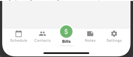
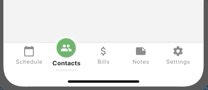
bottomNavigationBar: FFNavigationBar(
theme: FFNavigationBarTheme(
barBackgroundColor: Colors.white,
selectedItemBackgroundColor: Colors.green,
selectedItemIconColor: Colors.white,
selectedItemLabelColor: Colors.black,
),
selectedIndex: 1,
onSelectTab: (index) {},
items: [
FFNavigationBarItem(
iconData: Icons.calendar_today,
label: 'Schedule',
),
FFNavigationBarItem(
iconData: Icons.people,
label: 'Contacts',
),
FFNavigationBarItem(
iconData: Icons.attach_money,
label: 'Bills',
),
FFNavigationBarItem(
iconData: Icons.note,
label: 'Notes',
),
FFNavigationBarItem(
iconData: Icons.settings,
label: 'Settings',
),
],
),
);
Theme
The navbar has a Theme class which can be used to define the majority of appearance settings for the navbar and its items.
- barBackgroundColor: The background color for the entire bar (default = white)
- selectedItemBackgroundColor: The background color for the CircleAvatar widget used to display the selected item's icon (default = blueAccent)
- selectedItemIconColor: The color for the selected item's icon (default = white)
- selectedItemLabelColor: The color for the selected item's label (default = black)
- unselectedItemBackgroundColor: The background color for unselected items (default = transparent)
- unselectedItemIconColor: The color for unselected items' icons (default = grey)
- unselectedItemLabelColor: The color for unselected items' icons (default = grey)
- selectedItemTextStyle: The text style to use for the selected item's label. The selectedItemLabelColor takes priority over any color attribute of the style (defaults to size = 13.0, weight = Bold)
- unselectedItemTextStyle: The text style to use for the unselected items' labels (defaults to size = 12.0, weight = Normal)
- barHeight: The height for the bar (which is automatically included within a SafeArea widget)
- itemWidth: The width to use for the selected item CircleAvater (default = 48.0)
- showSelectedItemShadow: Indicates if the drop shadow below the selected item should be displayed (default = true)
FFNavigationBar Attributes
- selectedIndex: The item number (zero indexed) which should be marked as selected
- onSelectTab: Callback function to receive tap notifications using the typedef
Function(int selectedIndex) - items: List of FFNavigationBarItem objects to be displayed as the bar's items
- theme: A FFNavigationBarTheme theme object
FFNavigationBarItem
- label: The String to display as the item's label
- iconData: The IconData to use in the item's Icon
- animationDuration: A Duration object which can be used to tweak the AnimatedContainer behaviour of the navigation bar item.
- selectedBackgroundColor: A Color value which can override the theme's selectedItemBackgroundColor value for a specific navigation bar item (used to create different colors for each item)
- selectedForegroundColor: A Color value which can override the theme's selectedItemIconColor value
- selectedLabelColor: A Color value which can override the theme's selectedItemLabelColor value