Bottom Personalized Dot Bar
A bottom navigation bar that you can customize with the options you need, without any limits. You can also customize the appearance of the navigation bar.
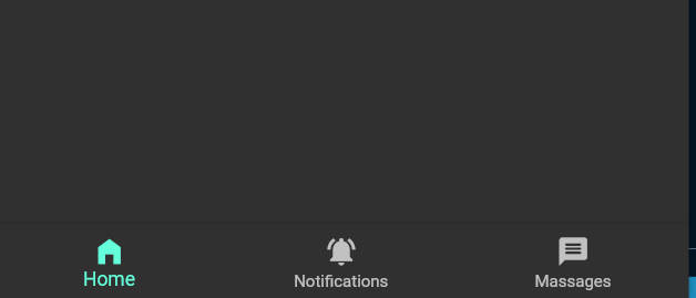
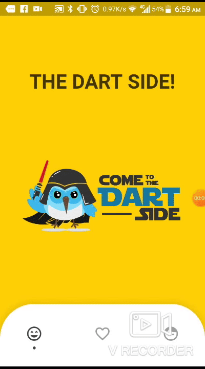
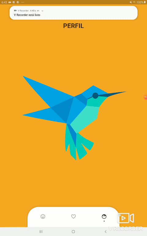
Demo example (Mobile)
Demo example (Tablet 1)
Demo example (Tablet 2)
Package overview
- [x] Drag and Drop your options!
- [x] Change icon colors
- [x] Listen to events 'Sort, Insert and Delete'
- [x] Dynamically change the selected option
- [x] Custom options
- [x] Unlimit options
- [x] Option to define custom item background color
- [x] And more ...
Getting Started
Add the plugin:
dependencies:
  ...
  bottom_personalized_dot_bar: ^1.0.2
Import the package
import 'package:bottom_personalized_dot_bar/bottom_personalized_dot_bar.dart';
How to use?
Important! dont use 'bottomNavigationBar' of Scaffold, because it occupies the entire screen, you need to add it inside a Stack.
To add the Options list, you must create BottomPersonalizedDotBarItem, and each must have the unique attribute 'keyItem'.
To modify the selected option, you must update the attribute keyItemSelected of the BottomPersonalizedDotBar
String _itemSelected = 'item-1';
...
..
.
Scaffold(
  body: Stack(
    children: <Widget>[
      .... // Your App Home
      BottomPersonalizedDotBar(
          keyItemSelected: _itemSelected,
          doneText: 'Done',
          settingTitleText: 'Your Menu',
          settingSubTitleText: 'Drag and drop options',
          iconSettingColor: const Color(0xFFFFD201),
          buttonDoneColor: const Color(0xFFFFD500),
          settingSubTitleColor: const Color(0xFFFECE02),
          hiddenItems: <BottomPersonalizedDotBarItem>[
              BottomPersonalizedDotBarItem('item-4', icon: Icons.cloud, name: 'Nube', onTap: (itemSelected) { /* event selected */ }),
              BottomPersonalizedDotBarItem('item-5', icon: Icons.access_alarm, name: 'Alarma', onTap: (itemSelected) { /* event selected */ }),
              BottomPersonalizedDotBarItem('item-6', icon: Icons.message, name: 'Mensaje', onTap: (itemSelected) { /* event selected */ }),
              BottomPersonalizedDotBarItem('item-7', icon: Icons.notifications, name: 'Alerta', onTap: (itemSelected) { /* event selected */ }),
              BottomPersonalizedDotBarItem('item-8', icon: Icons.security, name: 'Seguridad', onTap: (itemSelected) { /* event selected */ }),
              BottomPersonalizedDotBarItem('item-9', icon: Icons.help, name: 'Ayuda', onTap: (itemSelected) { /* event selected */ }),
              BottomPersonalizedDotBarItem('item-10', icon: Icons.settings, name: 'Config.', onTap: (itemSelected) { /* event selected */ }),
          ],
          items: <BottomPersonalizedDotBarItem>[
              BottomPersonalizedDotBarItem('item-1', icon: Icons.sentiment_very_satisfied, name: 'Flutter', onTap: (itemSelected) { /* event selected */ }),
              BottomPersonalizedDotBarItem('item-2', icon: Icons.favorite_border, name: 'Favorito', onTap: (itemSelected) { /* event selected */ }),
              BottomPersonalizedDotBarItem('item-3', icon: Icons.face, name: 'Perfil', onTap: (itemSelected) { /* event selected */ }),
          ],
      ),
    ],
  ),
);
Customization
BottomPersonalizedDotBar
| Attribute | Description |
|---|---|
items |
List of items to be displayed in the navigation bar |
hiddenItems |
List of items that will be hidden |
keyItemSelected |
Item key that is selected |
width |
Navigation bar width |
height |
Navigation bar height |
borderRadius |
Navigation bar radius |
selectedColorIcon |
Selected Icon color |
unSelectedColorIcon |
Unselected Icon color |
navigatorBackground |
Navigator Container Background color |
settingBackground |
Setting Container Background color (Hidden items) |
iconSetting |
Settings button icon |
iconSettingColor |
Settings button icon color |
settingTitleText |
Setting Title Text |
settingTitleColor |
Setting Title color |
settingSubTitleText |
Setting Sub-Title Text |
settingSubTitleColor |
Setting Sub-Title color |
doneText |
Done button Text |
textDoneColor |
Text Done Color |
buttonDoneColor |
Button done color |
hiddenItemBackground |
Background of hidden item |
iconHiddenColor |
Icon Hidden Color |
textHiddenColor |
Text Hidden Color |
dotColor |
Selection Indicator Color (Dot |
boxShadow |
Shadow of container |
onOrderHideItems |
Event when you sort the hidden options, this has as parameter the list of hidden options with the new order. onOrderHideItems: (List<BottomPersonalizedDotBarItem> hiddenItems) { /* Your action */ } |
onOrderItems |
Event when ordering browser options, this has as parameter the list of options with the new order onOrderItems: (List<BottomPersonalizedDotBarItem> items) { /* Your action */ } |
onAddItem |
Event when you add a new option to the navigation bar, this has as parameters the item you add and the list of options. onAddItem: (BottomPersonalizedDotBarItem itemAdd, List<BottomPersonalizedDotBarItem> items) { /* Your action */ } |
onRemoveItem |
Event when you delete an option from the navigation bar, this has as parameters the element to delete and the list of hidden options. onRemoveItem: (BottomPersonalizedDotBarItem itemRemove, List<BottomPersonalizedDotBarItem> hiddenItems) { /* Your action */ } |
BottomPersonalizedDotBarItem
| Attribute | Description |
|---|---|
keyItem |
Unique key |
icon |
Item icon |
name |
Item name |
onTap |
Event with you press the item. onTap: (String keyItem) { /* Your action */ } |